1
$\begingroup$

Background

I have two Empirical distributions, both derived from social media data.

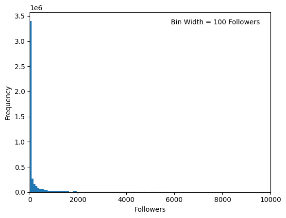
The first represents a broad sample of ~4.8 million posts and the number of followers each post author has. The distribution looks like this:

Sample 1 - The follower distribution for ~4.8 million posts.

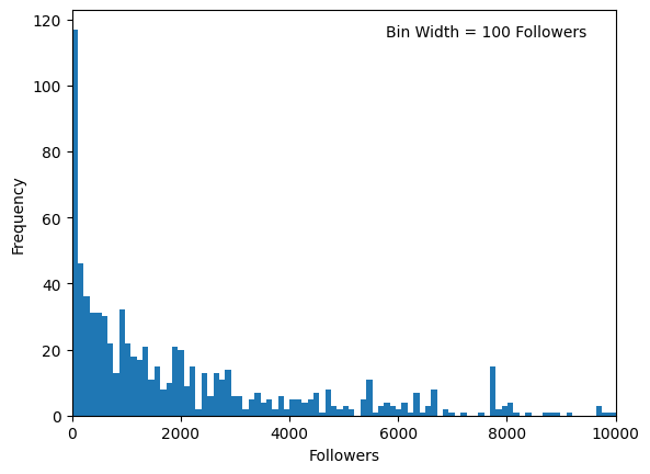
The second is a smaller sample of 1020 posts that were specifically recommended to me. The distribution looks like this:

Sample 2 - The follower distribution for 1020 recommended posts.

It's obvious from visual inspection that if you disregarded the scale and normalised the distribution, they would be very different from one another.

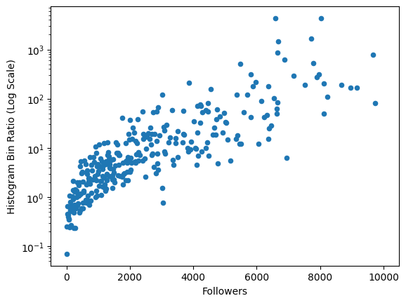
I have normalised these distributions and taken the ratio of the recommended distribution with the broad distribution. By taking the ratio, I mean dividing the recommended stories' bin values by the broad stories' bin values. I've plotted the result as a scatter plot:

The ratio of the recommended posts distribution with the broad distribution. Plotted against the followers.

The equation I used to create each data point is:

$$ R_i = \frac{r_i}{b_i}$$

Where $R_i$ is the ratio calculated for bin position $i$, $r_i$ is the normalised amount of stories in bin position $i$ for the recommended story distribution, and $b_i$ is the normalised amount of stories in bin position $i$ for the broad story distribution.

It shows an interesting pattern. The ratio increases as the number of followers increases. From this, I infer that your chances of being recommended increase as you get more followers. I expected the result I found, but I don't know if it's meaningful.

Question

If you have Empirical distributions, defined as histograms with the same set of bins, does taking the ratio of their bins allows you to say something about the differences between them? In particular, about the possible behaviour governing the creation of each?

$\endgroup$
7
  • 2
    $\begingroup$ It might be interesting to look at the (distinct) authors of the posts. It could be the case that the same authors are responsible for multiple posts. I would think it is likely that authors with lots of followers are very active on social media and have more posts than a typical user. Depending on the recommendation engine, it could also be the case that if you engage with a recommended post once you will be more likely to see other recommended posts by that author. In these cases where you have multiple posts by the same author, we would expect them all to have the same follower count. $\endgroup$ Commented Dec 31, 2023 at 14:58
  • $\begingroup$ Indeed! That is definitely the case. I have already seen trends that show posting frequently improves your chances of being recommended. And I agree that interaction is undoubtedly an important factor that I will investigate later in the EDA. But for now, what do you think of taking the ratios the way I've done it? $\endgroup$
    – Connor
    Commented Jan 1 at 12:32
  • 2
    $\begingroup$ Ratios can be unstable. They will be difficult to interpret. Why not use standard tools to compare distributions, such as probability plots, before moving on to such ad hoc methods? $\endgroup$
    – whuber
    Commented Jan 1 at 15:20
  • $\begingroup$ @whuber Thank you. I get the stability argument, my plan is to create multiple distributions using time windows and get some probability bounds. Why are ratios hard to interpret, is that to do with the stability? Also, I'm really trying to say something about the difference, like "compared to a random selection, the recommendation algorithm prefers you to have followers by X amount". Is it possible to draw a conclusion like that with a technique like this? Will a probability plot show me this? $\endgroup$
    – Connor
    Commented Jan 1 at 15:49
  • 1
    $\begingroup$ Both the numerator and denominator of a ratio are random variables and the distribution of that ratio can be difficult to deal with, especially when the denominator has any chance of being zero. When you want to say something about a comparison of distributions, statistical theory offers methods to identify suitable metrics and test statistics. When the denominator can equal zero, ratios are rarely among them. The probability plot will not only compare distributions, it will show you precisely how they differ. $\endgroup$
    – whuber
    Commented Jan 1 at 15:54

1 Answer 1

1
$\begingroup$

You can certainly say something about them, but I don't know what you can say about the behavior generating each, at least, not from the histograms alone.

But a little logic and knowledge of the field lets you say something:

Most posts get very few followers (it would be nice to see the 0-100 bin broken up in the top graph and maybe the bottom one. Posts that are recommended to you tend to have a lot more followers. (That's from the histograms alone). Why?

For a post to be recommended to you, it has to be read (and recced) by someone you follow. If the post is followed by thousands of people, it's much more likely that you follow one of them. In fact, I'd wager that even the sheer number of followers is not enough to account for this, because of network effects.

I'm guessing there have been a lot of studies of this phenomena using social network analysis. It's been a while since I looked at any of the SNA literature, but this seems to be an ideal situation for that kind of analysis.

$\endgroup$
13
  • 1
    $\begingroup$ If I had the actual data, I probably wouldn't use histograms at all. I might start with density plots (with number of followers on a log scale; I think this is one case where log(n+1) makes sense, because the "1" value is not arbitrary. Then I might do some kind of regression of recommended on total followers, including posts that were NOT recommended to me (probably a zero inflated negative binomial). And maybe other things as well. $\endgroup$
    – Peter Flom
    Commented Dec 31, 2023 at 14:58
  • 2
    $\begingroup$ William S. Cleveland, who is one of the world's leading experts on statistical graphic said that histograms are not a useful method of comparing distributions. Maybe some kind of quantile quantile plot. $\endgroup$
    – Peter Flom
    Commented Dec 31, 2023 at 14:59
  • 3
    $\begingroup$ Depends on the purpose of the comparisons. In some similar-looking problems, the authors of MASS (the book) uses log-spline density estimation to get more stable comparisons $\endgroup$ Commented Dec 31, 2023 at 16:41
  • 1
    $\begingroup$ @PeterFlom Cool, I haven't used density plots before, but to me they look like histograms in the limit is that fair to say? Can I compare empirical density plots the way I compared the histograms in this question? $\endgroup$
    – Connor
    Commented Jan 1 at 12:35
  • 1
    $\begingroup$ Yeah, I guess that's not a wrong description. I'm not sure how you could compare them the way you did the histogram, but there may be a way. That could be another question to look into. $\endgroup$
    – Peter Flom
    Commented Jan 1 at 12:37

Your Answer

By clicking “Post Your Answer”, you agree to our terms of service and acknowledge you have read our privacy policy.

Not the answer you're looking for? Browse other questions tagged or ask your own question.