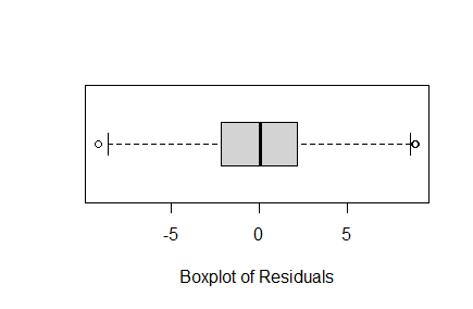
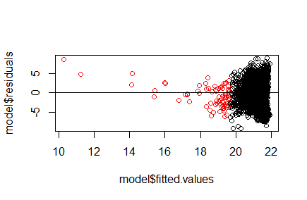
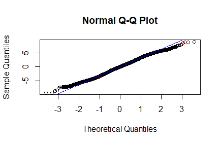
I am not sure if the normality condition for my multiple regression is met. Below are the graphs of my residuals. In the second graph (residuals vs fit) the red points are the outliers in the fitted values. Based on the boxplot and qq plot it looks okay but the vs fit plot worries me. Is it okay to proceed even if my fitted values are not normally distributed? However, there are only 73 outliers in the fit and my sample is 3,135 so would it also be okay since the number of outliers are relatively small?
-
6$\begingroup$ This looks fine to me. The residuals seem to line up quite nicely compared to the normal quantiles between -2 and 2. While the right tail looks thinner than would be expected, and the left a bit fatter, I don’t see any huge risk to proceeding (especially given linear regression is quite robust to any normality requirements with enough data) $\endgroup$– Demetri PananosCommented Jun 1 at 21:40
2 Answers
First, the aspect ratio of your graphs could be better chosen. I realize you probably stacked them this way to make it easier to post, but it would be easier to see what's going on if the ratio were closer to 1.
Second, the middle plot does not evaluate the normality of the residuals, it looks at whether there is a relationship between residuals and fitted values (there shouldn't be one). Again, it's hard to tell at this ratio, but it looks like you have heteroskedasticity. And your fitted values have a kind of odd pattern, which may be OK.
Some general points and more specific advice.
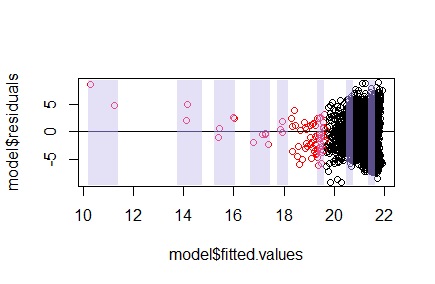
What to look at (general advice): "Outliers" for fitted values is not necessarily an issue; it might perhaps suggest you have some influential points, but this is not the best way to identify that. It's the distribution in narrow vertical slices you need to worry about because that gives you approximate information relating to the conditional distribution of errors (which we approximate using residuals). I've indicated a few vertical slices below:
I've widened the slices where the density of points is low so that we at least have a few points in each slice. The residuals should have roughly zero-mean within slices and the within-slice spread should stay roughly constant across slices. However, naturally fewer observations will tend to have somewhat smaller range than when there's more observations, so it's best not to focus just on range but on some 'typical distance' from the local mean. Of tertiary importance, you'd like each conditional distribution to not be too strongly inconsistent with normality, but this is usually not especially crucial compared to the first two.
What to notice (specific advice): There's a consistent pattern as you move from the rightmost slices to the leftmost; the spread narrows and the center moves further away from 0.
In short, residuals vs fitted show a lack of fit in the mean, and the spread doesn't seem to be locally constant.
Given that your residuals are not at all close to conditionally zero-mean and constant-variance, the impression gained marginal distribution of residuals isn't necessarily particularly relevant to the assumption on the errors: you're looking at a heterogeneous mixture of conditional distributions, which is not particularly informative about the shape of the individual conditional distributions you are trying to assess.
With very few points per slice it's best not to judge too much from a single slice but when there's a consistent impression across a sliding window of a trend in mean or spread, you may have something to worry about. Of course, if you have no interest in the smaller predicted values you may not care much about what the model does there. But if that's the situation you probably would want to consider bounding the influence in your regression to start with.
If the model for the conditional mean is not fairly close to correct there hardly seems to be any point worrying much about the other aspects of the model.
Another thing to notice: The appearance of an upper limit on fitted values (somewhere near $22$) suggests that your response may have an upper bound and that much of the data is quite close to that bound. If this is in fact the case, it would be important to consider the impact of such a boundary on your modelling; typically neither linearity nor homoskedasticity make much sense in such a situation.
Seeing more (general advice): The default plotting settings in R are fine with a few points, and sometimes with a few hundred, but where there's a lot of overlap you lose detail. Smaller, coloured/shaded points (but with transparency so lower plotted points show through and you can see where they're more dense) may be helpful in seeing more detail.
When the plot is crowded with points it might also help to draw in a local smooth of some kind, perhaps a LOESS curve or something similar.
It would help with giving advice if you were to talk about your variables (what are they measuring, what values would be notionally possible in the population) rather than disguise their nature. Very often the details give important clues that we otherwise must guess at.


