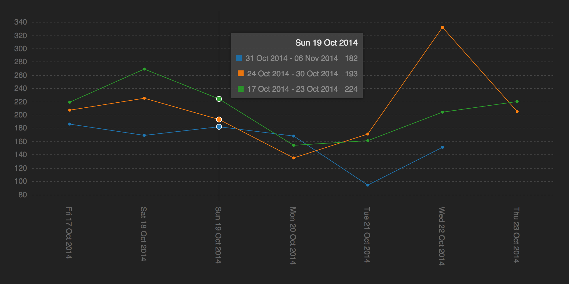
I am having trouble figuring out how to display multiple date ranges, stacked on the same graph.

I'm using c3js which has proven great so far, and relatively easy to get it to do what I want.
The screenshot shows the 3 previous weeks, and the date ranges are displayed on the tooltip, with their totals. However c3js by default will only display one x axis tick, and so overwrites each until the last remains - in this case 17 Oct to 23 Oct.
I'm not too keen on the idea of displaying several dates on the x axis anyway (there's no limit on the number of ranges that can be stacked), so I'm thinking about removing the x axis ticks all together and hacking the tooltip to display the actual dates you are hovering over instead of the range. However, this has drawbacks as the system has the ability to take screenshots of the graph for sharing, and the tooltip isn't visible on the screenshots.
Is there a standard display for this kind of graph? Or any ideas? If it was my choice I would keep it linear - as time usually is - but I've been asked specifically to stack it.

