14
$\begingroup$

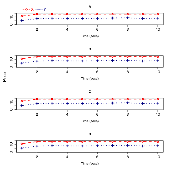
Using the following code, I tried to draw four plots on a graph in R. I am not happy with the figure because there is a lot of space between the plots, therefore the width of the plots are not sufficient enough to analyze the plots.

  1. Could someone help me to produce a nice graph having four plots?

  2. How can I keep x-axis labels from 1 to 10 instead of the default 5 labels?

Data:

a1: 11.013 13.814 13.831 13.714 13.787 13.734 13.778 13.771 13.823 13.659

a2: 5.181 7.747 8.314 8.061 7.920 8.153 8.540 8.845 7.881 8.301

I have used a1 data for b1, c1, and d1; a2 data for b2, c2, and d2 just for here.

Figure:

enter image description here

Code:

        op=par(mfrow=c(4,1), mar=c(5.5,5.1,4.1,2.1))
        plot(a1, type="b", ylim=c(0,14.5), xlab="Time (secs)", ylab="", cex.axis=1.4, cex.lab=1.3,cex=1.2,lwd=2.5,col="red1",lty=2,pch=1, main="A")
        lines(a2,type="b",pch=3,lty=3,col="darkblue",lwd=2.5,cex=1.2)
        par(xpd=T)
        legend(1,26.5,c("X","Y"),bty="n",horiz=T,cex=1.5,col=c("red1","darkblue"),text.col=c("red1","darkblue"),pch=c(1,3),lty=c(2,3),x.intersp=0.4,adj=0.2)
        plot(b1, type="b", ylim=c(0,14.5), xlab="Time (secs)", ylab="", cex.axis=1.4, cex.lab=1.3,cex=1.2,lwd=2.5,col="red1",lty=2,pch=1, main="B")
        lines(b2,type="b",pch=3,lty=3,col="darkblue",lwd=2.5,cex=1.2)
        plot(c1, type="b", ylim=c(0,14.5), xlab="Time (secs)", ylab="", cex.axis=1.4, cex.lab=1.3,cex=1.2,lwd=2.5,col="red1",lty=2,pch=1, main="C")
        lines(c2,type="b",pch=3,lty=3,col="darkblue",lwd=2.5,cex=1.2)
        plot(d1/1000, type="b", ylim=c(0,14.5), xlab="Time (secs)", ylab="", cex.axis=1.4, cex.lab=1.3,cex=1.2,lwd=2.5,col="red1",lty=2,pch=1, main="D")
        lines(d2,type="b",pch=3,lty=3,col="darkblue",lwd=2.5,cex=1.2)
   > mtext("Price", side=2, at=100,line=3,cex=1.1)
$\endgroup$
6
  • 1
    $\begingroup$ could you pls give the details of your data? possibly, dput(data_from_r) $\endgroup$
    – suncoolsu
    Commented Aug 19, 2011 at 21:00
  • $\begingroup$ @suncoolsu, I have updated the question with a sample of data. Thank you. $\endgroup$
    – samarasa
    Commented Aug 19, 2011 at 21:16
  • $\begingroup$ What if you had 2colors and 4 line types on the same axes with a legend? I'd like to see the code and results for that. $\endgroup$
    – Paul
    Commented Aug 20, 2011 at 1:33
  • $\begingroup$ @user87: Since 4 plots are from 4 different experiments. Therefore, I think that it is better to draw 4 plots to analyze the results from the experiments. $\endgroup$
    – samarasa
    Commented Aug 20, 2011 at 1:55
  • $\begingroup$ @user87, I'm not sure what you mean. Perhaps if you started a new question someone would answer it (I would :)) $\endgroup$ Commented Aug 20, 2011 at 3:13

4 Answers 4

17
$\begingroup$

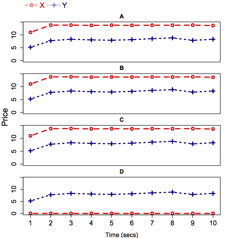
If you want to stick with something like the method you've been using then you might want to learn the layout() command. A few other detail changes and you can get the graphs much closer together. You could also put the unique things that change between graphs in a list (like the data and margins) and then go through a loop. Also, you'll note I made the bottom axis with the direct axis() command so that you can control where the items go.

layout(matrix(1:5, ncol = 1), widths = 1,
        heights = c(1,5,5,5,7), respect = FALSE)
par(mar=c(0, 4, 0, 0))
plot(1, type = 'n', axes = FALSE, bty = 'n', ylab = '')
legend('left', , c("X","Y"), bty="n", horiz=T, cex=1.5, col=c("red1","darkblue"), text.col=c("red1","darkblue"), pch=c(1,3), lty=c(2,3), x.intersp=0.4,adj=0.2)
par(mar=c(0, 4, 2, 1), bty = 'o')
plot(a1, type="b", ylim=c(0,14.5), xlab="Time (secs)", ylab="", xaxt = 'n', cex.axis=1.4, cex.lab=1.3,cex=1.2, lwd=2.5, col="red1", lty=2, pch=1, main="A")
lines(a2,type="b",pch=3,lty=3,col="darkblue",lwd=2.5,cex=1.2)
par(xpd=T)
plot(b1, type="b", ylim=c(0,14.5), xlab="Time (secs)", ylab="", xaxt = 'n', cex.axis=1.4, cex.lab=1.3,cex=1.2,lwd=2.5,col="red1",lty=2,pch=1, main="B")
lines(b2,type="b",pch=3,lty=3,col="darkblue",lwd=2.5,cex=1.2)
plot(c1, type="b", ylim=c(0,14.5), xlab="Time (secs)", ylab="", xaxt = 'n', cex.axis=1.4, cex.lab=1.3,cex=1.2,lwd=2.5,col="red1",lty=2,pch=1, main="C")
lines(c2,type="b",pch=3,lty=3,col="darkblue",lwd=2.5,cex=1.2)
par(mar=c(4, 4, 2, 1))
plot(d1/1000, type="b", ylim=c(0,14.5), xlab="Time (secs)", ylab="", xaxt = 'n', cex.axis=1.4, cex.lab=1.3,cex=1.2,lwd=2.5,col="red1",lty=2,pch=1, main="D")
lines(d2,type="b",pch=3,lty=3,col="darkblue",lwd=2.5,cex=1.2)
mtext("Price", side=2, at=40,line=2.5,cex=1.1)
axis(1, 1:10, cex.axis = 1.4)

theplot

I should note that I really didn't put an effort into making this as nice as I could and instead of making that first dummy graph I could have just set enough space in the first frame. Unfortunately the mar() setting try to fill the frame and the top margin influences the distance that the label above the graph is away so I'd have to go and make all my labels with mtext() or text() instead of just using the main setting within plot and I didn't feel like doing that

$\endgroup$
1
  • $\begingroup$ second the +1 for badass base graphics. I've tried in vain to write something nice with the layout() command. I'm going to come back here next time I need to use it. $\endgroup$ Commented Aug 20, 2011 at 10:32
14
$\begingroup$

I would recommend learning the lattice graphics package. I can get close to what you want with a few lines. First, package up your data in a data frame, something like this:

dat <- data.frame (x=rep (1:10, 8), y=c(a1, a2, b1, b2, c1, c2, d1, d2),
        var=factor (rep (c("X", "Y"), each=10)),
        graph=factor (rep (c("A", "B", "C", "D"), each=20)))

which yields:

    x           y var graph
1   1 0.556372979   X     A
2   2 0.754257646   X     A
3   3 0.815432905   X     A
4   4 0.559513013   X     A
5   5 0.763368168   X     A
6   6 0.426415259   X     A
7   7 0.597962532   X     A
8   8 0.723780143   X     A
9   9 0.228920116   X     A
10 10 0.607378894   X     A
11  1 0.865114425   Y     A
12  2 0.919804947   Y     A
13  3 0.437003794   Y     A
14  4 0.203349303   Y     A
15  5 0.620425977   Y     A
16  6 0.703170299   Y     A
17  7 0.174297656   Y     A
18  8 0.698144659   Y     A
19  9 0.732527016   Y     A
20 10 0.778057398   Y     A
21  1 0.355583032   X     B
22  2 0.015765144   X     B
23  3 0.315004753   X     B
24  4 0.257723585   X     B
25  5 0.506324279   X     B
26  6 0.028634427   X     B
27  7 0.475360443   X     B
28  8 0.577119754   X     B
29  9 0.709063777   X     B
30 10 0.308695235   X     B
31  1 0.852567748   Y     B
32  2 0.938889121   Y     B
33  3 0.080869739   Y     B
34  4 0.732318482   Y     B
35  5 0.325673156   Y     B
36  6 0.378161864   Y     B
37  7 0.830962248   Y     B
38  8 0.990504039   Y     B
39  9 0.331377188   Y     B
40 10 0.448251682   Y     B
41  1 0.967255983   X     C
42  2 0.722894624   X     C
43  3 0.039523960   X     C
44  4 0.003774719   X     C
45  5 0.218605160   X     C
46  6 0.722304874   X     C
47  7 0.576140686   X     C
48  8 0.108219812   X     C
49  9 0.258440127   X     C
50 10 0.739656846   X     C
51  1 0.528278201   Y     C
52  2 0.104415716   Y     C
53  3 0.966076056   Y     C
54  4 0.504415150   Y     C
55  5 0.655384900   Y     C
56  6 0.247340395   Y     C
57  7 0.193857228   Y     C
58  8 0.019133583   Y     C
59  9 0.799404908   Y     C
60 10 0.159209090   Y     C
61  1 0.422574508   X     D
62  2 0.823192614   X     D
63  3 0.808715876   X     D
64  4 0.770499188   X     D
65  5 0.049138399   X     D
66  6 0.747017767   X     D
67  7 0.239916970   X     D
68  8 0.152777362   X     D
69  9 0.052862276   X     D
70 10 0.937605577   X     D
71  1 0.850112019   Y     D
72  2 0.675407232   Y     D
73  3 0.273276166   Y     D
74  4 0.455995477   Y     D
75  5 0.695497498   Y     D
76  6 0.688414035   Y     D
77  7 0.454013633   Y     D
78  8 0.874853452   Y     D
79  9 0.568746031   Y     D

Then, use lattice's xyplot:

library (lattice)
xyplot (y ~ x | graph, groups=var, data=dat, type="o",
        layout=c(1, 4), as.table=T, xlab="Time (secs)", ylab="Price")

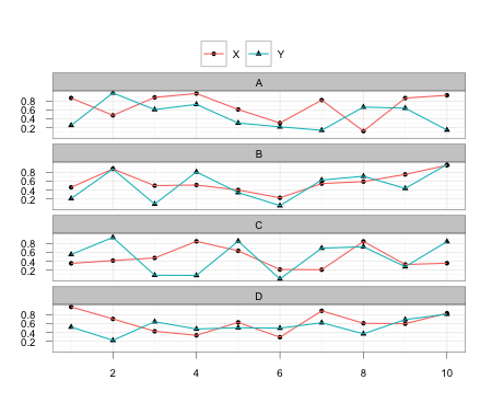
which yields a nice graph like:
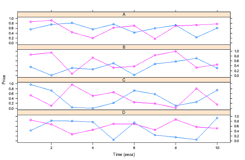
enter image description here

EDIT:

If you want to have different symbols and lines and have that show up in your legend, it gets complicated, because you literally build the legend yourself, and you have to know how to get the default lattice colors if you didn't override them yourself:

my.text <- levels (dat$var)
my.lty <- c(2, 3)
my.pch <- c(1, 2)
my.col <- trellis.par.get ("superpose.symbol")$col[1:2]
xyplot (y ~ x | graph, groups=var, data=dat, type="o", pch=my.pch, lty=my.lty,
        main="Main Title", layout=c(1, 4), as.table=T, xlab="Time (secs)", ylab="Price",
        key=list (columns=2, text=list (my.text), points=list (pch=my.pch, col=my.col)))
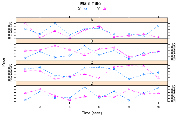
enter image description here

EDIT 2:

You can simplify the code and the graph, if the two categories really are as simple as "X" and "Y":

xyplot (y ~ x | graph, groups=var, data=dat, type="o", pch=c("X", "Y"), cex=1.25, lty=c(2, 3),
        layout=c(1, 4), as.table=T, xlab="Time (secs)", ylab="Price")

which will use "X" and "Y" as the point symbols. You don't need a legend at all, and can then devote even more space to the graphs themselves. (On the other hand, you might not like the look, or might find it harder to determine the exact center of the point, though that's not as much of an issue as it might be since the line goes through each point.)

EDIT 3:

Actually, you should add strip=F, strip.left=T, to the plot, to put the A, B, C, D, labels to the left of the graphs, which gives you more room on a long graph like this:

xyplot (y ~ x | graph, groups=var, data=dat, type="o", pch=my.pch, lty=my.lty,
        main="Main Title", layout=c(1, 4), as.table=T, xlab="Time (secs)", ylab="Price",
        strip.left=T, strip=F,
        key=list (columns=2, text=list (my.text), points=list (pch=my.pch, col=my.col),
        lines=list (lty=my.lty, col=my.col)))
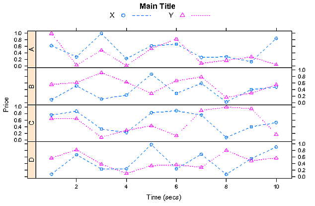
enter image description here

$\endgroup$
6
  • $\begingroup$ @Wayne: I am trying to keep a legend on top of the graph using auto.key with space="top", pch=c(1,2), lty=c(2,4) arguments, but the pch values and lty values are not working. Moreover, I would like to keep the X and Y as horizontal in the legend. Could you please help me for this. $\endgroup$
    – samarasa
    Commented Aug 19, 2011 at 21:53
  • $\begingroup$ Yes. I need to use different pch values to distingish X and Y on a paper. I am able to use different pch values in the plot by adding the argument pch(1,4) to xyplot, but it is not reflecting on legend. Please let me know how can I use different pch values for X and Y in the legend. $\endgroup$
    – samarasa
    Commented Aug 19, 2011 at 22:04
  • $\begingroup$ OK, I figured it out once I got home and consulted the book. Check out the edited version. $\endgroup$
    – Wayne
    Commented Aug 20, 2011 at 2:15
  • $\begingroup$ No problem. I think my EDIT 3 gives you the best graph that's similar to (but better looking and with more graphing space than) your original. I didn't move the legend, which I think is fairly straightforward. If you want to have the line go through the point in the legend, I think you'd have to take it to the next complexity level and do draw.key stuff that create custom grobs (a grid thing: lattice and ggplot2 build on grid). $\endgroup$
    – Wayne
    Commented Aug 20, 2011 at 20:08
  • $\begingroup$ Yep, now the graph is better. However, it would be really good if we get the point over the line in the legend like we get with normal plot function. $\endgroup$
    – samarasa
    Commented Aug 21, 2011 at 3:14
10
$\begingroup$

Here's a version of @Brandon's ggplot2 solution that incorporates the desired legend behavior:

dat <- data.frame (x=rep (1:10, 8), y=runif(80),
        var=factor (rep (c("X", "Y"), each=10)),
        graph=factor (rep (c("A", "B", "C", "D"), each=20)))

ggplot(data = dat,aes(x = x, y = y)) + 
    facet_wrap(~graph,nrow = 4) + 
    geom_point(aes(shape = var)) + 
    geom_line(aes(colour = var, group = var)) + 
    labs(x = NULL, y = NULL, shape = "", colour = "") + 
    theme_bw() + 
    opts(legend.position = "top", legend.direction = "horizontal")

enter image description here

I find legends to be far easier in ggplot2, but YMMV.

EDIT

Addressing a few questions in the comments. To specify particular point or line types, you would use scale_aesthetic_manual where aesthetic is either shape, linetype, etc. For instance:

ggplot(data = dat,aes(x = x, y = y)) + 
    facet_wrap(~graph,nrow = 4) + 
    geom_point(aes(shape = var)) + 
    geom_line(aes(colour = var, linetype = var, group = var)) + 
    labs(x = NULL, y = NULL, shape = "", colour = "", linetype = "") + 
    scale_shape_manual(values = 4:5) +
    theme_bw() + 
    opts(legend.position = "top", legend.direction = "horizontal")

Changing the size of various axis labels is done by changing settings in the theme, usually using opts(). For instance:

ggplot(data = dat,aes(x = x, y = y)) + 
    facet_wrap(~graph,nrow = 4) + 
    geom_point(aes(shape = var)) + 
    geom_line(aes(colour = var, linetype = var, group = var)) + 
    labs(x = "X Label", y = "Y Label", shape = "", colour = "", linetype = "") + 
    theme_bw() + 
    opts(legend.position = "top", legend.direction = "horizontal",
         axis.text.x = theme_text(size = 15),axis.title.y = theme_text(size = 25, angle = 90))

You should really dive into the website and his book for more information.

$\endgroup$
3
  • 2
    $\begingroup$ I often prefer ggplot2. In fact I made a quick try at with ggplot2 when lattice was getting too complex, and found that I couldn't quite get the legend to properly reflect the point/line styles if I wanted to choose shapes and line styles explicitly. I probably did it the wrong way, and it managed to work in the graph, but fooled ggplot's legend creation. Could you see if it works for you and post the code? $\endgroup$
    – Wayne
    Commented Aug 20, 2011 at 2:22
  • $\begingroup$ @Joran: I tried to figureout to change the linetypes and pointtypes, and colors, but no success. Could you let us know how can we change the linetypes, etc. And also please let us know how can we increase the size of x and y labs. $\endgroup$
    – samarasa
    Commented Aug 20, 2011 at 3:19
  • $\begingroup$ I'm on my phone at the moment; if @Brandon doesn't edit his answer before I get home with what you're looking for, I'll get to it later tonight. $\endgroup$
    – joran
    Commented Aug 20, 2011 at 3:33
8
$\begingroup$

Similar to Wayne's answer, I would also use a different package as well, namely ggplot2

library(ggplot2) 

df <- data.frame(
parameter=runif(300),
Time=1:300,
split=sample(c(1:4),300,replace=T),
split2=sample(c(1:2),300,replace=T)
)

ggplot(df, aes(Time, parameter, colour=as.factor(split2))) + 
geom_line() + 
facet_wrap(~split,nrow=4)

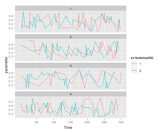
Which gives us a chart like:

enter image description here

$\endgroup$
5
  • 1
    $\begingroup$ I like the grids in ggplot, but is there a way to turn off the light-gray background? $\endgroup$
    – bluepole
    Commented Aug 19, 2011 at 21:41
  • 1
    $\begingroup$ + opts(panel.background=theme_blank()) $\endgroup$ Commented Aug 19, 2011 at 21:45
  • 1
    $\begingroup$ If you want to make other changes, you can type theme_get() to see what you can change. Then follow the same pattern as my last comment, setting them =theme_blank() $\endgroup$ Commented Aug 19, 2011 at 21:46
  • 2
    $\begingroup$ I was going to do ggplot2 myself, but thought perhaps lattice would be an easier step. Either one provides a structured way to stack graphs like this. Tweaking a lot of details might get hard, but getting something attractive and readable quickly is easy. (Though you do have to wrap your head around creating the right data frame from which to graph the data, instead of just throwing stuff into the graph. $\endgroup$
    – Wayne
    Commented Aug 19, 2011 at 21:47
  • $\begingroup$ I've found that Hadley has provided data manipulation tools in his other packages for massaging the data into the right shape. When in doubt the answer is usually, melt() $\endgroup$ Commented Aug 21, 2011 at 16:07

Your Answer

By clicking “Post Your Answer”, you agree to our terms of service and acknowledge you have read our privacy policy.

Not the answer you're looking for? Browse other questions tagged or ask your own question.