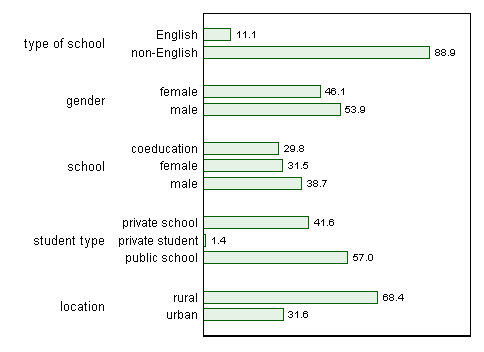
A bar chart will work fine, but is much better horizontal.

I've taken small liberties with what was presented, which will be explained and defended.
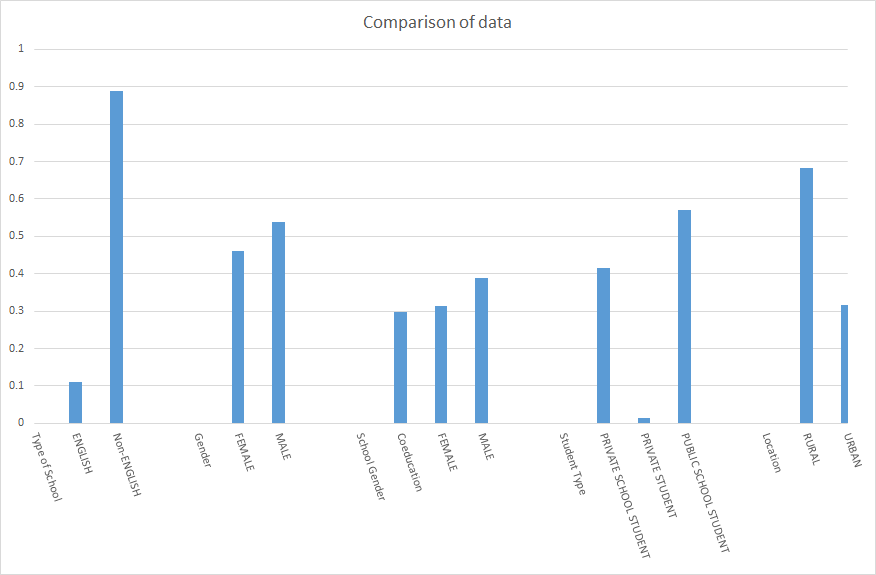
The major design choice is horizontal alignment, which permits text to run left to right, the easiest reading direction for most readers. The near vertical alignment in the answer by Dave is driven by the need to accommodate several labels and a horizontal axis.
I use lower case text in labels to the extent possible. "English" is best given with an initial capital to follow the usual conventions; otherwise lower case letters take less space and are easier to read (some even report the synaesthetic impression of SHOUTING on reading much upper case).
Percents are rounded to 1 decimal place. That's still 3 significant figures for all but one fraction reported (if any fraction was less than 1%, that might need rethinking).
I made small simplifications of wording.
The counts are suppressed. It's easy to put too much into a graph of this kind. Some people hate numbers on graphs, but to me hybrid graph-tables permit the best of both worlds. Given that, axis ticks and numeric labels can be suppressed too.
Note further
There is no stacking of bars. We don't need it here. A resultant feature is that we don't have to work hard to decode which fractions are bigger (or biggest). It's immediate that males are in a slight majority, all-male schools are the largest single category, and so forth.
I use a subdued colour. Solid blocks of heavy colour are hard on the eye and brain. I don't use several colours. The text labels show what is what: we don't need a raid on the elementary school paintbox. If printing colour were a constraint, light grey bars with black outline are essentially always possible.
Note that there is no legend, a common small evil in displays of this kind, which only obliges the conscientious reader to go back and forth to decode the display (and tempts the less conscientious reader not to engage with the display in any serious sense). Here, and often, we can lose the legend in favour of text labels by each bar.
There is a presumption that the researcher would add a figure caption or other text explaining place, time, data collection and definition details of importance, and so forth. The units could be emphasised as percent in the caption. Showing percent on the graph too would be perfectly defensible, and many would prefer it.
The outer text labels are perhaps superfluous. For example, given male and female as labels, gender adds nothing. Similarly, rural and urban don't need the gloss location. In context, which I don't know here, the distinction between English and non-English might also be clear to the reader. In a paper or presentation, there should always be explanations somewhere, unless categories are presumed self-evident. Equally, a graph should be self-contained as far as practicable and not rely on the reader recalling details that may have been given once and quickly, or are in tables or supplementary material not yet accessed.
A horizontal (Cleveland) dot chart would perform as well. In practice, very many audiences, including many lay groups, are familiar and comfortable with bar charts, and much less familiar with dot charts, which often gives the bar chart design a major edge.
For the record, I used Stata. Non-Stata users need not care, but they might be interested in seeing whether their own favourite software requires less or more code.
clear
input id str14 what str15 which count percent
1 "type of school" "English"     156497  11.11
1 "type of school" "non-English" 1252372 88.89
2 "gender" "female"  649465  46.10
2 "gender" "male"    759405  53.90
3 "school" "coeducation" 413422  29.78
3 "school" "female"      436883  31.47
3 "school" "male"        537754  38.74
4 "student type" "private school"  585947  41.57
4 "student type" "private student"         20107   1.43
4 "student type" "public school"   803471  57.00
5 "location" "rural"   962959  68.41
5 "location" "urban"   444769  31.59
end

labmask id, values(what)
graph hbar (asis) percent, over(which, gap(*0.5)) over(id) nofill bar(1, bfcolor(green*0.1)) blabel(total, format(%2.1f)) yla(none) ysc(r(0 100)) scheme(s1color)


