2
$\begingroup$

I am looking at the effects role has an opportunities to collaborate between groups in a social network. At a basic level the data are modeled as:

relRatio~role

With relative ratio being the percentage of teammates who are part of the subject's normal group. The data I have come from multiple time slices over the years, with some of the subjects being polled two or more times. Not every subject has multiple entries, nor does every subject with multiple entries have the same number of entries. From some advice I received it was suggested that I test the differences between groups using a random effect ANOVA model, which would be modeled (in R) as

relRatio~role+Error(subjectId)

After trying to read up more on random effects ANOVA, I started to get the impression that linear mixed effects models (with the lmer) package are preferred over random effects ANOVA, although I have yet to see a clear distinction between the two. This leads to my first question: Which approach is best for modeling my data?

If it involves using the random effects ANOVA, I would greatly appreciate it if someone could recommend a resource for the process of interpreting the results.

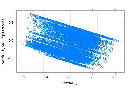
My second question is, if the better approach is to use the mixed effects models, which I have tried, why do I get striping in my residuals?
enter image description here

One guide suggested that I am dealing with categorical data, which requires the use of logistic regression. However, the dependent variable for my data is continuous, and the IV is categorical, which I thought LMM are supposed to handle. This leads to my second question - does my residual plot indicate something is wrong with the way I have modeled my data?

$\endgroup$
3
  • 1
    $\begingroup$ Stripes suggest rounding. For example, measures were rounded to the closest 10%. $\endgroup$ Commented Feb 23, 2015 at 23:10
  • 4
    $\begingroup$ This would make sense, as the DV is a converted fraction, with 95% or so of the original denominators ranging from 1-8. $\endgroup$
    – Mark C
    Commented Feb 24, 2015 at 1:26
  • 1
    $\begingroup$ Having a ratio as the DV is something I generally try very hard to avoid. You probably need some kind of GLMM. $\endgroup$
    – Roland
    Commented Feb 24, 2015 at 10:36

1 Answer 1

2
$\begingroup$

This answer focuses on the second question, generalized to Why do I get striping in my residuals? That question often arises in one form or another. The surprise people have on spotting such patterns is, one hopes, matched by the pleasure of understanding them when the reason is explained. The answer is generic to any plot of residuals versus fitted or predicted values, whenever the definition is the usual or default form

residual = observed $-$ fitted.

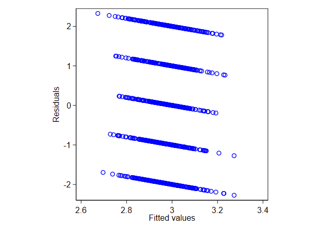
It follows easily from the definition that instances of each distinct value of the observed lie on a straight line with gradient $-1$, namely

residual = this observed value $-$ fitted,

as they have the same observed value but typically different fitted values given often different values on corresponding predictors.

If the observed values are all or mostly distinct, then that will still be true but not obvious as striping on a mere scatter plot. However, if

  1. Observed values are bounded sharply or nearly, limiting lines may be discernible either because data lie on but not beyond those lines or because a limit may be traced by eye. Simple examples are

(a) when observed values must be positive, or positive or zero, and the smallest values are zero, or at least close to zero;

(b) when values are proportions or percents in $[0, 1]$ or $[0, 100]$;

(c) with binary outcomes $0$ or $1$ (although in this case the effect does not usually cause surprise and it is widely known that better plots should be used).

  1. If there is a small set of distinct values, they will define a discernible set of parallel lines. Simple examples are

(d) counts, especially when most data are small counts;

(e) Likert-type ordinal scores fitted with a linear model.

Other definitions of residual don't all undermine this phenomenon, which may still be detectable in modified form.

The explanation should come with at least one graphical example. Here is a nonsense model in which scores $1$ to $5$ are from a discrete uniform and the model includes a predictor that is Gaussian noise. The pattern on the residual versus fitted plot is thus pure artefact.

enter image description here

For the record, here is the Stata code used, which could be matched by code in any other statistical or mathematical software:

clear 
set obs 1000 
set seed 314159265
set scheme s1color 

gen y = runiformint(1, 5)
gen x = rnormal()

regress y x 
rvfplot, ms(Oh) mc(blue) yla(, ang(h)) aspect(1)
$\endgroup$

Your Answer

By clicking “Post Your Answer”, you agree to our terms of service and acknowledge you have read our privacy policy.

Not the answer you're looking for? Browse other questions tagged or ask your own question.