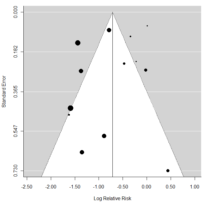
Lets say I want to take the usual funnel plot for meta-analysis, and add another dimension to it, visually changing the points used for each study by a covariate. While it might be easier to change the marker or color for categorical variables, for a continuous variable, this gets a little harder.
Lets say we want to see if there's obvious asymmetry not just overall, but by say, length of follow-up. Does anyone know a way in either R or Stata to either change the size of the points plotted - so you essentially have a funnel-bubble plot, or to color them on a continuous gradient?
Clearly, this can be done by just modifying a scatterplot, but I'd like to save the steps in manipulating the access to get it looking like a conventional funnel plot.

