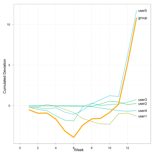
You might want to plot this as the cumulated deviation from the predicted values. Whether this makes sense depends on what the billing/analysis period is: If the group has to stay below a certain limit for each quarter, this would allow them to see whether they're on track for reaching that goal. If their account balance is reset to zero every week, however, this kind of graph would be less useful.

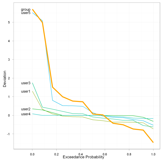
Alternatively, an exceedance curve might be useful. This sorts each user's weekly deviations by magnitude. It allows to assess how much of the time each user was above or below their target. In the chart below, you can see that although all users apart from user5 stayed below their limit more than 50% of the time, the group as a whole was above their limit almost 60% of the time.

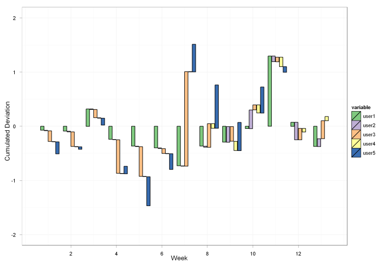
And for a completely different way of showing the data, a Waterfall Chart could be interesting for you. It shows the breakdown of the weekly values, but with five variables it already becomes quite cluttered:

Here's the R code for the charts.
Cumulative Deviation
    library(ggplot2)

    data <- cumsum(
        data.frame(
            user1 = c(-0.075, -0.09, 0.32, -0.242, -0.368, -0.401, -0.73, -0.367, -0.294, -0.043, 1.296, 0.075, -0.373),
            user2 = c(-0.009, -0.013, -0.01, -0.008, -0.008, -0.01, -0.005, -0.02, 0.287, 0.345, -0.104, -0.324, 0.144),
            user3 = c(-0.197, -0.271, -0.153, -0.621, -0.549, -0.09, 1.745, 0.436, -0.271, 0.093, 0.085, 0.211, 0.331),
            user4 = c(-0.005, -0.005, -0.006, -0.006, -0.006, -0.005, -0.006, -0.086, -0.171, -0.15, -0.175, -0.067, 0.078),
            user5 = c(-0.223, -0.048, -0.129, 0.14, -0.535, -0.29, 0.51, 0.801, 0.521, 0.482, -0.105, 5.082, 5.516),
            group = c(-0.509, -0.427, 0.022, -0.737, -1.466, -0.796, 1.514, 0.764, 0.072, 0.727, 0.997, 4.977, 5.696)
        )
    )

    data$week=c(1:13)

    molten <- melt(data,id.vars="week")

    p <- ggplot(molten, aes(x=week, y=value, colour=variable)) +
            geom_line(aes(group=variable)) +
            scale_colour_hue(h=c(100,250)) +
            geom_line(aes(y=molten$value[molten$variable=="group"]), colour="orange", size=1.5) +
            theme_bw() + opts(legend.position = "none") +
            geom_text(data=molten[molten$week==13,], aes(label=variable), colour="black", hjust=-0.2, size=4) +
            xlim(0,13.9) + xlab("Week") + ylab("Cumulated Deviation")
    print(p)
Exceedance Curve
library(ggplot2)

data <- data.frame(
        user1 = c(-0.075, -0.09, 0.32, -0.242, -0.368, -0.401, -0.73, -0.367, -0.294, -0.043, 1.296, 0.075, -0.373),
        user2 = c(-0.009, -0.013, -0.01, -0.008, -0.008, -0.01, -0.005, -0.02, 0.287, 0.345, -0.104, -0.324, 0.144),
        user3 = c(-0.197, -0.271, -0.153, -0.621, -0.549, -0.09, 1.745, 0.436, -0.271, 0.093, 0.085, 0.211, 0.331),
        user4 = c(-0.005, -0.005, -0.006, -0.006, -0.006, -0.005, -0.006, -0.086, -0.171, -0.15, -0.175, -0.067, 0.078),
        user5 = c(-0.223, -0.048, -0.129, 0.14, -0.535, -0.29, 0.51, 0.801, 0.521, 0.482, -0.105, 5.082, 5.516),
        group = c(-0.509, -0.427, 0.022, -0.737, -1.466, -0.796, 1.514, 0.764, 0.072, 0.727, 0.997, 4.977, 5.696)
)

data_sorted <- data.frame(apply(data,2,sort,decreasing=T))
data_sorted$exceedance_prob=c(0:12)/12


molten <- melt(data_sorted,id.vars="exceedance_prob")

p <- ggplot(molten, aes(x=exceedance_prob, y=value, colour=variable)) +
        geom_line(aes(group=variable)) +
        scale_colour_hue(h=c(100,250)) +
        geom_line(aes(y=molten$value[molten$variable=="group"]), colour="orange", size=1.5) +
        theme_bw() + opts(legend.position = "none") +
        geom_text(data=molten[molten$exceedance_prob==0,], aes(label=variable), colour="black", hjust=1.2, size=4) +
        xlim(-0.1,1) + xlab("Exceedance Probability") + ylab("Deviation")
print(p)
Exceedance Curve
library(ggplot2)

data <- data.frame(
                user1 = c(-0.075, -0.09, 0.32, -0.242, -0.368, -0.401, -0.73, -0.367, -0.294, -0.043, 1.296, 0.075, -0.373),
                user2 = c(-0.009, -0.013, -0.01, -0.008, -0.008, -0.01, -0.005, -0.02, 0.287, 0.345, -0.104, -0.324, 0.144),
                user3 = c(-0.197, -0.271, -0.153, -0.621, -0.549, -0.09, 1.745, 0.436, -0.271, 0.093, 0.085, 0.211, 0.331),
                user4 = c(-0.005, -0.005, -0.006, -0.006, -0.006, -0.005, -0.006, -0.086, -0.171, -0.15, -0.175, -0.067, 0.078),
                user5 = c(-0.223, -0.048, -0.129, 0.14, -0.535, -0.29, 0.51, 0.801, 0.521, 0.482, -0.105, 5.082, 5.516),
                group = c(-0.509, -0.427, 0.022, -0.737, -1.466, -0.796, 1.514, 0.764, 0.072, 0.727, 0.997, 4.977, 5.696)
        )

originaldata <- data
data <- data[,1:5]

lower<-as.data.frame(t(apply(data,1,"cumsum")))

data$week=c(1:13)
lower$week=c(1:13)


molten <- melt(data,id.vars="week")
moltenlower <- melt(lower,id.vars="week")
molten$lower <- moltenlower$value

p <- ggplot(molten, aes(x=week, y=value, fill=variable)) +
        geom_rect(aes(
            xmin=week+as.numeric(variable)/6-0.5,
            xmax=week+as.numeric(variable)/6-0.35,
            ymin=lower,
            ymax=lower-value,
            group=variable),
            colour="black") +
        scale_fill_brewer()+
        theme_bw() +
        xlim(0.5,13.5) + xlab("Week") + ylab("Cumulated Deviation") + ylim(-2,2)

print(p)

