I know this is similar to this question, but that one didn't seem to get a satisfactory answer.
I'm using plink to run a GWAS. My phenotype data are binary, so it's performing a logistic regression for each genetic variant. I'm checking the data by looking at QQ plots of the p-values, with the expectation that they will mostly conform to a uniform distribution with a small excess of significant values at the end.
I also have other data that I want to use as covariates in the logistic regression. This includes which batch the samples were run in, the first few principal components from a PCA analysis (in order to control for population stratification), and phenotype data like age and sex.
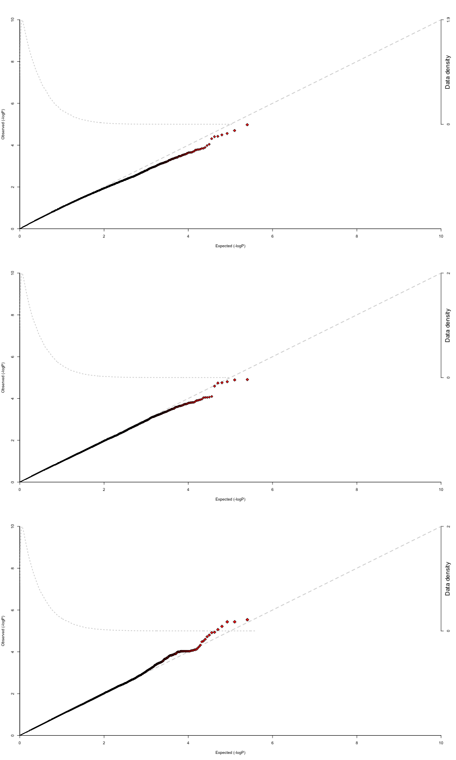
When I use no covariates in the regression, I get results that conform fairly well to the uniform distribution (there are three phenotypes I'm testing separately, which is why there are three plots).
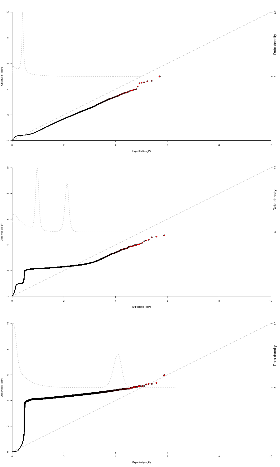
However, once I include covariates, the QQ plots get pretty weird. Here are the QQ plots for the regressions run with the batch as a covariate.
And I get similarly-shaped results (though not necessarily this extreme) for any covariates that I use.
All these covariates are commonly included in similar studies. Even if they didn't help, I don't understand why they are making things worse. It's especially confusing that all of them make the plots worse because this suggests that there is some sort of systematic problem that's bigger than the specifics of each covariate.
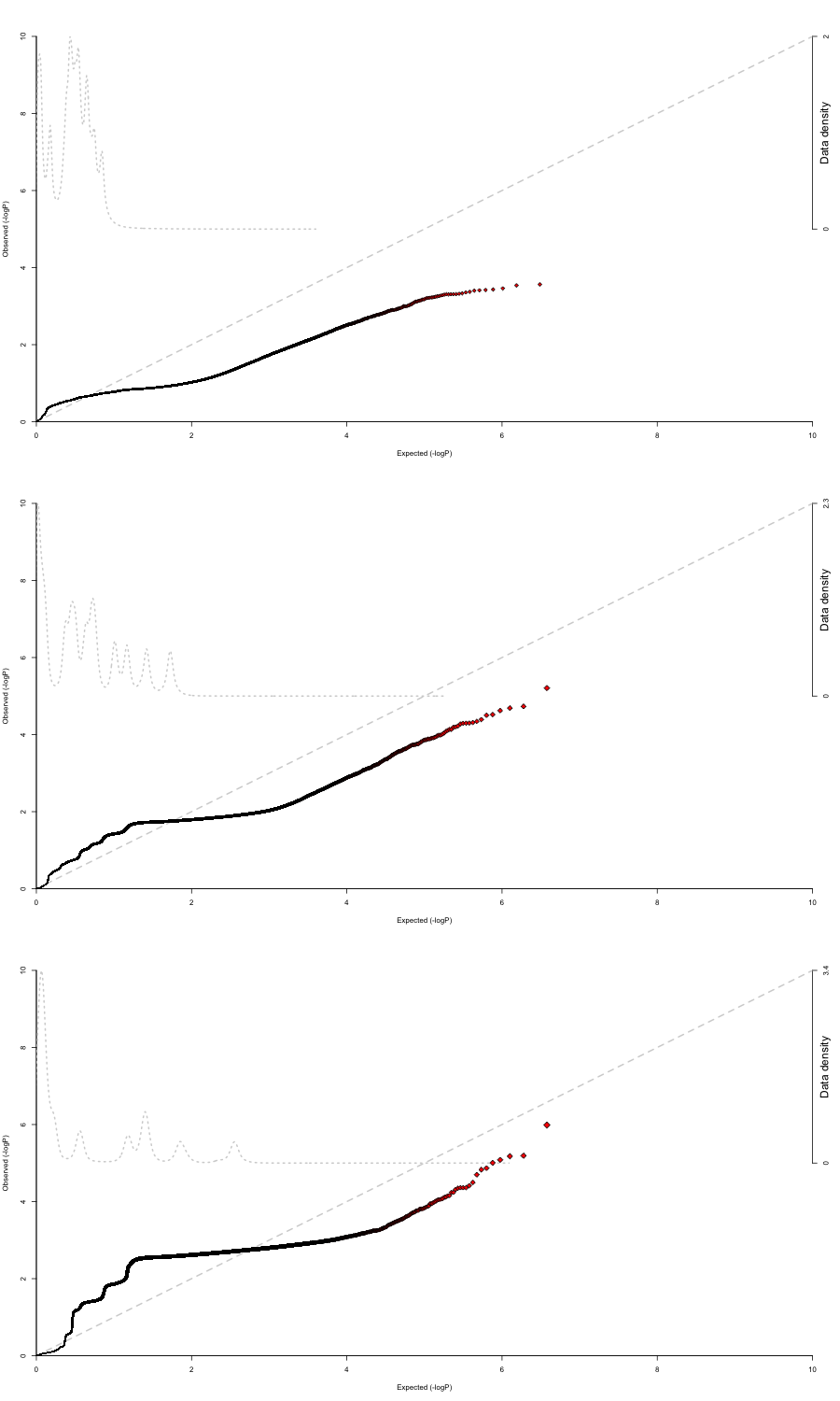
Edit: I thought that perhaps multiple covariates working together would solve the problem, but running it using all the covariates produces this slightly different but equally strange QQ plot. It almost looks like it's quantized.


