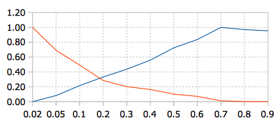
I'm trying to understand a tradeoff that came up to me when I'm studying an algorithm used to distribute a load in a distributed system. The tradeoff involves network communication and make span.
More general, I have two measured features (Cost and Network usage) in function of a parameter (P), with the following values:
P          Cost     Network  Norm.Cost  Norm. Network
0.02     165861   120475244       0.00           1.00
0.05     370734   111585613       0.08           0.69
0.1      700087   105874552       0.22           0.49
0.2      988711    99895161       0.33           0.29
0.3     1245062    97533787       0.44           0.20
0.4     1549184    96407051       0.56           0.16
0.5     1957080    94602881       0.72           0.10
0.6     2233933    93743271       0.84           0.07
0.7     2637193    92035416       1.00           0.01
0.8     2563590    91746277       0.97           0.00
0.9     2523726    91680622       0.95           0.00
The plot of normalised values is:
In my scenario, choosing P depends on the limit of network bandwidth and the cost that can be take. However, there is a general theory about that cross point? What it indicates? It is statistically correct (and commonly used) to show this chart or there is a better way?

