6
$\begingroup$

I am learning logistic regression modeling from the book Applied Logistic Regression by Hosmer.

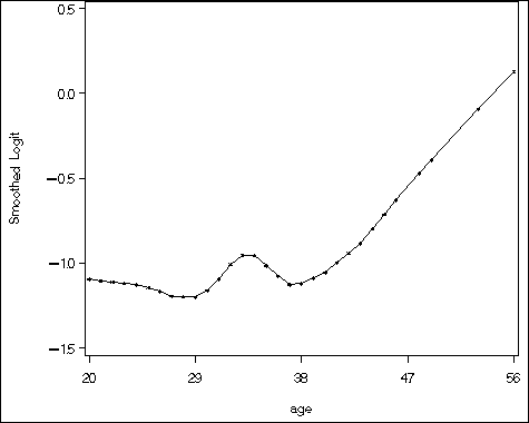
I need to create a plot named "create univariable smoothed scatterplot on logit scale", something like this one (Figure 4.2 page 107): enter image description here
Can anyone help? Thanks.

edit 01

Thanks for all the answers. I tried creating the plot, and discover that smooth.spline created the graph by using percentage (nrow((df[df[,"dfree"]==1,]))/nrow(df)), rather than logit (log(nrow(df[df[,"dfree"]==1,])/nrow(df[df[,"dfree"]==0,]))) when creating the y-axis. Yes, the graph looks similar, but I wonder if we can create an exact copy of that? Thanks.

One more thing, when using logit, some of the logit value in the data.frame is -Inf and Inf, which is not allowed in smooth.spline.

edit 02

I have further question concerning my edit: What if I manually dropped all Inf and -Inf in my data.frame and do smooth.spline on that data.frame? Is it appropriate?

$\endgroup$
1
  • 1
    $\begingroup$ Note that the caption to the original figure is "Univariable lowess smoothed logit versus AGE." This indicates it is a lowess smooth of the binary response data re-expressed on a logit scale. The purpose, as stated in the text, is to evaluate whether a model that is linear in the logit of AGE makes sense. Based on the linearity from ages 40-56, and the very rough linearity for all ages, the conclusion is that linearity is reasonable. $\endgroup$
    – whuber
    Commented Jan 11, 2012 at 19:26

3 Answers 3

7
$\begingroup$

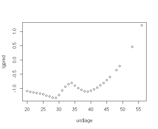
You can find the H&L ALR on the web. I believe what L&H are doing is simply fitting a loess to the dfree ~ age relationship and then transforming the expected probabilities to logits. See below.

uis<-read.delim("http://www.umass.edu/statdata/statdata/data/uis.dat",                  
                skip=4, sep="", header=FALSE) 
names(uis)<-c("id","age","beck","ivhx","ndrugx","race","reat","site","dfree")  
lfit<-loess(uis$dfree~uis$age) 
lgpred<-log(predict(lfit)/(1-predict(lfit))) 
plot(lgpred~uis$age)

enter image description here

As @Momo said, from there you can play around withe the smoothing parameter to get a better reproduction.

$\endgroup$
1
  • $\begingroup$ I think this is pretty much it. The discrepancy for values > 36 might be algorithmic, but maybe loess() can be adjusted to produce predictions between -0.5 and 0.5 (as in the SAS plot) instead of -0.5 and 1.5 (as in the R plot) (all values just roughly inferred from the plots). $\endgroup$
    – Momo
    Commented Jan 11, 2012 at 20:05
4
$\begingroup$

It didn't happen in this example, but you have to watch that the loess model doesn't get carried away and produce 'smoothed' probabilities that lie outside of (0,1). Following the example from Brett

lprob <- predict(lfit)
lprob <- apply(cbind(lprob, 0.01), MARGIN=1, FUN=max)
lprob <- apply(cbind(lprob, 0.99), MARGIN=1, FUN=min)

As a newbie working through Hosmer and Lemeshow, I found it interesting to plot the loess fit (as a probability) against age -- you get a good idea how it is forming a 'weighted average' between the unsmoothed 0's and 1's as age increases.

By the way to get pretty close to the graph H+L made, try

lfit <- loess(uis$dfree ~ uis$age, span=.6, degree=1)
$\endgroup$
4
$\begingroup$

The key here is that the logit is plotted on the y axis. When you're running a logistic regression, typically your data are a column of 1's and 0's. When values only occur at a limited number of discrete x values, they can be 'grouped', or turned into percentages. Lets assume that your data are in percentages. The logit transformation is:

$$l=\ln\left(\frac{p}{1-p}\right)$$

where $l$ is the logit, $p$ is the percentage and $\ln$ (obviously) is the natural log. Given these values, the plot could be created in R with plot(lowess(logit~age)).

If your data are not grouped (or group-able), then this would not work. (For example, the natural log of $0$ is -Inf. and $1/0$ is undefined. In such a case, you might fit a lowess to your untransformed $y$ first (which would yield predicted probabilities) and assign the lowess fit to a variable. Then the variable can be transformed, as above, and plotted.

$\endgroup$

Your Answer

By clicking “Post Your Answer”, you agree to our terms of service and acknowledge you have read our privacy policy.

Not the answer you're looking for? Browse other questions tagged or ask your own question.