2
$\begingroup$

Given that i have the following data.

enter image description here

if i was to choose the best player based strictly on percentage of missed shots without knowing the total number of shots taken and total number of misses then i would pick player C OR D. However with the given data set i want to present this to someone in the best visual way possible to make them understand that look player A might have missed 13% of his shots but he took a LOT more shots than player C OR D. The best way to visually represent this i thought was using a stacked bar graph but is there better ways to graph or visually present this data?Also are there other statistical tests i should be doing? Appreciate all answers.

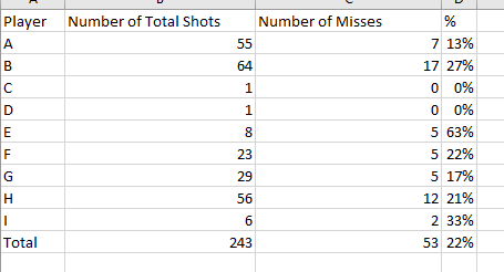
$\endgroup$
2
  • $\begingroup$ 1. remove inactive players (c,d,e,i). 2. Plot percentages of remaining players. $\endgroup$
    – vadim123
    Commented Aug 24, 2016 at 15:15
  • $\begingroup$ @vadim123 yeah i think, assume that we don't know who is active or inactive. I am sorry i should have mentioned all that. $\endgroup$
    – user2733436
    Commented Aug 24, 2016 at 15:20

1 Answer 1

2
$\begingroup$

I think a stacked bar graph with total shots on the y axis will do just fine. You can include the percentage of misses (or the percentage of hits) near the bar for each player. Your data are in Excel; it will draw the chart for you easily.

For this small number of players you are presenting all the data, so you don't need any fancy statistical tools.

$\endgroup$

Your Answer

By clicking “Post Your Answer”, you agree to our terms of service and acknowledge you have read our privacy policy.

Not the answer you're looking for? Browse other questions tagged or ask your own question.