It doesn't matter which values go with which axes, provided you clearly label them. (Both forms are in common use.)
The "sample probability" is badly named, because it is a relative frequency; namely, the relative frequency of any possible value $k$ in a sample $(x_1, x_2, \ldots, x_n)$ is $1/n$ times the number of $x_i$ equal to $k.$ The sample frequencies in the example in the question can be computed in R with a formula like table(x) / length(x). Let's call these relative frequencies $\hat f(k).$
The "model probability" is not well named either. It is an estimate of the chance of $x,$ assuming the sample is a sequence of $n$ independent realizations of a random variable. But in this case there at least is a probability model in evidence: the Poisson family of distributions. A good (but not the only) estimate of the Poisson parameter is the mean of the data, $\bar x.$ The Poisson family is defined so that when the parameter equals $\bar x,$ the probability of $k$ when $k$ is among the natural numbers $0, 1, 2, \ldots$ is given by
$$\Pr(k) = e^{-\bar x} \frac{\bar x^k}{k!}.$$
This gives two distribution functions. The value of the empirical distribution function $\hat F$ for any number $k$ (whether a natural number or not) is the chance a randomly chosen data value will not exceed $k.$ Evidently
$$\hat F(k) = \sum_{x\mid x \le k} \hat f(x).$$
It is the proportion of data values less than or equal to $k.$
The second distribution is that of the estimated Poisson distribution,
$$\tilde F(k) = \sum_{x=0}^k \Pr(k)$$
The PP plot consists of all the distinct ordered pairs $(\tilde F(k), \hat F(k))$ as $k$ ranges over all the values of the data.
When the data frequencies are similar to the frequencies of this estimated distribution, these pairs will thereby all come close to the line $y=x.$ Deviations from that line indicate deviations between the data distribution and the fitted ("model") distribution. With a little practice, at a glance you can tell whether the fit is good or not.
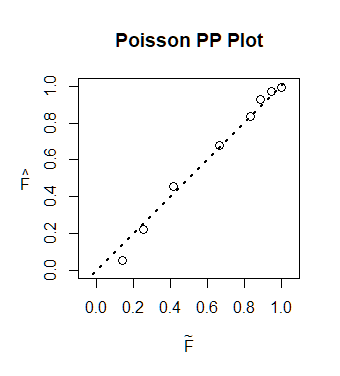
Here is a full R implementation and its output.
lambda.hat <- mean(x)
F.hat <- cumsum(table(x) / length(x))
p.hat <- ppois(as.numeric(names(F.hat)), lambda.hat)
plot(F.hat, p.hat, xlim = 0:1, ylim = 0:1, asp = 1)

The set of ordered pairs is implicit in the two arrays F.hat and p.hat. Here they are stacked to show the pairs in the columns:
          0    1    2    3    4    5    6    7
F.hat 0.140 0.25 0.42 0.67 0.83 0.89 0.94 1.00
p.hat 0.057 0.22 0.46 0.68 0.84 0.93 0.97 0.99
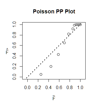
To appreciate what a PP plot can do, here is the output for a dataset of the same size and a similar mean generated with a geometric distribution rather than a Poisson distribution:

It is immediately obvious the points do not come close to the reference line. Comparing the point heights to the reference line shows that $\hat F$ (the empirical distribution describing the data) is too small for small values (at the left) and too large for large values (at the right). In other words, the data have too many extremely large values for their average.


