43
$\begingroup$

I am looking for guidelines on how to interpret residual plots of glm models. Especially poisson, negative binomial, binomial models. What can we expect from these plots when the models are "correct"? (for example, we expect the variance to grow as the predicted value increases, for when dealing with a Poisson model)

I know the answers depend on the models. Any references (or general points to consider) will be helpful/appreciated.

$\endgroup$

4 Answers 4

19
$\begingroup$

I think this is one of the most challenging parts when doing regression analysis. I also struggle with most of the interpretations (in particular binomial diagnostics are crazy!).

I just stumbled on this post http://www.r-bloggers.com/model-validation-interpreting-residual-plots/ who also linked https://web.archive.org/web/20100202230711/http://statmaster.sdu.dk/courses/st111/module04/module.pdf

what helps me the most is to plot the residuals versus every predictive parameter included AND not included into the model. This means also the ones who were dropped beforehand for to multicolinearity reasons. For this boxplots, conditional scatterplots and normal scatterplots are great. this helps to spot possible errors

In "Forest Analytics with R" (UseR Series) are some good explanations how to interpret residuals for mixed effects models (and glms as well). Good read! https://www.springer.com/gp/book/9781441977618

Someday ago I thought about a website that could collect residual patterns which users can vote to be "ok" and to be "not ok". but I never found that website ;)

$\endgroup$
13
$\begingroup$

I would suggest the methods described in:

 Buja, A., Cook, D. Hofmann, H., Lawrence, M. Lee, E.-K., Swayne,
 D.F and Wickham, H. (2009) Statistical Inference for exploratory
 data analysis and model diagnostics Phil. Trans. R. Soc. A 2009
 367, 4361-4383 doi: 10.1098/rsta.2009.0120

There are a few different ideas, but they mostly come down to simulating data where you know what the true relationship is and that relationship is based on your analysis of the real data. Then you compare the diagnostics from your real data to the diagnostics of the simulated data sets. The vis.test function in the TeachingDemos package for R implements a variation of 1 of the suggestions in the paper. Read the whole paper (not just my very short summarization) for a better understanding.

$\endgroup$
2
  • $\begingroup$ I think that is a fine suggestion to seeing patterns that deviate from random in scatter or other plots, but that isn't the only goal when viewing residuals. Frequently we are interested in particular deviations from random (e.g. hetereoscedasticity, misspecified non-linearity in model, omitted variables, outliers or high leverage values, etc.). Comparisons to randomly generated data don't really help any in identifying why the residuals are not random nor the remedy. $\endgroup$
    – Andy W
    Commented Aug 31, 2012 at 18:26
  • $\begingroup$ @AndyW, I think that we are interpreting the original question differently. My answer gets the researcher started by letting them know if there is something more that they need to look for, or if the residual plot is reasonable. What to do if it does not look reasonable is then the next step and beyond my answer (though some additional assumptions could be compared using a new set of simulations). $\endgroup$
    – Greg Snow
    Commented Aug 31, 2012 at 18:55
10
$\begingroup$

This question is quite old, but I thought it would be useful to add that, since recently, you can use the DHARMa R package to transform the residuals of any GL(M)M into a standardized space. Once this is done, you can visually assess / test residual problems such as deviations from the distribution, residual dependency on a predictor, heteroskedasticity or autocorrelation in the normal way. See the package vignette for worked-through examples, also other questions on CV here and here.

$\endgroup$
0
$\begingroup$

For decades, the standard diagnostic plots provided by plot.lm included a normal QQ-plot, which likely—at least in part—prompted this question.

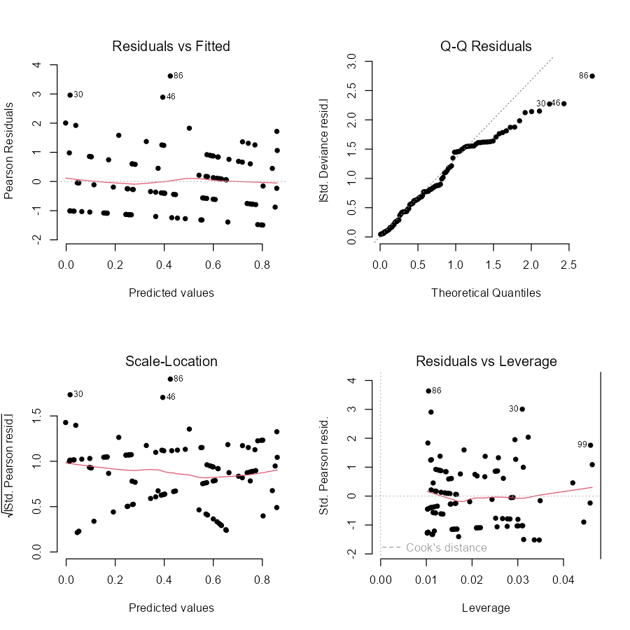
Interestingly, as of R version 4.3.0 (released Apil 2023), plot.lm has been updated for GLMs:

The plot.lm() function no longer produces a normal Q-Q plot for GLMs. Instead it plots a half-normal Q-Q plot of the absolute value of the standardized deviance residuals.

Now, if you use plot on a model fit with glm, it returns the following four plots:

set.seed(2024)
n <- 100
x <- runif(n)
y <- rpois(n, exp(x))
DF <- data.frame(x, y)
GLM <- glm(y ~ x, family = "poisson", data = DF)
par(mfrow = c(2, 2))
plot(GLM)
par(mfrow = c(1, 1))
plot.glm

As you can see, this is still not great, as the model's assumptions perfectly hold, and yet a pattern appears in the QQ-plot... However, it might be useful to know that what appears in many videos, lecture slides, textbooks, and other places on this website, is now outdated.

I am a big fan of @FlorianHartig's package (+1) and recommend any future readers to use that. For non-R users, the package is based on randomized quantile residuals, which is fairly easy to implement and only requires you have a function for the cumulative distribution function and the quantile function.


Dunn, P. K., & Smyth, G. K. (1996). Randomized Quantile Residuals. Journal of Computational and Graphical Statistics, 5(3), 236–244. https://doi.org/10.1080/10618600.1996.10474708

$\endgroup$

Your Answer

By clicking “Post Your Answer”, you agree to our terms of service and acknowledge you have read our privacy policy.

Not the answer you're looking for? Browse other questions tagged or ask your own question.