What you could do is use the residual shading ideas from vcd here in combination with sparse matrix visualisation as for example on page 49 of this book chapter. Imagine the latter plot with residual shadings and you get the idea.
The sparse matrix/contigency table would normally contain the number of occurences of each drug with each adverse effect. With the residual shading idea however you can set up a baseline log linear model (e.g. an independence model or whatever else you like) and use the color scheme to find out which drugs/effect combination occurs more often/ less often than the model would predict. Since you have many observations, you could use a very fine color thresholding and get a map that looks similar to how microarrays in cluster analysis are often visualised e.g. here (but probably with stronger color "gradients"). Or you could build the thresholds such that only if the differences of observations to predictions exceeds the threshold than it gets colored and the rest will remain white. How exactly you would do this (e.g. which model to use or which thresholds) depends on your questions.
Edit
So here's how I would do it (given I'd have enough RAM available...)
- Create a sparse matrix of the desired dimensions (drug names x effects)
- Calculate the residuals from the independence loglinear model
- Use a color gradient in fine resolution from the min to the maximum of the residual (e.g. with a hsv colorspace)
- Insert the according color value of the residuals magnitude at the according position in the sparse matrix
- Plot the matrix with an image plot.
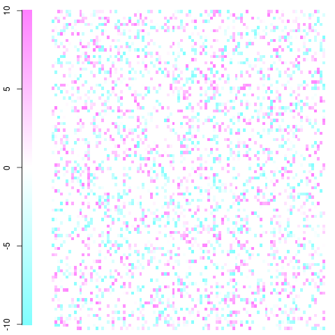
You then end up with something like this (of course you picture will be much larger and there will be a much lower pixel size but you should get the idea. With clever usage of color you can visualize the associations/departures from independence you are most interested in).
A quick and dirty example with a 100x100 matrix. This is just a toy example with residuals ranging from -10 to 10 as you can see in the legend. White is zero, blue is less frequent than expected, red is more frequent than expected. You should be able to get the idea and take it from there. Edit: I fixed the plot's set up and used non-violent colors.

This was done using the image function and cm.colors() in the following function:
ImagePlot <- function(x, ...){
 min <- min(x)
 max <- max(x)
 layout(matrix(data=c(1,2), nrow=1, ncol=2), widths=c(1,7), heights=c(1,1))

 ColorLevels <- cm.colors(255)

 # Color Scale
 par(mar = c(1,2.2,1,1))
 image(1, seq(min,max,length=255),
  matrix(data=seq(min,max,length=255), ncol=length(ColorLevels),nrow=1),
  col=ColorLevels,
  xlab="",ylab="",
  xaxt="n")


 # Data Map
 par(mar = c(0.5,1,1,1))
 image(1:dim(x)[1], 1:dim(x)[2], t(x), col=ColorLevels, xlab="",
 ylab="", axes=FALSE, zlim=c(min,max))

layout(1)
}

#100x100 example
x <- c(seq(-10,10,length=255),rep(0,600))
mat <- matrix(sample(x,10000,replace=TRUE),nrow=100,ncol=100)
ImagePlot(mat)
using ideas from here http://www.phaget4.org/R/image_matrix.html. If your matrix is so big that the image function gets slow, use the useRaster=TRUE argument (you might also want to use sparse Matrix objects; note that there should be an image method if you want to use the code from above, see the sparseM package.)
If you do this, some clever ordering of the rows/columns might become handy, which you can calculate with the arules package (check page 17 and 18 or so). I would generally recommend the arules utilities for this type of data and problem (not only visualisation but also to find patterns). There you will also find measures of association between the levels that you could use instead of the residual shading.
You might also want to look at tableplots of you want to investigate only a couple of adverse effects later.

