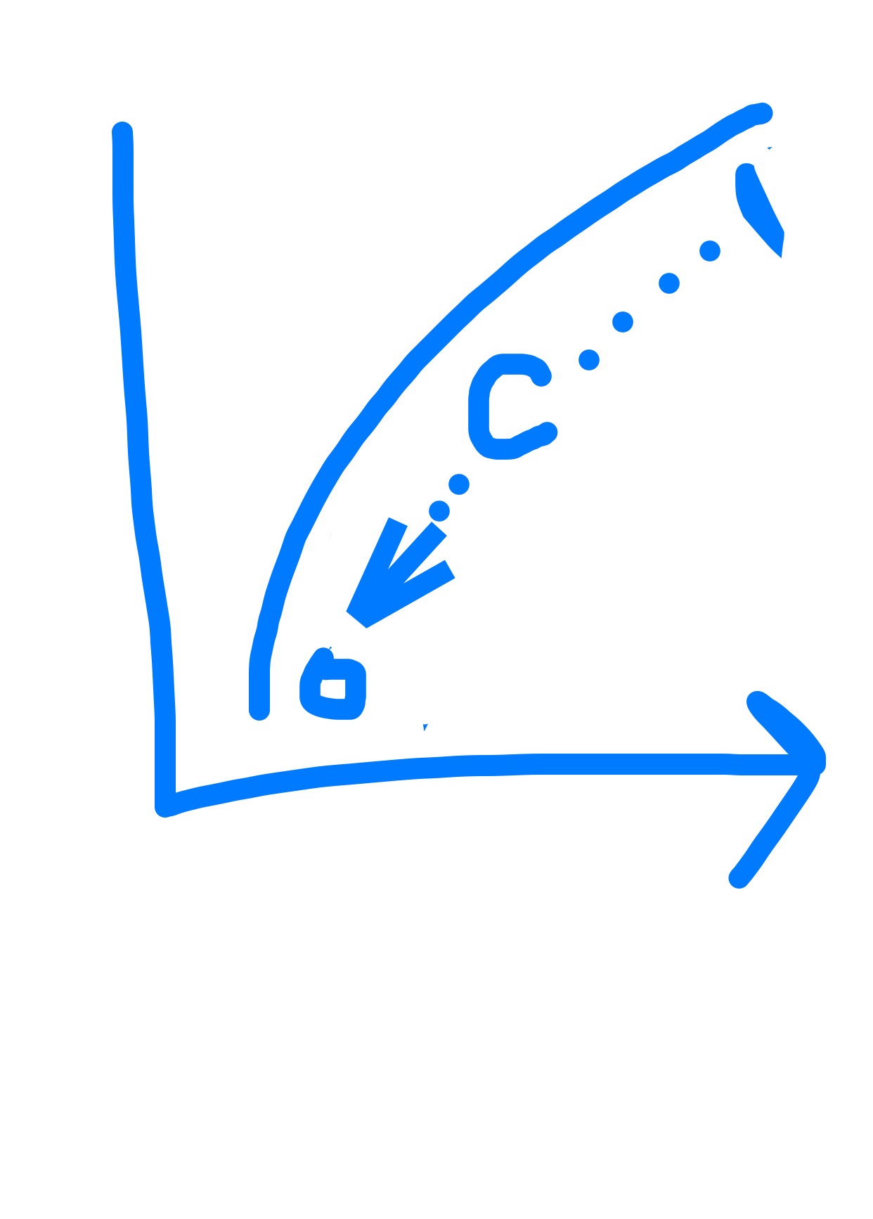
When you use a classifier model, the model outputs probabilities that the positive result will occur. You must then set a threshold to obtain classifications. A ROC curve is the plot of the True Positive Rate on the Y-axis and the False Postive Rate on the Y axis plotted at a range of thresholds between 0 and 1.
https://en.wikipedia.org/wiki/Receiver_operating_characteristic
Here's some code I wrote in python to plot ROC curves:
(it also prints a bunch of stuff you may or may not find useful)
import matplotlib.pyplot as plt
def regressor_to_classifier(predictions, threshold = 0.5):
    output = []
    for prediction in predictions:
        if prediction > threshold:
            output.append(1)
        else:
            output.append(0)
    return output

def confusion_matrix(true, predictions):
    TP = 0
    FP = 0
    TN = 0
    FN = 0
    for t, p in zip(true, predictions):
        if t == 1 and p == 1:
            TP += 1
        elif t == 0 and p == 1:
            FP += 1
        elif t == 1 and p == 0:
            FN += 1
        else:
            TN += 1
    print("TP = {}\nFP = {}\nTN = {}\nFN = {}".format(TP, FP, TN, FN))
    print("Precision = {}".format(str(TP / (TP + FP))))
    print("Recall = {}".format(str(TP / (FN + TP))))
    return TP, FP, TN, FN

def roc_curve(true, float_predictions):
    x = []
    y = []
    for i in range(100):
        threshold = 0.01 * i
        bool_predictions = regressor_to_classifier(float_predictions, threshold)
        print("Threshold = {}".format(threshold))
        TP, FP, TN, FN = confusion_matrix(true, bool_predictions)
        TPR = TP / (TP + FN)
        FPR = FP / (FP + TN)
        x.append(FPR)
        y.append(TPR)
    plt.plot(x, y)
    plt.xlabel("False Positive Rate")
    plt.ylabel("True Positive Rate")
    plt.title("ROC Curve")
    plt.show()

