0
$\begingroup$

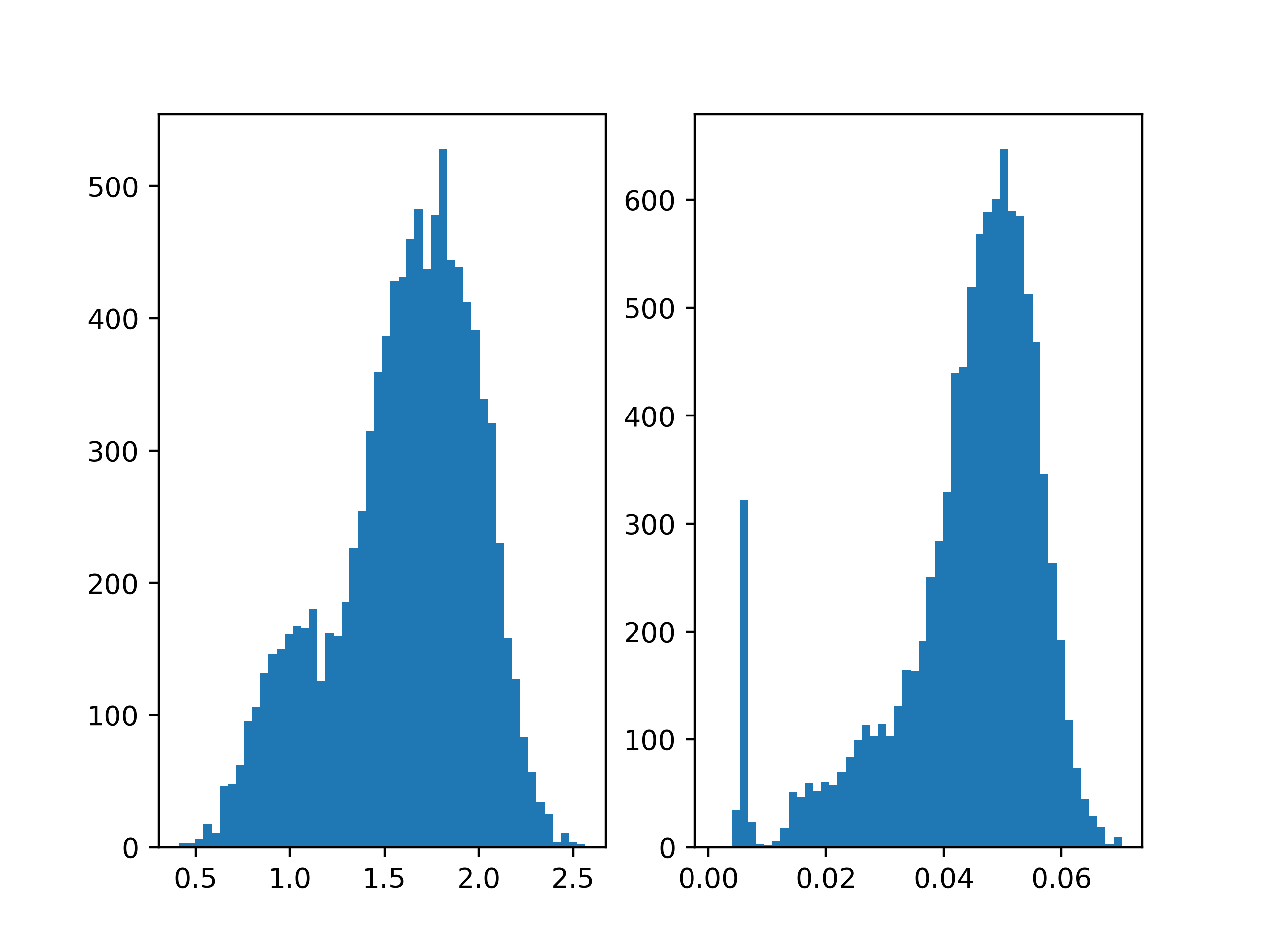
I want to compare the distributions of different data sets. Here is an example of two distributions I want to compare:

enter image description here

In my case, for example, a "good" distribution is defined by the fact that it drops quickly on the right.

Which tools can I use to detect the "best" distribution in my data set?

$\endgroup$
6
  • 2
    $\begingroup$ It's hard to believe that comparison makes sense at all. On the right, values don't seem to go above 0.07. On the left, values seem to go from 0.4 to 2.5. The modes vary by a factor of about 1.8/0.05 = 36. Given those facts whether distributions drop quickly on the right seems a secondary detail. $\endgroup$
    – Nick Cox
    Commented Oct 22, 2018 at 17:36
  • $\begingroup$ @NickCox That is right. But I am really interested in the shape of the distribution. So I would like to compare the shapes of distributions and want to be able to rate non-symmetric distributions higher than symmetric distributions. Any ideas? $\endgroup$
    – Gilfoyle
    Commented Oct 22, 2018 at 17:49
  • 3
    $\begingroup$ There are many ways to approach this as it is still an open and puzzling question. Perhaps skewness will help. Perhaps you need something ad hoc but customised such as the difference or the ratio between the 99% and 90% percentiles. The maximum may, unusually, be quite stable. $\endgroup$
    – Nick Cox
    Commented Oct 22, 2018 at 18:00
  • $\begingroup$ Can you give some context? It is not possible for a good answer without context. $\endgroup$ Commented Nov 10, 2019 at 12:41
  • $\begingroup$ @kjetilbhalvorsen In my specific case, a distribution that peaks on the far left side (at zero) of the distribution is better than a more uniform distribution. In case of a grayscale image that is mostly black and therefore peaks in the region of zero is "better" compared to a noisy image. $\endgroup$
    – Gilfoyle
    Commented Nov 10, 2019 at 15:30

1 Answer 1

1
$\begingroup$

Distributions are not usually classified as "good" or "bad." Data is what it is.

As for your question: Generally, if you want to compare the "tails" of two distributions, a good starting point is the kurtosis statistic. This only works if you are comparing two similar samples -- this is NOT the case in your data.

Using the kurtosis statistic in this comparison would require some modification of your data (especially removing observations), which is generally not advised. Note: the data on the left appears to be bi-modal (there is definitely two sub-populations here), whereas the data on the right appears to have a lot of outliers on the left. The kurtosis statistic for the distribution on the right plot would prove to be quite useless, as it would essentially capture the fact that you have outliers on the left.

Your best bet here, if you really wish to continue with the comparison, would be to compare the quantiles, say the range between the 90% quantile and the 99% quantile as a measure of "falling off more quickly on the right." The choice of quantiles would be quite arbitrary, but it will get the point across.

$\endgroup$

Not the answer you're looking for? Browse other questions tagged or ask your own question.