-1
$\begingroup$

I have a data set with one row per subject. Some variables include laboratory parameters for blood chemistry, hematology, etc. I also have some flag variables: any = 1 if the subject experienced an adverse event, 0 if not; and ser_flag = 1 if the subject experienced a serious adverse event, 0 if not.

There doesn't seem to be any difference in the distribution of laboratory parameters between subjects who experienced an adverse event (any=1) and subjects who did not (any = 0). When I do a pair plot of all the lab parameters against each other and color by the any flag, there doesn't seem to be any clustering or separation of subjects.

However, when I do the same pair plot and color by ser_flag - I notice that the 20 subjects (out of roughly 2000) who experienced a serious adverse events seem to be clustered together in many of the plots.

What test (if any) can I use to determine if these clusters I think I am seeing are occurring randomly, by chance...or if they are statistically significant?

$\endgroup$
3
  • 2
    $\begingroup$ Please specify what you mean by "clusters are statistically significant". For example, with respect to which null hypothesis? $\endgroup$
    – Momo
    Commented Oct 28, 2018 at 17:29
  • 2
    $\begingroup$ You cannot make any progress on this until you can elevate your definition of "clustered" from a psychological phenomenon ("I notice that") to a quantitative characteristic of the data. Could you provide a clear, detailed description of what a "cluster" is in you mind? $\endgroup$
    – whuber
    Commented Oct 28, 2018 at 17:46
  • $\begingroup$ This can be done with Hopkins Test $\endgroup$ Commented Oct 30, 2018 at 1:31

1 Answer 1

0
$\begingroup$

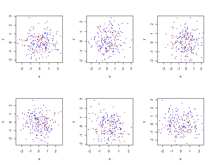
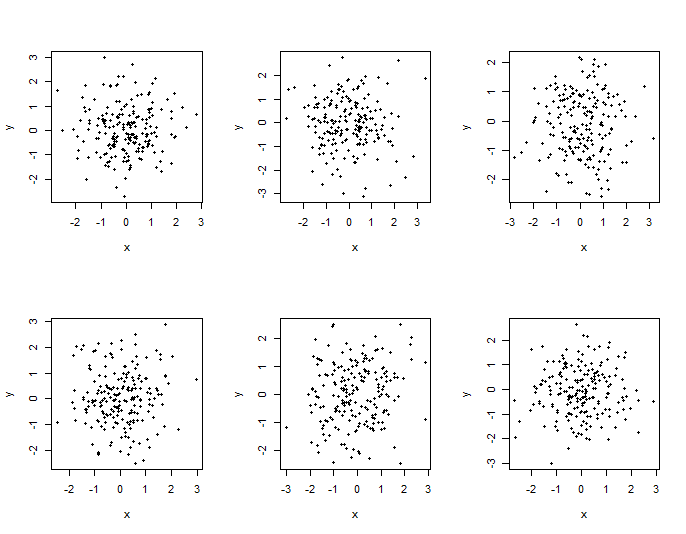
Comment: Do you see what you would call "clusters" in any of the six plots below?

enter image description here

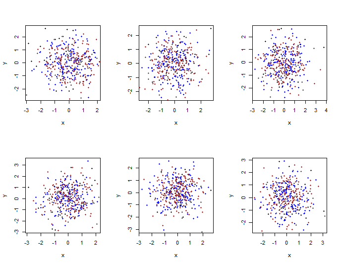
Each is a sample of 200 observations from a bivariate normal distribution. Any clusters are artifacts of random sampling.

Addendum as requested: (100 blue, 100 brown)

enter image description here

200 of each color in each plot:

enter image description here

$\endgroup$
2
  • $\begingroup$ Now what if we add a third variable to the plot, for example ser_ae (which takes value of 1 or 0) and have that be represented with color, and we notice that those with ser=1 are all lumped together (in different places) in every graph $\endgroup$ Commented Oct 28, 2018 at 23:59
  • $\begingroup$ Addendum with colors, just posted. $\endgroup$
    – BruceET
    Commented Oct 29, 2018 at 0:06

Your Answer

By clicking “Post Your Answer”, you agree to our terms of service and acknowledge you have read our privacy policy.