1
$\begingroup$

EDIT the data is here

https://www.dropbox.com/s/ufrqesp1tmeh3ll/my.data.csv?dl=0

My data consists of a crop yield value collected over multiple locations and year. This is what my data looks like:

  yield admin1 admin2          x1         x2        year
  6000     31  31002  0.61842540  0.5265148 -1.63343256
  7000     31  31002  0.61842540  0.5265148 -1.05893532
  6500     31  31002  0.61842540  0.5265148 -0.48443809
  7800     31  31002  0.03556101  0.1613198 -0.19718947
  7500     31  31002  0.61842540  0.5265148  0.09005915
  8500     31  31002 -0.44165048 -0.1268841  0.37730777

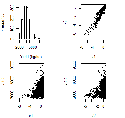
The locations from which yield data are collected are nested within admin2 and admin2 are nested with admin1. I have two indepenent variables x1 and x2. I did some pre-processing such that x1 and x2 are in standardised units (i.e. from original x1 and x2, I subtracted the respective mean and divided by the respective SD. Same was done for the year variable) Some raw plots:

enter image description here

There is weak quadratic relationship between yield with x1 and x2. I fitted a mixed model:

 mod <- lmer(log(yield) ~ x1 + x2 + year + (year |admin1/admin2), REML = FALSE, data = dat)
 summary(mod)

 Fixed effects:
        Estimate Std. Error t value
    (Intercept)  8.41458    0.08582  98.054
      x1          -0.07341    0.01559  -4.709
      x2           0.13192    0.01522   8.667
      year         0.11647    0.02992   3.893

One thing I do not understand is why the coefficient of x1 is negative. Given the raw plot, the coefficient of x1 and x2 should be positive since they have a positive relationship with yield. Even if x1 and x2 are correlated, the correlation is positive so they should not reverse their coefficients sign.

My ultimate aim is to predict yield as a function of x1 and x2

EDIT

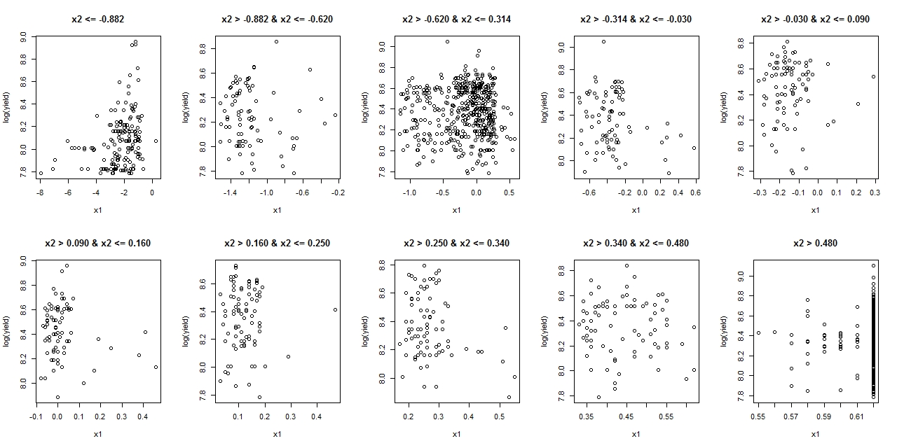
I followed the suggesting in the comment and plotted x1 and log yield for different range of x2 and this is what I get. Could anyone tell me what does it tell me w.r.t to why the signs of x1 and x2 are opposite in the model and if does it affect my predictions (I am more interested in the prediction than the sign of the regression coefficient itself).

enter image description here

EDIT

Following Ben's explanation, I am extending this question to get more understanding

x1 and x2 are variables that measure the water availability to crops so as x1 or x2 increases (better water availability), the yield should go up as well (i.e. a positive correlation of x1 and x2 with yield which the univariate plots show). Does this result mean that I cannot use this model for any prediction since the coefficient of x1 is wrong (negative indicting yield goes down with increasing x1) or does it mean that interpreting the reg coefficients as it is not practical in this case?

$\endgroup$
10
  • $\begingroup$ Separate the observations in to 10-15 groups according to the value of x2, for each group, generate scatterplot of x1 vs log(yield). Then you may get the idea what " x1 -0.07341" means. $\endgroup$
    – user158565
    Commented Nov 26, 2018 at 18:32
  • $\begingroup$ It seems that the explanatory variables are highly collinear which probably explains it, but without more information or access to the data it is hard to say..... It is always good to provide the data.... $\endgroup$ Commented Nov 26, 2018 at 19:24
  • $\begingroup$ Thanks @RobertLong. I have added the link to the data. $\endgroup$
    – 89_Simple
    Commented Nov 26, 2018 at 22:37
  • $\begingroup$ If there is negative corelation between x1 and x2, then I thought the regression coefficient would switch signs. Bit in this particular case, x1 and x2 are positively correlated, then why would their regression coefficients have opposite sign? $\endgroup$
    – 89_Simple
    Commented Nov 26, 2018 at 22:39
  • $\begingroup$ @user158565 I have done what you suggested but I cannot figure out how does that answer my question $\endgroup$
    – 89_Simple
    Commented Nov 26, 2018 at 23:05

1 Answer 1

3
$\begingroup$

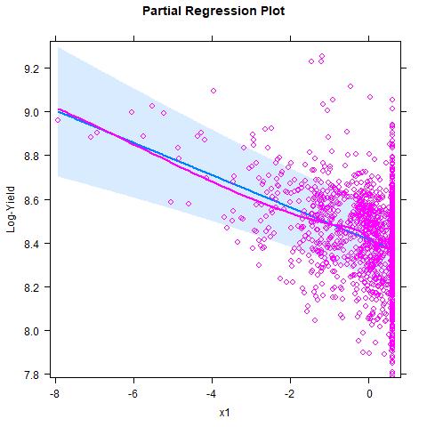
What is happening here is essentially just Simpson's "paradox". In this particular case you have observed positive marginal correlation between yield and x1, but the relationship turns negative after you condition on x2 and year in your linear model. You can also see from your plots that x1 and x2 have strong positive correlation, so this is giving you strong multicollinearity which would explain the phenomenon in this case.

This type of phenomenon is not unusual when examining relationships between multiple variables, especially when there is strong collinearity. For this reason it is generally misleading to plot crude pairwise comparisons between variables when doing analysis with many variables. If you want to look at the conditional relationship between yield and x1 then this would usually be illustrated with an partial regression plot (also called an added variable plot).


Implementation in R: The effects package has functionality to automatically produce residuals that absorb the lower-order terms marginal to the model variable of interest. This allows you to construct what are effectively partial regression plots for a range of models including lme models. This can be implemented to produce a partial regression plot in R using the code below. (Note that the data file you have linked to does not exactly match with the model output you have presented in your question. I have included the model output from the linked data.)

#Read data (need to put it in working directory first)
DATA <- read.csv('my.data.csv');

#Fit your model
library(lme4);
MODEL <- lmer(log(yield) ~ x1 + x2 + year + (year |admin1/admin2),
              REML = FALSE, data = DATA);

#Show model output
summary(MODEL);

...
Fixed effects:
            Estimate Std. Error t value
(Intercept)  8.41434    0.08585  98.008
x1          -0.07381    0.01558  -4.736
x2           0.13214    0.01521   8.687
year         0.11642    0.02994   3.888
....

#Generate partial regression plot using effects package
library(effects);
PARTIAL_MODEL <- Effect('x1', partial.residuals = TRUE, mod = MODEL);
plot(PARTIAL_MODEL, main = 'Partial Regression Plot',
     xlab = 'x1', ylab = 'Log-Yield');

enter image description here

$\endgroup$
3
  • $\begingroup$ Thanks Ben for your time and explanation. Would it be possible for you to add addition explanations. My x1 and x2 are variables that measure the water availability to crops so as x1 or x2 increases (better water availability), the yield should go up as well (i.e. a positive correlation of x1 and x2 with yield which the univariate plots show. Does this result mean that I cannot use this model for any prediction since the coefficient of x1 is wrong (negative indicting yield goes down with increasing x1) or does it mean that interpreting the reg coefficients as it is not practical in this case? $\endgroup$
    – 89_Simple
    Commented Nov 27, 2018 at 0:18
  • $\begingroup$ "casual" to "causal" I think. $\endgroup$
    – Nick Cox
    Commented Nov 27, 2018 at 16:29
  • 1
    $\begingroup$ It sounds like you are interested in modelling the causal effects of these variables. This will require you to read up on controlled experimentation and regression. If you wish to make causal inferences (i.e., interpret your parameters as causal effects) then this generally requires you to engage in some kind of controlled trial to avoid problems with confounding variables. Without this you can still interpret your coefficients predictively, in the sense that they are simply rates-of-change of the conditional expectation of the response variable. $\endgroup$
    – Ben
    Commented Nov 27, 2018 at 21:21

Your Answer

By clicking “Post Your Answer”, you agree to our terms of service and acknowledge you have read our privacy policy.

Not the answer you're looking for? Browse other questions tagged or ask your own question.