quantile does not assume any distribution, in the quantile() function from R, for the case of 97.5 quantile, it finds the two values between which the quantile value should lie, and does an interpolation, so for example in the below example of 100 values, it interpolates between the 97th and 98th sorted value:
set.seed(11)
x = runif(100)
sort(x)[97:98]
[1] 0.8806992 0.9071830
quantile(x,0.975)
    97.5%
0.8946032
qnorm is quite different. It returns you the value at 97.5 quantile of a normal distribution with mean and variance estimated from your data. So whether this coincides with the above value, depends on how well the normal distribution with estimated mean and variance, can describe your data.
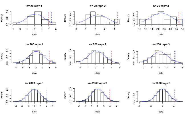
Below I give a simple example, where you have small sample size and causing the two estimates can differ. I simulate draw from samples of 20,200 and 2000 from a normal distribution of mean
norm_data_quantiles = function(i,n){
set.seed(i+n)
alpha = 0.05
data = rnorm(n,2,1)
norm_quantile = qnorm(1-alpha/2, mean = mean(data), sd = sd(data))

h = hist(data,freq=FALSE,main=paste("n=",n,"rep=",i))
lines(h$mids,dnorm(h$mids,mean(data),sd(data)),col="blue")
abline(v=norm_quantile,col="blue",lty=8)
abline(v=quantile(data,0.975),col="red",lty=8)
}

par(mfrow=c(3,3))
D = expand.grid(sim=1:3,n=c(20,200,2000))
for(i in 1:nrow(D)){
norm_data_quantiles(D$sim[i],D$n[i])}

The blue line is meant to show the expected normal probability while the histogram reflects the distribution in the actual data. The red dotted line is the 0.975 quantile while blue dotted is that estimated from the normal.
So you can see when you increase sample size, the two values differ less.
There are other reasons when they can differ, for example, your data is heavy tailed, big outliers, basically anything that can throw off the estimation of the mean and standard deviation.

