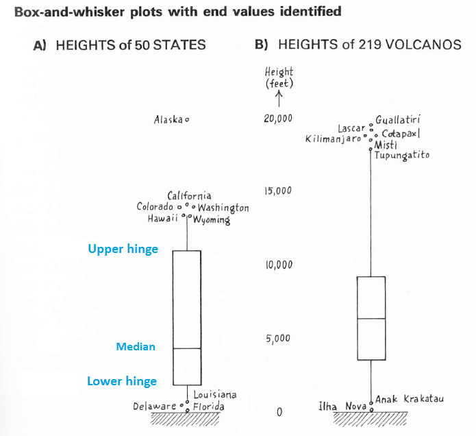
A boxplot is intended to summarize a relatively small set of data in a way that clearly shows
A central value.
The spread of "typical" values.
Individual values which depart so much from the central value, relative to the spread, that they are singled out for special attention and separately identified (by name, for instance). These are called "identified values."
This is to be done in a robust way: that means the boxplot should not look appreciably different when one, or a relatively small portion, of the data values is arbitrarily changed.
The solution adopted by its inventor John Tukey is to use the order statistics--the data as sorted from lowest to highest--in a systematic way. For simplicity (he did calculations mentally or with pencil and paper) Tukey focused on medians: the middle values of batches of numbers. (For batches with even counts, Tukey used the midpoint of the two middle values.) A median is resistant to changes in up to half the data on which it is based, making it excellent as a robust statistic. Thus:
The central value is estimated with the median of all the data.
The spread is estimated with the difference between the medians of the "upper half"--all data equal to or above the median--and the "lower half"--all data equal to or less than the median. These two medians are called the upper and lower "hinges" or "fourths". They tend nowadays to be replaced by things called the quartiles (which have no universal definition, alas).
Invisible fences for screening outliers are erected 1.5 and 3 times the spread beyond the hinges (away from the central value).
- "The value at each end closest to, but still inside, the inner fence is 'adjacent'."
- Values beyond the first fence are called "outliers."
- Values beyond the second fence are "far out."
(Those old enough to remember the hippie argot of the '60s will understand the joke.)
Since the spread is a difference of data values, these fences have the same units of measure as the original data: this is the sense of "distance" in the question.
Concerning the data values to identify, Tukey wrote
We can at least identify the extreme values, and might do well to identify a few more.
Any graphical method to display the median, hinges, and the identified values arguably deserves to be called a "boxplot" (originally, "box-and-whisker plot"). The fences usually are not depicted. Tukey's design consists of a rectangle describing the hinges with a "waist" at the median. Unobtrusive line-like "whiskers" extend outward from the hinges to the innermost identified values (both above and below the box). Usually these innermost identified values are the adjacent values defined above.
Consequently, the default appearance of a boxplot is to extend the whiskers to the most extreme non-outlying data values and to identify (through text labels) the data comprising the ends of the whiskers and all outliers. For example, Tupungatito volcano is the high adjacent value for the volcano heights data depicted at the right of the figure: the whisker stops there. Tupungatito and all taller volcanos are separately identified.
So that this will display the data faithfully, distance in the graphic is proportional to differences in data values. (Any departure from direct proportionality would introduce a "Lie Factor" in Tufte's (1983) terminology.)

These two boxplots from Tukey's book EDA (p. 41) illustrate the components. It is noteworthy that he has identified non-outlying values at the high and low ends of the States dataset at the left and one low non-outlying value of the Volcano heights at the right. This exemplifies the interplay of rules and judgment that pervades the book.
(You can tell these identified data are non-outlying, because you can estimate the locations of the fences. For instance, the hinges of the state heights are near 11,000 and 1,000, giving a spread around 10,000. Multiplying by 1.5 and 3 gives distances of 15,000 and 30,000. Thus, the invisible upper fence must be near 11,000 + 15,000 = 26,000 and the lower fence, at 1,000 - 15,000, would be below zero. The far fences would be near 11,000 + 30,000 = 41,000 and 1,000 - 30,000=-29,000.)
References
Tufte, Edward. The Visual Display of Quantitative Information. Cheshire Press, 1983.
Tukey, John. Chapter 2, EDA. Addison-Wesley, 1977.

