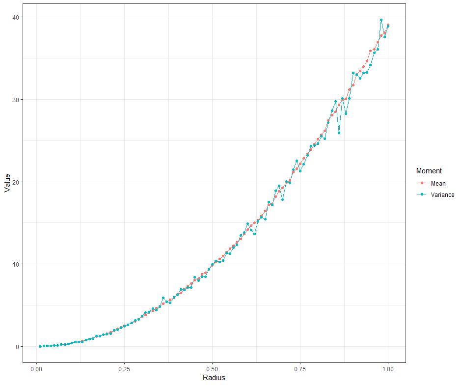
I am hopeful that the following code and resulting graph will be helpful. I believe that what you're reading is spreading the points over a wide area and varying where the circle is centered. I believe that it is equivalent to keeping the circle centered at the origin and drawing repeated samples of points. (Do you see why?) If you deviate from independent and uniform marginal distributions along the axes, then there would have to be modifications.
library(ggplot2)
library(dplyr)
set.seed(2021)
N <- 5000 # Number of points in the square [-10, 10] x [-10, 10]
B <- 1000 # Number of times to sample per circle radius
Rs <- seq(0.01, 1, 0.01) # Circle radii
L <- list() # Empty list to hold data frames produced in the upcoming loop
# Loop over the circle radii
#
for (i in 1:length(Rs)){

  n_points <- rep(NA, B) # Blank vector to hold number of points within the circle of radius Rs[i], centered at (0, 0)

  # Loop B-many times
  #
  for (j in 1:B){

    # Sample from independent U(-10, 10) distributions
    #
    x <- runif(N, -10, 10)
    y <- runif(N, -10, 10)
    rs <- sqrt(x^2 + y^2)

    # Count how many points are within the circle of radius Rs[i], centered at (0, 0)
    #
    n_points[j] <- length(which(rs <= Rs[i]))


  }

  # Made one-row data frames of the radius and either variance or mean number of points
  # Add to list L
  #
  L[[i]] = data.frame(Radius = Rs[i], Value = mean(n_points), Moment = "Mean")
  L[[i + 1*length(Rs)]] = data.frame(Radius = Rs[i], Value = var(n_points), Moment = "Variance")
  # L[[i + 2*length(Rs)]] = data.frame(Radius = Rs[i], Value = sd(n_points), Moment = "Standard Deviation")

  if (i %% 5 == 0 | i < 5){
    print(paste(i/length(Rs) * 100, "% complete", sep = ""))
  }
}

# Concatenate the data frames in L
#
d <- bind_rows(L)

# Plot
#
ggplot(d, aes(x = Radius, y = Value, col = Moment)) +
  geom_line() +
  geom_point() +
  # facet_grid(~Moment, scales = "free_y") +
  theme_bw()

As EdM discussed, the Poisson distribution has equal mean and variance. The graph above almost has equal means and variances, but not quite, so the distribution is not Poisson, right? No! Those are the sample means and sample variances, where we expect some sampling variation. That both follow about the same curve tells me that the population mean and variance are about equal. Something Poisson or at least nearly Poisson seems quite plausible.
(Poisson makes sense to me if there is independence between the axes and uniform marginal distributions. You're essentially asking how many particles are going to pass through a circle, which is what the Poisson distribution is.)
Perhaps you can use some of what I did here to make your own simulation. Particularly if you're showing this to a friend, you may create stronger evidence by running simulations and presenting graphs than by writing a formal mathematical proof; many people like pictures.


