$\alpha$ and $\beta$ are related. I'll try to illustrate the point with a diagnostic test. Let's say that you have a diagnostic test that measures the level of a blood marker. It is known that people having a certain disease have lower levels of this marker compared to healthy people. It is immediately clear that you have to decide a cutoff value, below which a person is classified as "sick" whereas people with values above this cutoff are thought to be healthy. It is very likely, though, that the distribution of the bloodmarker varies considerably even within sick and healthy people. Some healthy persons might have very low blood marker levels, even though they are perfectly healthy. And some sick people have high levels of the blood marker even though they have the disease.
There are four possibilities that can occur:
- a sick person is correctly identified as sick (true positive = TP)
- a sick person is falsely classified as healthy (false negative = FN)
- a healthy person is correctly identified as healthy (true negative =
TN)
- a healthy person is falsely classified as sick (false positive =
FP)
These possibilities can be illustrated with a 2x2 table:
               Sick Healthy
Test positive   TP     FP
Test negative   FN     TN
$\alpha$ denotes the false positive rate, which is $\alpha = FP/(FP + TN)$. $\beta$ is the false negative rate, which is $\beta = FN/(TP + FN)$. I wrote a simply R script to illustrate the situation graphically.
alphabeta <- function(mean.sick=100, sd.sick=10,
    mean.healthy=130, sd.healthy=10, cutoff=120, n=10000,
    side="below", do.plot=TRUE) {

      popsick <- rnorm(n, mean=mean.sick, sd=sd.sick)
      pophealthy <- rnorm(n, mean=mean.healthy, sd=sd.healthy)

      if ( side == "below" ) {

        truepos <- length(popsick[popsick <= cutoff])
        falsepos <- length(pophealthy[pophealthy <= cutoff])
        trueneg <- length(pophealthy[pophealthy > cutoff])
        falseneg <- length(popsick[popsick > cutoff])

      } else if ( side == "above" ) {

        truepos <- length(popsick[popsick >= cutoff])
        falsepos <- length(pophealthy[pophealthy >= cutoff])
        trueneg <- length(pophealthy[pophealthy < cutoff])
        falseneg <- length(popsick[popsick < cutoff])

      }

      twotable <- matrix(c(truepos, falsepos, falseneg, trueneg),
                    2, 2, byrow=T)
      rownames(twotable) <- c("Test positive", "Test negative")
      colnames(twotable) <- c("Sick", "Healthy")

      spec <- twotable[2, 2]/(twotable[2, 2] + twotable[1, 2])
      alpha <- 1 - spec
      sens <- pow <- twotable[1, 1]/(twotable[1, 1] +
                      twotable[2, 1])
      beta <- 1 - sens

      pos.pred <- twotable[1,1]/(twotable[1,1] + twotable[1,2])
      neg.pred <- twotable[2,2]/(twotable[2,2] + twotable[2,1])

      if ( do.plot == TRUE ) {
        dsick <- density(popsick)
        dhealthy <- density(pophealthy)

        par(mar=c(5.5, 4, 0.5, 0.5))
        plot(range(c(dsick$x, dhealthy$x)), range(c(c(dsick$y,
       dhealthy$y))), type = "n", xlab="", ylab="",
           axes=FALSE)
        box()
        axis(1, at=mean(pophealthy),
         lab=substitute(mu[H[0]]~paste("=", m, sep=""),
         list(m=mean.healthy)), cex.axis=1.5, tck=0.02)
        axis(1, at=mean(popsick),
           lab=substitute(mu[H[1]] ~ paste("=", m, sep=""),
           list(m=mean.sick)), cex.axis=1.5, tck=0.02)
        axis(1, at=cutoff, lab=substitute(italic(paste("Cutoff=",
         coff, sep="")), list(coff=cutoff)), pos=-0.004,
          tick=FALSE, cex.axis=1.25)
        lines(dhealthy, col = "steelblue", lwd=2)

        if ( side == "below" ) {
          polygon(c(cutoff, dhealthy$x[dhealthy$x<=cutoff],
          cutoff), c(0, dhealthy$y[dhealthy$x<=cutoff],0),
            col = "grey65")
        } else if ( side == "above" ) {
          polygon(c(cutoff, dhealthy$x[dhealthy$x>=cutoff],
            cutoff), c(0, dhealthy$y[dhealthy$x>=cutoff],0),
            col = "grey65")
        }

        lines(dsick, col = "red", lwd=2)

        if ( side == "below" ) {
          polygon(c(cutoff, dsick$x[dsick$x>cutoff], cutoff),
          c(0, dsick$y[dsick$x>cutoff], 0) , col="grey90")
        } else if ( side == "above" ) {
          polygon(c(cutoff, dsick$x[dsick$x<=cutoff], cutoff),
            c(0, dsick$y[dsick$x<=cutoff],0) , col="grey90")
        }

        legend("topleft",
               legend=
          (c(as.expression(substitute(alpha~paste("=", a),
           list(a=round(alpha,3)))),
             as.expression(substitute(beta~paste("=", b),
             list(b=round(beta,3)))))), fill=c("grey65",
             "grey90"), cex=1.2, bty="n")
        abline(v=mean(popsick), lty=3)
        abline(v=mean(pophealthy), lty=3)
        abline(v=cutoff, lty=1, lwd=1.5)
        abline(h=0)

      }

      #list(specificity=spec, sensitivity=sens, alpha=alpha, beta=beta, power=pow, positiv.predictive=pos.pred, negative.predictive=neg.pred)

      c(alpha, beta)

    }
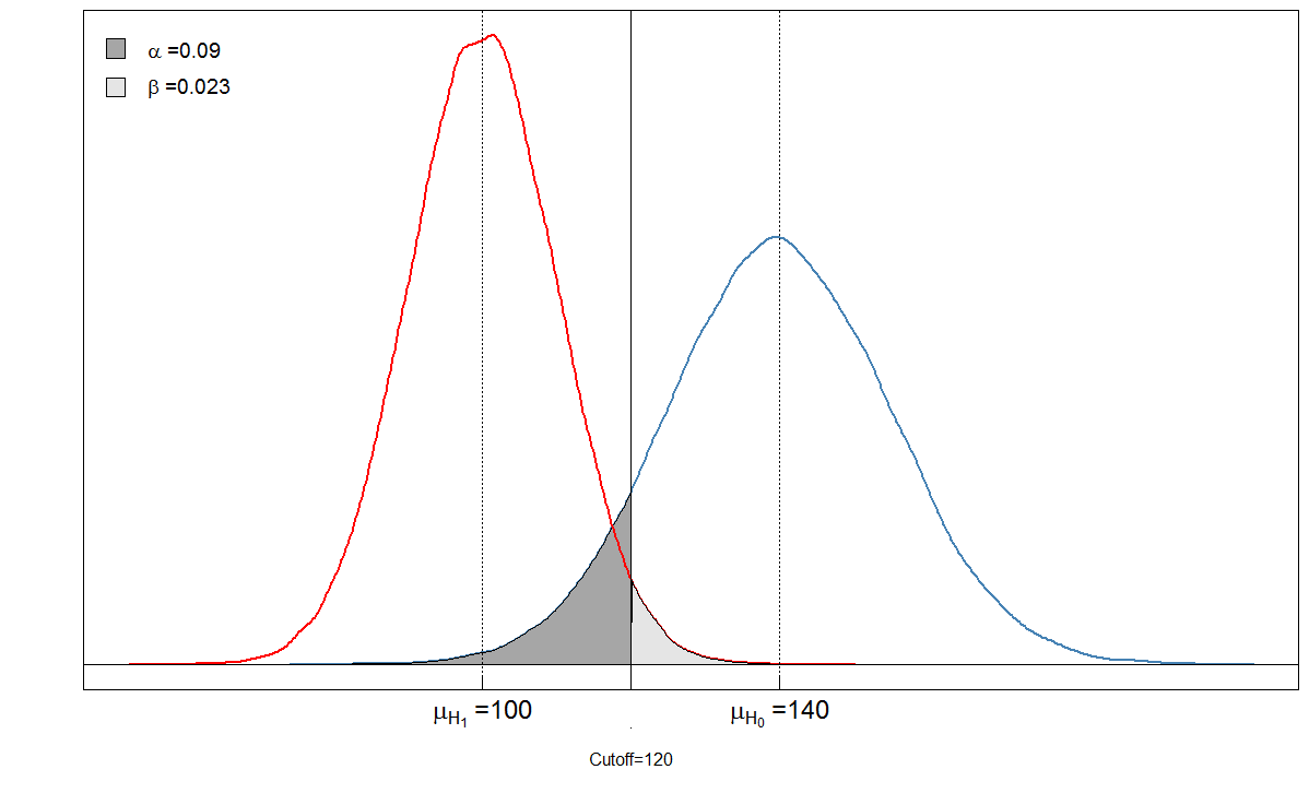
Let's look at an example. We assume that the mean level of the blood marker among the sick people is 100 with a standard deviation of 10. Among the healthy people, the mean blood level is 140 with a standard deviation of 15. The clinician sets the cutoff at 120.
    alphabeta(mean.sick=100, sd.sick=10, mean.healthy=140,
         sd.healthy=15, cutoff=120, n=100000, do.plot=TRUE,
         side="below")

                  Sick Healthy
    Test positive 9764     901
    Test negative  236    9099

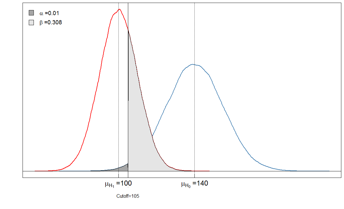
You see that the shaded areas are in a relation with each other. In this case, $\alpha = 901/(901+ 9099) \approx 0.09$ and $\beta = 236/(236 + 9764)\approx 0.024$. But what happens if the clinician had set the cutoff differently? Let's set it a bit lower, to 105 and see what happens.
              Sick Healthy
Test positive 6909      90
Test negative 3091    9910

Our $\alpha$ is very low now because almost no healthy people are diagnosed as sick. But our $\beta$ has increased, because sick people with a high blood marker level are now falsely classified as healthy.
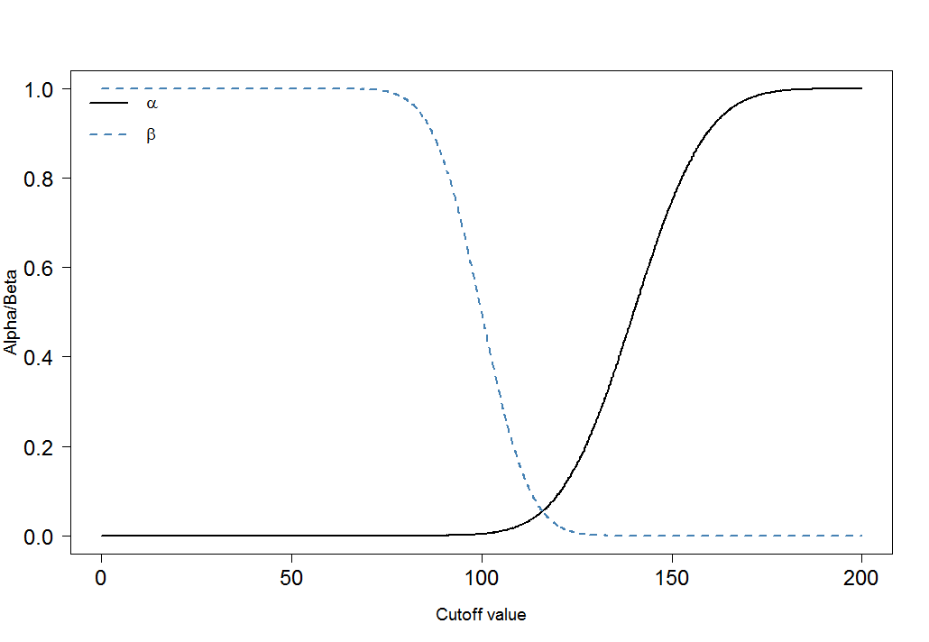
Finally, let us look how $\alpha$ and $\beta$ change for different cutoffs:
    cutoffs <- seq(0, 200, by=0.1)
    cutoff.grid <- expand.grid(cutoffs)

    plot.frame <- apply(cutoff.grid, MARGIN=1, FUN=alphabeta,
        mean.sick=100, sd.sick=10, mean.healthy=140,
        sd.healthy=15, n=100000, do.plot=FALSE, side="below")

    plot(plot.frame[1,] ~ cutoffs, type="l", las=1,
      xlab="Cutoff value", ylab="Alpha/Beta", lwd=2,
      cex.axis=1.5, cex.lab=1.2)
    lines(plot.frame[2,]~cutoffs, col="steelblue", lty=2, lwd=2)
    legend("topleft", legend=c(expression(alpha),
       expression(beta)), lwd=c(2,2),lty=c(1,2), col=c("black",
       "steelblue"), bty="n", cex=1.2)

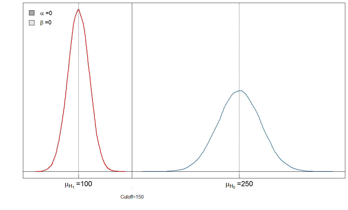
You can immediately see that the ratio of $\alpha$ and $\beta$ is not constant. What is also very important is the effect size. In this case, this would be the difference of the means of the blood marker levels among sick and healthy people. The greater the difference, the easier the two groups can be separated by a cutoff:

Here we have a "perfect" test in the sense that the cutoff of 150 discriminates the sick from the healthy.
Bonferroni adjustements
Bonferroni adjustments reduces the $\alpha$ error but inflate the type II error ($\beta$). This means that the error of making a false negative decision is increased while false positives are minimized. That's why the Bonferroni adjustment is often called conservative. In the graphs above, note how the $\beta$ increased when we lowered the cutoff from 120 to 105: it increased from $0.02$ to $0.31$. At the same time, $\alpha$ decreased from $0.09$ to $0.01$.

