7
$\begingroup$

As a non-statistician, I am interested in understanding whether model evaluation should be conducted with the measured values on the x-axis and modelled (or predicted) values on the y-axis, or vice versa.

For context, I am teaching a university course on environmental modelling. One of the practicals utilises measured data on river water quality (e.g. measured NO2 concentrations). Based on the characteristics of the river catchment (i.e. land use, geology, soil types, topography) and using testing-training datasets, students are asked to create models to predict river water quality (i.e. modelled NO2 concentrations). EDIT: the measured data are first split into training (70%) and testing (30%) subsets. The models are tuned using the training subsets, and then evaluation is with the testing subsets.

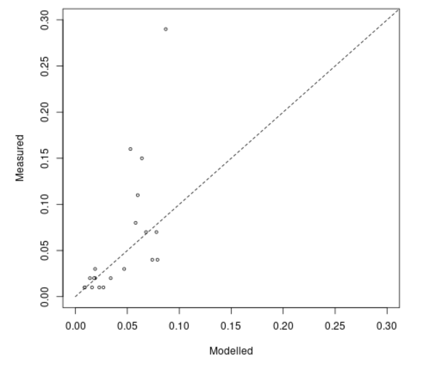
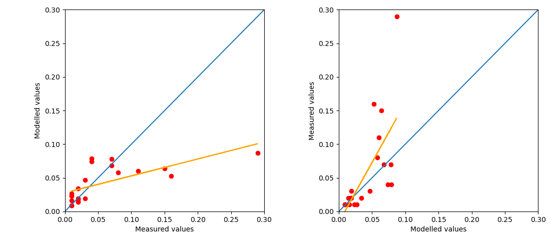
They students are then asked to evaluate the models in a variety of ways, one of which is simply plotting measured vs. modelled data, and comparing the results of linear regression to 1:1. I have included some sample data and code below to illustrate, the results of which are shown here:

Plot of measured vs. modelled data

EDIT The aim here is to enable students to gain experience of model evaluation, specially thinking about missing variables as well as different types of error (i.e. systematic-random, under- or over-prediction).

This course has run for a number of years but I only recently began to contribute to it, and in checking over the method, I came across the papers by Piñeiro et al. (2008) and Pauwels et al. (2019). The former is highly cited (>700 times) and recommends the following: Observed (in the y-axis) vs. predicted (in the x-axis) (OP) regressions should be used ...

Pauwels et al. (2019) argue that this approach is incorrect and is an artefact of the experiment setup and that instead, assessing models in a scatter plot with the observations in abscissa (X-axis) and the corresponding simulations in ordinate (Y-axis) will lead to the correct conclusions regarding the model performance. This paper has only been cited once since publication.

While I have some understanding of statistics, I am not an expert statistician and would like to know if there is a general rule for evaluating measured-modelled data on the X-Y axes.

## Example Code

import numpy as np
import matplotlib.pyplot as plt

# Input data
Measured = [0.110, 0.150, 0.070, 0.070, 0.040, 0.020, 0.010, 0.020, 0.010, 0.290, 0.040, 0.020, 0.020, 0.010, 0.010, 0.010, 0.160, 0.030, 0.030, 0.080]
Modelled = [0.06, 0.064, 0.078, 0.068, 0.079, 0.019, 0.009, 0.014, 0.016, 0.087, 0.074, 0.034, 0.018, 0.009, 0.023, 0.027, 0.053, 0.047, 0.019, 0.058]

# Set up plot
fig, (ax1, ax2) = plt.subplots(1, 2)

# Plot Measured (X) vs. Modelled (Y), with 1:1 line
ax1.plot(Measured,Modelled, 'ro')
ax1.set_xlabel("Measured values")
ax1.set_ylabel("Modelled values")
ax1.axline([0, 0], slope=1)

# Plot Modelled (X) vs. Measured (Y), with 1:1 line
ax2.plot(Modelled,Measured, 'ro')
ax2.set_xlabel("Modelled values")
ax2.set_ylabel("Measured values")
ax2.axline([0, 0], slope=1)

#obtain m1 (slope) and b1 (intercept) for Measured vs. Modelled
m1, b1 = np.polyfit(Measured, Modelled, 1)
#obtain m2 (slope) and b2 (intercept) for Modelled vs. Measured
m2, b2 = np.polyfit(Modelled, Measured, 1)

#add linear regression line to scatterplot 
ax1.plot(Measured, m1*np.array(Measured)+b1, color='orange')
ax2.plot(Modelled, m2*np.array(Modelled)+b2, color='orange')

# using padding
fig.tight_layout(pad=1.0)
plt.show()

## **EDIT**

# Full input data, including predictors, split by test-training
group = ["Testing","Testing","Testing","Testing","Testing","Testing","Testing","Testing","Testing","Testing","Testing","Testing","Testing","Testing","Testing","Testing","Testing","Testing","Testing","Testing","Training","Training","Training","Training","Training","Training","Training","Training","Training","Training","Training","Training","Training","Training","Training","Training","Training","Training","Training","Training","Training","Training","Training","Training","Training","Training","Training","Training","Training","Training","Training","Training","Training","Training","Training","Training","Training","Training","Training","Training","Training","Training","Training","Training","Training","Training","Training","Training","Training","Training"]
measured = [0.11,0.15,0.07,0.07,0.04,0.02,0.01,0.02,0.01,0.29,0.04,0.02,0.02,0.01,0.01,0.01,0.16,0.03,0.03,0.08,0.08,0.02,0.07,0.05,0.06,0.03,0.09,0.07,0.03,0.04,0.07,0.17,0.03,0.01,0.05,0.01,0.01,0.04,0.01,0.01,0.01,0.14,0.21,0.04,0.02,0.02,0.03,0.02,0.01,0.02,0.01,0.01,0.01,0.02,0.01,0.01,0.01,0.02,0.06,0.06,0.02,0.02,0.06,0.06,0.07,0.07,0.07,0.13,0.06,0.05]
predictor_1 = [1.231824555,0.615234151,1.165186392,0.525859101,0.735572055,7.67780908,8.958903593,8.900461024,7.84647476,2.655325443,2.792221068,5.769693553,8.185012004,8.787211459,5.962420116,5.297960321,1.479561438,5.255290898,7.885828985,0.738002703,0.483714239,1.928896113,0.514826816,1.629628135,1.067315635,0.487807436,0.961284723,0.639645339,2.083082213,1.816748332,1.14119713,0.798762487,7.004250655,12.22349063,8.000742572,9.017686869,11.75561384,3.944032552,9.432875808,9.136357158,8.595211952,3.552441934,1.014219737,3.166220771,5.648604781,5.078663497,4.869929446,7.760899685,8.529723683,6.461895963,6.707680902,5.852565035,5.046068182,7.239011985,7.770876954,7.852262871,7.432389029,0.907447671,0.654238481,1.823821963,9.255090086,0.885662936,1.296456938,0.741698994,2.262652753,1.785146869,2.334035797,0.852653873,1.615497552,2.260345848]
predictor_2 =[20.94380929,22.28754677,38.81228455,25.88769612,37.95297372,5.306122449,0.71199097,6.019852706,3.647733194,53.617942,41.58515404,13.3125,6.267806268,0.436681223,2.730375427,4.155021427,15.40168664,24.30683482,6.862044317,16.93954187,49.46439824,35.71915474,51.2345679,19.19191919,43.77224199,26.84396699,20.8882198,10.34992607,29.30439073,27.18836218,45.91439689,59.22795797,1.314405889,0.245813489,7.367230134,0.675378065,0.442993705,43.89086595,6.382160707,10.60371517,2.124943,47.69738512,73.13639511,34.74692202,5.964254636,20.48104956,12.4137931,11.84210526,1.167031364,26.07170694,0.805951643,0,3.050847458,8.497854077,3.602941176,2.43567753,10.25430681,34.79212254,67.48427673,8.855545749,2.836335761,16.58502449,15.38725154,7.392759355,34.95531281,22.39939256,3.680501175,9.542991065,6.595855307,11.16022099]

$\endgroup$
19
  • 2
    $\begingroup$ 1) Are the modeled data predicted values from a model trained on the measured data, or are they predictions from a model trained previously on a different dataset? 2) If the latter, are you trying to see if the model needs to be updated, or something like that? 3) Does the model represent something like a simplified or baseline understanding of the phenomenon, & you want to see the information that is being missed? Something else? Some additional context would help. $\endgroup$ Commented Oct 25, 2022 at 15:34
  • 1
    $\begingroup$ The data cannot tell you whether there are missing confounders. You would need a causal model for that. $\endgroup$
    – dipetkov
    Commented Oct 25, 2022 at 17:17
  • 1
    $\begingroup$ Related CV threads: Residual plots: why plot versus fitted values, not observed 𝑌 values?, How do I test hypothesis of slope = 1 and intercept = 0 for observed vs. predicted regression?. I would add that (partial) residual plots can be more informative that either alternative you are considering. $\endgroup$
    – dipetkov
    Commented Oct 25, 2022 at 17:46
  • 1
    $\begingroup$ @MattTomkins, it is the second linked thread, not the first one. $\endgroup$ Commented Oct 25, 2022 at 18:32
  • 1
    $\begingroup$ What is the problem when we switch the x and y axis? The image remains basically the same or not? Or maybe I missed something in the story that explains why flipping the image is relevant? $\endgroup$ Commented Oct 25, 2022 at 19:01

1 Answer 1

2
$\begingroup$

Whether a value is observed or modelled is irrelevant. What matters is whether or not a value has an error or a random distribution that you want to study.

Two common cases

It is common to consider a conditional distribution of some variable based one or more other variables. Then we have the value for which we want to determine the (conditional) distribution on the y-axis and the value on which we condition on the x-axis.

  • Physics experiments are a typical example. In those cases an experiment is often performed by changing/controlling some variable and this variable is considered an 'independent' variable which has little measurement error. Then the y-axis represents an observed variable that is the 'dependent' variable. The relevant question in such experiments is to determine $Y|X$ the distribution of $Y$ given $X$. And that is exactly what ordinary least squares regression does.

  • In observational studies, as often seen in the field of economy, nutrition and health, or sociology, there are no 'independent' variables. The experimenter has no control over variables and is just observing patterns.

    In that case there is no natural variable to be placed on the x-axis. Still, one might be interested in a particular direction of patterns. For instance because of some application or goal for which one performs the study.

    An example could be a doctor that wants to predict some risk based on a set of variables. The risk is modelled as function of some variable, so risk is on the y-axis and the variable on the x-axis (but that doesn't mean that there is a causal relationship in that direction, it is just that the doctor wants to know the statistical model, and not the causal model).

Comments on your case

For your case it is not directly obvious what should go on the x-axis.

I personally prefer to have the modelled value on the x-axis, but that is because I am often dealing with physics experiments where the modelled variable is a well controlled variable and the observed variable contains the error. Plotting the modelled variable on the x-axis can also be a way to decrease the dimensionality.

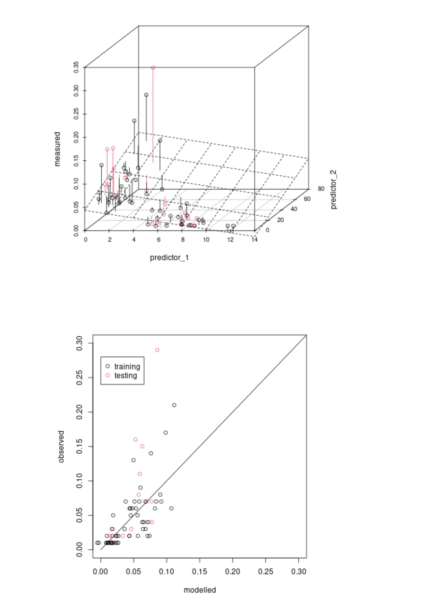
If you have multiple variables that you control in an experiment then it can be difficult to plot the output/observed value as function of all those variables (because it is multidimensional). But instead of all those variables you can replace them by the modelled variable. This might be your case as you could view your data as the 3d plot below

3dplot

This does not always need to be the situation. The modelled variable can depend on controlled variables, but there might be a degree of error in the actual values and the values that were set. (e.g. you might control some concentration of a solution, but due to experimental variations the concentration has error)

Relating to regression

  • You migh want to know just the statistical relationship. How well does my model describe observations. What is the error that we make with a particular model? For such questions you want to characterise the distribution of the observations as function of the modelled values.
  • You might want to use regression as a goodness of fit test. For this case you want to use a correct representation of the error distribution. You might not just have statistical variation in the observations but also in the modelled values. This is a more nuanced situation than either regressing observed vs modelled or regressing modelled bs observed. In this case you want to express both errors together and use something like Deming regression.

Another note on your plot. Possibly you might want to change the scales of the axes such that the line observation=modelled has a 45 degree angle. The use of 45 degree angles makes it easier to compare differences (see also this question and answer about slopegraphs)

example of 45 degrees

Related questions

Inverse Regression vs Reverse Regression

Effect of switching response and explanatory variable in simple linear regression

If in this problem I regress $x$ on $y$ instead than $y$ on $x$, do I need to use an error-in-variables model?

$\endgroup$
6
  • $\begingroup$ Thank you for you answer and for pointing me in the direction of those previous threads. I agree that the solution here is not so obvious, but having read your reasoning, I think the most logical approach is to use the measured data on the x-axis and modelled on the y-axis, as the measured data is the well-controlled variable and it is the modelled data where error is more likely. It would still be useful to know if there is any broader guidance on this (and particularly clearing up the difference between Piñeiro et al. (2008) and Pauwels et al. (2019)), but I am happy to accept this answer. $\endgroup$ Commented Oct 26, 2022 at 13:36
  • $\begingroup$ @MattTomkins that is an interesting comment. I felt like I was steering into the opposite direction, to use the measured data on the y-axis. Now I feel obliged to read those two articles, which I admit now that I didn't read (or I don't remember them). $\endgroup$ Commented Oct 26, 2022 at 18:55
  • $\begingroup$ I was convinced by your example of "physics experiments where the modelled variable is a well controlled variable and the observed variable contains the error." I am presuming here that the model is based on established laws/principles and you are trying to see how well your physical measurements match that. The reverse is true in my case (hence the decision of measured on X, modelled on Y), as we want to see how well the model reproduces the "true" measured data (rather than vice versa). $\endgroup$ Commented Oct 27, 2022 at 12:20
  • $\begingroup$ @MattTomkins I have added a graph for your situation. Your model is a linear regression with two predictor variables. Effectively you are assessing how well a plane fits the data points. It seems natural to me to consider the variation of the observed values in relation to the modeled point. $\endgroup$ Commented Oct 27, 2022 at 16:02
  • $\begingroup$ Very good answer, +1. I'd like to add from my analytical chemist/chemometrician perspective: plotting measured (signal) against predictors (reference) is a different plot from predicted vs. reference. For the former, we typcially put signal as ordinate (y) over reference on the abscissa(s; x) regardless of whether a classical or inverse model is used. For the latter, I'd also say the convention is to put the prediction on the ordinate over reference on the abscissa (and I highly recommend not only same scale but also same range for this plot). The reason is philosophical: we consider... $\endgroup$
    – cbeleites
    Commented Oct 27, 2022 at 21:01

Your Answer

By clicking “Post Your Answer”, you agree to our terms of service and acknowledge you have read our privacy policy.

Not the answer you're looking for? Browse other questions tagged or ask your own question.