How should I interpret the negative relationship between the residual and the fitted value in the plot shown below?
2 Answers
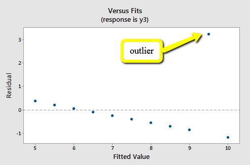
In your case, the graph indicates that you have one very influential data point. If that data point were excluded, the slope of your regression would become more positive. In other words, the general negative slope between fitted values and residuals exists because of the 'outlier' (I use quotes because it is a slippery concept). Remove the outlier and recalculate the regression and the negative slope will disappear.
This does not necessarily mean that you should exclude the outlier; it's best to exclude points only when they represent clear errors. If the point is correct, an alternative is to use what is called a 'robust regression'. This will retain the point but reduce its influence on the estimated slope and intercept.
-
1$\begingroup$ +1. The part about exclusion is probably important for OP given the question. $\endgroup$ Commented Sep 7, 2023 at 5:13
Fitted values are those which are predicted from a linear regression equation, whereas residuals are how well this "guess" was at actually fitting the regression line. In an ideal world, we want the residuals and fitted values to have no pattern and to be as similar in magnitude away from the center line as possible.
Without knowing the data exactly in this example, it appears the residual for this specific point is very far away from $0$, which indicates that overall the regression guessed this value pretty poorly compared to the others. There could be a variety of reasons for this, including outlier values, poor fit to the actual function of data (e.g. fitting a linear relationship to a nonlinear one), unequal variance around the mean, and other influences.
Here are some examples.
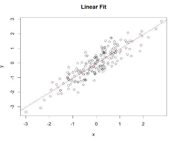
Example 1
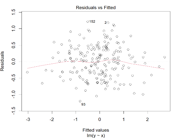
This is a linear fit that does a good job overall of fitting the data around the mean, though you can see that because the variance isn't completely evenly distributed around the regression line, it curves at times around the residual plot line (because of less data on the tails in the actual scatterplot of data).
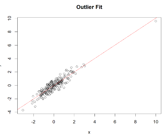
Example 2
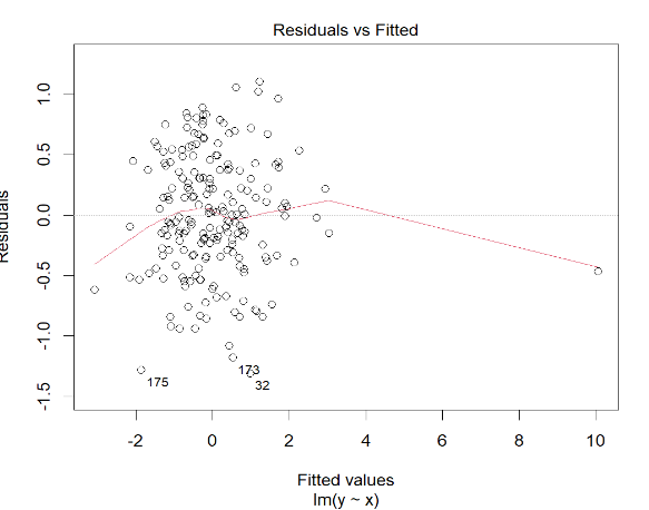
This is a fit with an extreme outlier. Here you can see on the fitted/residuals plot that the outlier appears far to the right, but it can also look like yours where it is far away on the y-axis.
Example 3
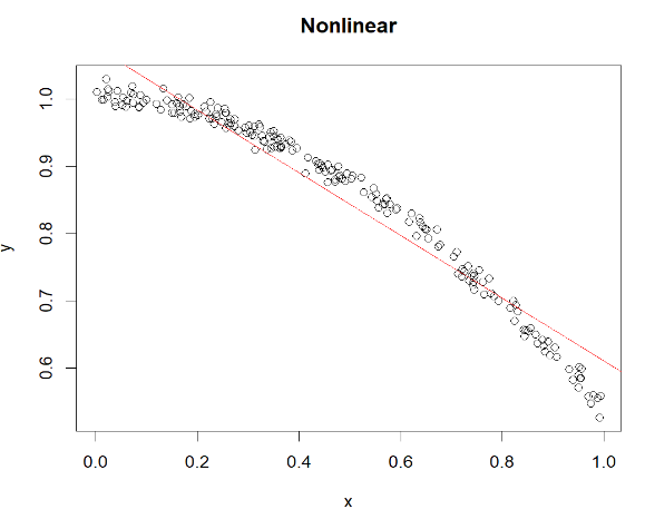
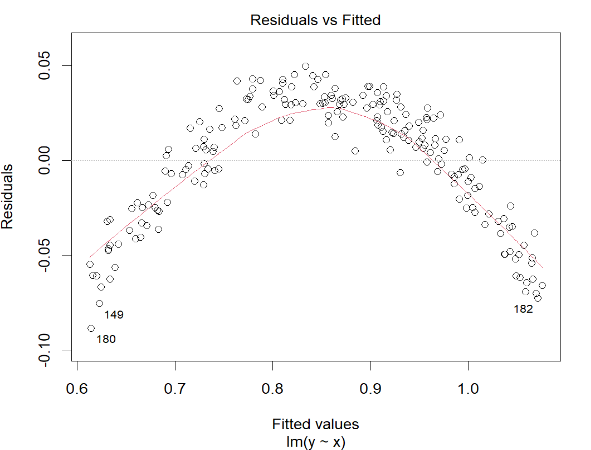
Here is what it can look like with nonlinear fits, where it resembles a u-shape here since it both under/overpredicts the curve.

