12
$\begingroup$

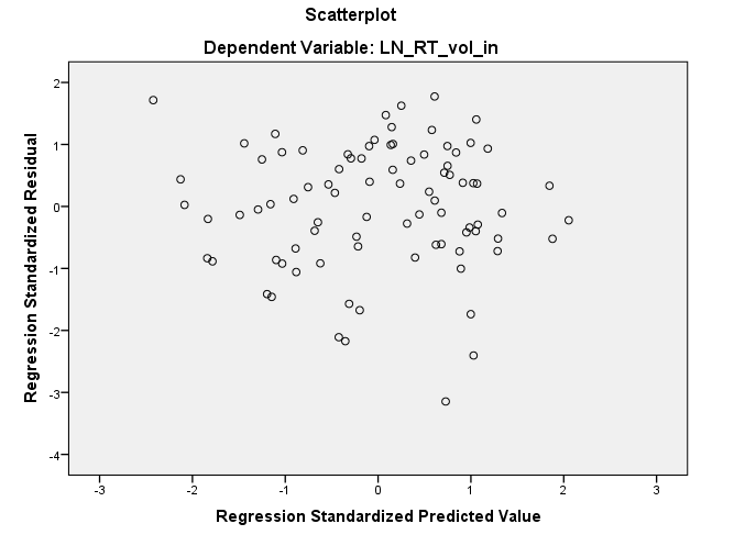
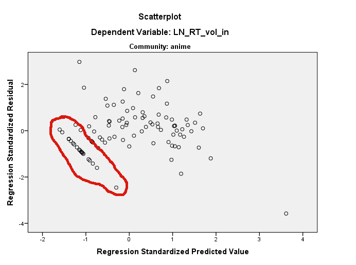
I am observing strange patterns in residuals for my data: enter image description here

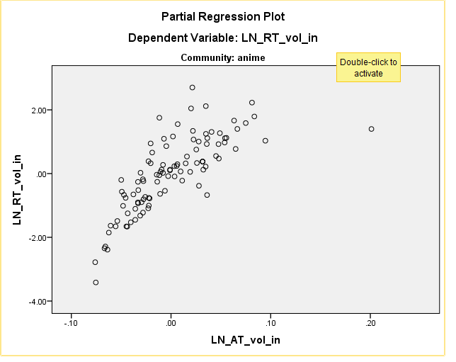
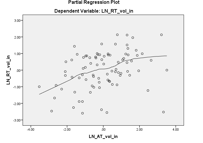
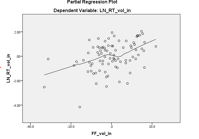
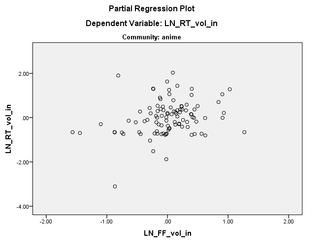
[EDIT] Here are the partial regression plots for the two variables:

https://i.sstatic.net/yx5IM.png

https://i.sstatic.net/DzYtS.png

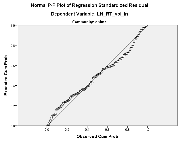
[EDIT2] Added the PP Plot http://i.imgur.com/pCKFA.png

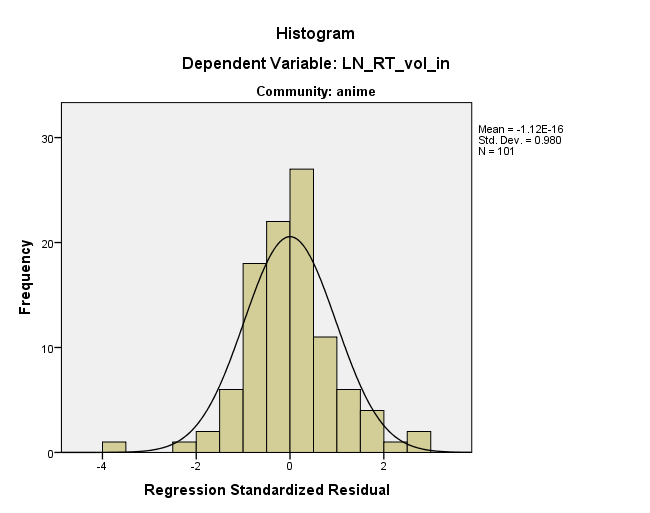
The distribution seems to be doing fine (see below) but I have no clue where this straight line might be coming from. Any ideas? enter image description here

[UPDATE 31.07]

It turns out you were absolutely right, I had cases where the retweet count was indeed 0 and these ~ 15 cases resulted in those strange residual patterns.

The residuals look much better now: https://i.sstatic.net/GvSj4.png

I've also included the partial regressions with a loess line. https://i.sstatic.net/BzSsj.png https://i.sstatic.net/2XE3f.png

$\endgroup$
6
  • $\begingroup$ Could you add the fitted line plotted on the original data as well? $\endgroup$
    – MånsT
    Commented Jul 27, 2012 at 9:29
  • $\begingroup$ Also, the subtitles of the figures say "community: anime" and "community: astrology", which seems to imply that these plots come from different data sets... $\endgroup$
    – MånsT
    Commented Jul 27, 2012 at 9:45
  • $\begingroup$ I remember seeing this type of patterns in my residuals when my dependent variables are categorical or 'not continuous enough'. $\endgroup$
    – King
    Commented Jul 27, 2012 at 9:51
  • $\begingroup$ I've added the proper PP plot and the partial plots of the two IV $\endgroup$
    – plotti
    Commented Jul 27, 2012 at 10:11

4 Answers 4

27
$\begingroup$

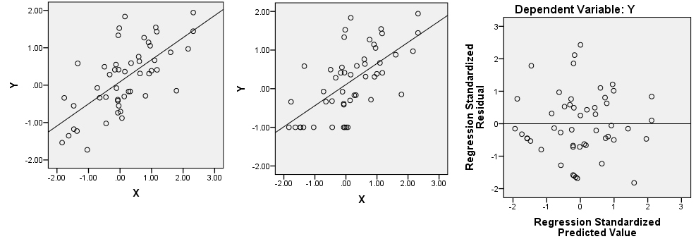
It seems that on some its subrange your dependent variable is constant or is exactly linearly dependent on the predictor(s). Let's have two correlated variables, X and Y (Y is dependent). The scatterplot is on the left.

enter image description here

Let's return, as example, on the first ("constant") possibility. Recode all Y values from lowest to -0.5 to a single value -1 (see picture in the centre). Regress Y on X and plot residuals scatter, that is, rotate the central picture so that the prediction line is horizontal now. Does it resemble your picture?

$\endgroup$
2
  • 8
    $\begingroup$ That is forensic statistics at its best! A big +1. $\endgroup$ Commented Jul 27, 2012 at 13:55
  • $\begingroup$ It turns out you were absolutely right, I had cases where the retweet count was indeed 0 and these ~ 15 cases resulted in those strange residual patterns. i.imgur.com/XGas9.png $\endgroup$
    – plotti
    Commented Jul 31, 2012 at 9:21
4
$\begingroup$

It's not surprising you don't see the pattern in the histogram, the odd pattern spans quite a bit of the range of the histogram and represents only a few data points in each bin. You really need to find out which data points those are and look at them. You could use the predicted values and residuals to find them easy enough. Once you find the values start investigating why those ones might be special.

Having said that, this particular pattern is only special because it's long. If you look carefully at your residuals plot and your quantile plot you'll see it repeats but that it's smaller sequences. Perhaps it really just is an anomaly. Or perhaps it really is a pattern that repeats. But, you're going to have to find where it is in the raw data and examine it in order to have any hope of understanding it at all.

To give you a bit of help, the quantile-quantile plot suggests you have a bunch of identical residuals. It's possible that it could be a coding error. I can generate something similar in R with...

x <- c(rnorm(50), rep(-0.2, 10), rep(0, 4))
qqnorm(x);qqline(x)

Note the flat two flat spots in the line. However, it seems more complex than that because there's an implication that the identical residuals are coming across a range of predictors.

$\endgroup$
3
$\begingroup$

It looks like you are using R. If so, note that you can identify points on a scatterplot using ?identify. I think there are several things going on here. First, you have a very influential point on the plot of LN_RT_vol_in ~ LN_AT_vol_in (the highlighted one) at about (.2, 1.5). This is very likely to be the standardized residual that's about -3.7. The effect of that point will be to flatten the regression line, tilting it more horizontal than the sharply upward line you otherwise would have gotten. An effect of that is that all your residuals will be rotated counterclockwise relative to where they would otherwise have been located within the residual ~ predicted plot (at least when thinking in terms of that covariate and ignoring the other one).

Nonetheless, the apparent straight line of residuals that you see would still be there, as they exist somewhere in the 3-dimensional cloud of your original data. They may be hard to find in either of the marginal plots. You can use the identify() function to help, and you can also use the rgl package to create a dynamic 3D scatterplot that you can rotate freely with your mouse. However, note that the straight line residuals are all below 0 in their predicted value, and have below 0 residuals (i.e., they are below the fitted regression line); that gives you a big hint for where to look. Looking again at your plot of LN_RT_vol_in ~ LN_AT_vol_in, I think I may see them. There is a fairly straight cluster of points running diagonally down and to the left from about (-.01, -1.00) at the lower edge of the cloud of points in that region. I suspect those are the points in question.

In other words, the residuals look that way because they are that way somewhere within the data space already. In essence, this is what @ttnphns is suggesting, but I don't think it's quite a constant in any of the original dimensions--it's a constant in a dimension at an angle to your original axes. I further agree with @MichaelChernick that this apparent straightness in the residual plot is probably harmless, but that your data are not really very normal. They are somewhat normal-ish, however, and you seem to have a decent number of data, so the CLT may cover you, but you may want to bootstrap just in case. Finally, I would worry that that 'outlier' is driving your results; a robust approach is probably merited.
$\endgroup$
3
  • 1
    $\begingroup$ Can this your statement it's a constant in a dimension at an angle to your original axes be comparable with my is exactly linearly dependent on the predictor(s), or you mean something different? $\endgroup$
    – ttnphns
    Commented Jul 29, 2012 at 7:11
  • $\begingroup$ @ttnphns, I missed that part of your answer when I skimmed it; I saw the "constant" & saw the points in your plot, & that's what I took away. Yes, "it's a constant in a dimension... " is logically synonymous w/ "is exactly linearly dependent... ". I now realize that my core point is largely the same as yours (+1), although I think some of my other points (re which data are likely the culprit, R strategies, robust approaches, etc) still contribute something to the discussion. $\endgroup$ Commented Jul 29, 2012 at 13:05
  • $\begingroup$ Sure, your answer contributed a lot, for me. $\endgroup$
    – ttnphns
    Commented Jul 29, 2012 at 13:27
1
$\begingroup$

I would not necessarily say that the histogram is okay. Visually superimposing the best fitting normal on a histogram can be deceptive and your histogrsm could be sensitive to the choice of bin width. The normal probability plot seems to indicate a large departure from normal and even looking at the histogram there seems to my eye to be slight skewness (higher frequency in the [0,+0.5] bin compared to the [-0.5,0] bin) and severe kurtosis ( too large of a frequency in the intervals [-4,-3.5] and [2.5, 3]).

Regarding the pattern you see it may be coming from selective exploring through the scatterplot. It looks like if you hunt some more you can find two or three more lines nearly parallel to the one you picked out. I think you are reading too much into this. But the nonnormality is a real concern. You have one very huge outlier with a residual of nearly -4. Do these residuals come from a least squares fit? I agree that it might be enlightening to look at the fitted line on a scatter plot of the data.

$\endgroup$
2
  • $\begingroup$ I've added the partial plots of the two IV to shed more light on this $\endgroup$
    – plotti
    Commented Jul 27, 2012 at 10:13
  • 1
    $\begingroup$ I would like to see the most basic thing, the fitted line runing through a scatter plot of the data. $\endgroup$ Commented Jul 27, 2012 at 10:15

Your Answer

By clicking “Post Your Answer”, you agree to our terms of service and acknowledge you have read our privacy policy.

Not the answer you're looking for? Browse other questions tagged or ask your own question.