3
$\begingroup$

I'm experiencing strange patterns of residuals. The following chart is a scatterplot of Standard residuals (Sres) versus Fits. I'm interested in the diagonal lines that mean that a higher fit leads to a smaller error.
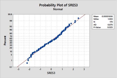
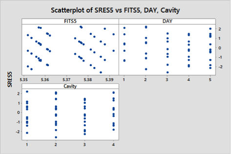
Normal Probability Plot

Scatter Plot

General Factorial Regression: Y versus Cavity, DAY 

Method

Rows unused  10


Factor Information

Factor  Levels  Values
Cavity       4  1, 2, 3, 4
DAY          5  1, 2, 3, 4, 5


Analysis of Variance

Source                 DF    Adj SS    Adj MS  F-Value  P-Value
Model                  19  0.025927  0.001365    33.07    0.000
  Linear                7  0.024252  0.003465    83.97    0.000
    Cavity              3  0.022556  0.007519   182.24    0.000
    DAY                 4  0.001336  0.000334     8.10    0.000
  2-Way Interactions   12  0.000733  0.000061     1.48    0.137
    Cavity*DAY         12  0.000733  0.000061     1.48    0.137
Error                 150  0.006189  0.000041
Total                 169  0.032115


Model Summary

        S    R-sq  R-sq(adj)  R-sq(pred)
0.0064232  80.73%     78.29%      75.29%


Fits and Diagnostics for Unusual Observations

Obs  Y_1_1_1      Fit     Resid  Std Resid
  8  5.37000  5.35800   0.01200       2.09  R
 27  5.34000  5.35375  -0.01375      -2.29  R
 41  5.39000  5.37667   0.01333       2.20  R
 48  5.37000  5.35700   0.01300       2.13  R
 54  5.39000  5.37700   0.01300       2.13  R
 82  5.37000  5.38600  -0.01600      -2.63  R
142  5.40000  5.38778   0.01222       2.02  R
161  5.37000  5.38300  -0.01300      -2.13  R

R  Large residual

Is there a common reason for this behaviour?

The response variable is a diameter of the inner circle fit of a plastic component made by injection. The factors of the ANOVA are the Day of the production and the Cavity since there are 4 cavities in the mould.

$\endgroup$
3
  • $\begingroup$ See stats.stackexchange.com/questions/25068/… for the same phenomenon in Poisson regression. $\endgroup$
    – whuber
    Commented Jan 8, 2015 at 17:13
  • $\begingroup$ Note: one graph shows SRES3 and another SRES5. $\endgroup$
    – Nick Cox
    Commented Jan 9, 2015 at 14:03
  • $\begingroup$ Yup, in 5 i've just deleted some outliers $\endgroup$
    – gmeroni
    Commented Jan 12, 2015 at 9:52

1 Answer 1

4
$\begingroup$

From the definition of residuals $e$ as the differences between observed $y$ and predicted $\hat y$, namely

$e = y - \hat y,$

the residuals for each distinct value of $y$ lie on lines of the form

$\text{value} - \hat y,$

which are parallel and have slope $-1$ on a plotted of residual versus fitted. Such parallel lines are detectable on your residual versus fitted plot. Patterns like these are not usually strange at all, but just side-effects of working (mostly or entirely) with a small number of reported values for the response. The most common examples arise with counted responses, where the possible values might be 0, 1, and so forth. That is not what you have here, but I think you have something similar, but with measured values.

Your residuals have been standardised first in some way, but that should not affect this tendency other than multiplicatively. Alternatively, the small amount of jitter visible on the plot as small departures from parallel lines may arise from some fancy standardisation.

I note that your predicted values vary from about 5.35 to 5.39. It is not clear what the range of the observed values is on the same scale, but I'd conjecture that the original data are values like 5.36, 5.37, etc. and were, mostly or entirely, measured to a resolution of 0.01 in whatever units you were using. Either way, I count 7 distinct lines and guess at the same number of reported values. Alternatively, the plot is consistent with a majority pattern of "rounded" measurements and a sprinkling of supposedly more precise measurements with 3 or more decimal places.

I would like to see the distribution of measured responses, preferably as a table as well as a quantile or similar plot.

I don't endorse the verbal summary that higher fit means smaller error.

$\endgroup$
1
  • $\begingroup$ Perfect explanation, here you can find and individual value plot where you can see the 7 different measurements! Thank you very very much! $\endgroup$
    – gmeroni
    Commented Jan 9, 2015 at 8:16

Your Answer

By clicking “Post Your Answer”, you agree to our terms of service and acknowledge you have read our privacy policy.

Not the answer you're looking for? Browse other questions tagged or ask your own question.