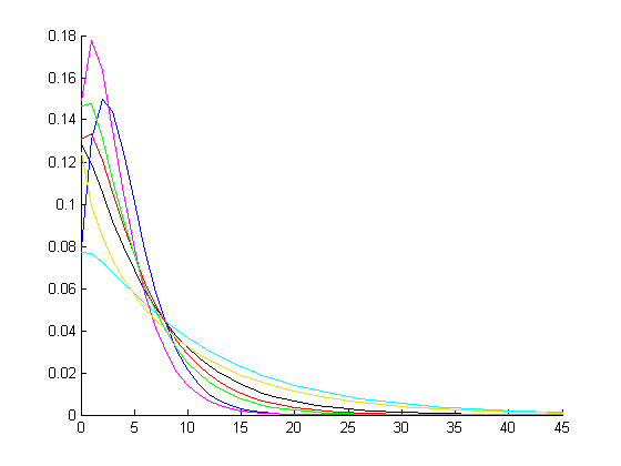
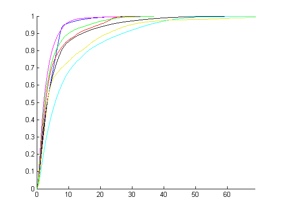
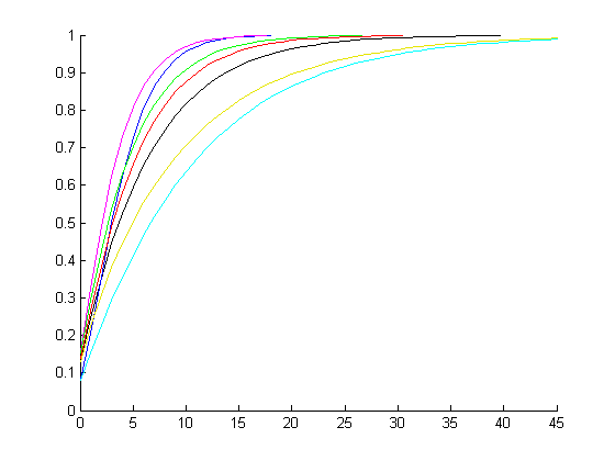
The empirical CDF needs to be treated with care at the end points of the data, and in other places where there is "sparse" data. This is because they tend to make weak structural assumptions about what goes on "in between" each data point. It would also be a good idea to have "dots" for the empirical CDF plot rather than lines, or have the dots superimposed over the lines, so that it is easier to see where most of the data actually is. Another alternative is to put the "dots" for the data over the fitted CDF plot, although there may be too much going on in the plot.
Maybe its a plotting difficulty, but the empirical CDF should look like a staircase or step function (horizontal lines with "jumps" at the observed values). The empirical plots above do not look this way, they appear "smoothed". Maybe they are a "non-parametric" CDF using some kind of plot smoother?
If it is a "non-parametric" CDF then you are basically comparing between to models: the negative binomial and the non-parametric one.
My advice: have a separate plot for each data (each colour on a new graph), and then put the empirical CDF as "dots" where the data was observed, and the fitted negative binomial CDF as a smooth line on the same plot. This would look similar to a regression-style scatter plot with a fitted line. An example of the kind of plot I am talking (which has R-code to create it) is here How to present the gain in explained variance thanks to the correlation of Y and X?)


