0
$\begingroup$

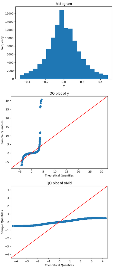
I'm trying to build an GLM regression (10k samples and 50 dimensions). I ran an analysis of the dependent variable since the regression has a normality assumption for the dependent variable.

The QQ plot (mid fig) shows the distribution of y is far away from normal distribution (does it imply a gap in y? I did not find the gap in the histogram (top fig)). After I removed top 3% and bottom 3% of y, the QQ plot (bottom fig) becomes a straight line implying heavy tails.

My questions are: 1. why is QQ plot so sensitive to extreme values? 2. since QQ plot is too sensitive to extreme values or outliers, does it make sense to run QQ plot after removing certain data?

enter image description here

A previous post does not help much.

Update 2023.12.20

It turns out that I confused distribution of the response vs. distribution of residuals. The original purpose of this post is to see if GLM is appropriate in my application. I know now that I should have used residuals rather than ys for normality check.

$\endgroup$
7
  • $\begingroup$ The only thing that doesn't make sense in your post is "removing certain data". The QQ-plot does what it ain't: it shows empirical quantiles against theoretical ones. $\endgroup$
    – utobi
    Commented Dec 18, 2023 at 7:45
  • 1
    $\begingroup$ Your histogram seems mightily truncated. If I understand correctly, your outcome varies from about $=7$ to about $31$, but the histogram shows only a small fraction of that range. Ditto: "10K samples" seems to mean a sample size of 10000, but there are more like 100000 data points in the histogram if "frequency" means what it says. $\endgroup$
    – Nick Cox
    Commented Dec 18, 2023 at 12:05
  • $\begingroup$ Should be $-7$ above. $\endgroup$
    – Nick Cox
    Commented Dec 18, 2023 at 12:32
  • 1
    $\begingroup$ It would be very illuminating to see scatterplots of your predictor x outcome relationships and would enable answerers to assist. $\endgroup$ Commented Dec 18, 2023 at 13:53
  • $\begingroup$ @NickCox Good spotting on the histogram! I didn't even notice that. $\endgroup$
    – Peter Flom
    Commented Dec 18, 2023 at 14:23

1 Answer 1

3
$\begingroup$

First, regression does NOT assume the dependent variable is normally distributed. It makes assumptions about the errors, which we look at by examining residuals.

Second, the QQ plot is sensitive to outliers because it is supposed to be. They are not "too sensitive" to outliers, they are appropriately sensitive to them. You have five (I think it's five) points that are very far from what the normal distribution would be.

Third, histograms aren't great graphs. Yeah, I know, they are very, very common, but see this thread. There is a quote from Cleveland, something like "ubiquity and longevity are not signs of utility and histograms will not be seen in this book".

Finally, while I won't say it's never sensible to use a quantile normal plot after removing a bunch of points, it's not a good general policy.

$\endgroup$

Your Answer

By clicking “Post Your Answer”, you agree to our terms of service and acknowledge you have read our privacy policy.

Not the answer you're looking for? Browse other questions tagged or ask your own question.