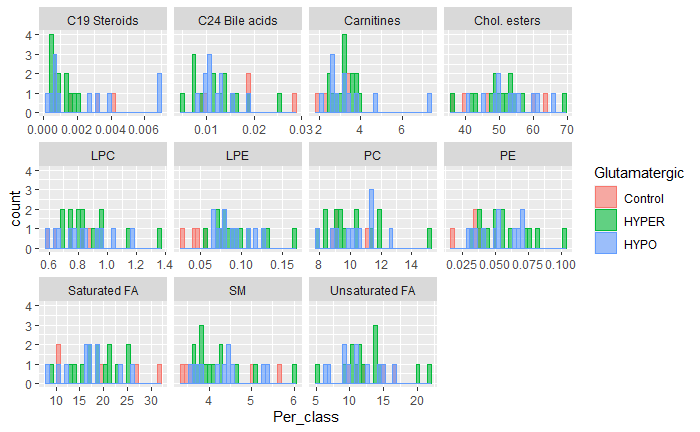
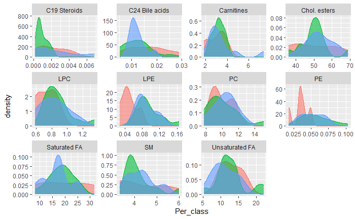
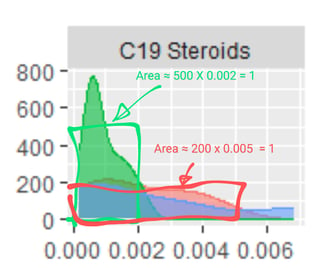
The bottom line (here at the top) is that the vertical scale in the second series of plots is probability density, which not only is not the count or frequency in any bin, it is not probability either. It is the probability per unit, where the unit (of measurement) is the unit of whatever is plotted on the horizontal axis.
The rule is that the probability density (probability per unit) adds (strictly, integrates) to 1 over the total support. To see this, think of a uniform (rectangular, flat) distribution on [0, 1]. The range is 1, the probability density is constant at 1, and
total probability = average density over the range $\times$ the range
OR
1 = 1 (this average is easy, as density is constant) $\times$ 1.
Now halve the variable so that the distribution is on [0, 0.5]. The total probability remains the same and so the average density must double to 2. Or double it, and the converse is observed.
Checking out your second series of plots underlines that as the horizontal range increases numerically, even though the specific units may well vary from plot to plot, so also the typical densities decrease. This inverse relationship arises from the fact that total probability is constant at 1.
The top left distribution has a range of about 0.007, so the average density must be about 1/ 0.007 or about 140, which does not quite match the numbers on the probability density axis. At the same time, it seems that the plots are all truncated, so the set-up is presumably complicated by that at least.
In principle, this is nothing whatever to do with your use of R or ggplot2. It is standard statistically.
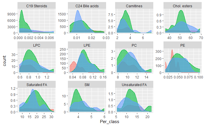
Important detail: What the third series of plots shows is not so clear to me. Perhaps it is frequency density.
One way to check what any routine does is to feed it a very simple dataset for which you can work out in advance what the results should be. E.g. 100 values of integers 0 to 9 with equal frequencies of 10.

