0
$\begingroup$

I was reading the hypertools docs and came across this pictorial that shows 10 clusters (some seem to share very similar coloring) generated from some (mushroom) data. I was wondering what in the K-Means algorithm would cause these clusters to overlap. For instance, you can see some red patches surrounded/separated by green and also blue patches in between pink:
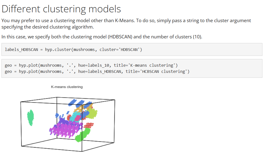
enter image description here Link to the hypertools docs.

$\endgroup$
4
  • 2
    $\begingroup$ Well, they overlap in the 3 dimensions being shown here, but the data has 22. $\endgroup$
    – PBulls
    Commented Mar 1 at 8:47
  • $\begingroup$ Are you able to deduce something useful from such a visualization? $\endgroup$ Commented Mar 1 at 12:21
  • 1
    $\begingroup$ It's the most dimensions you can visualize in a somewhat interpretable way, so it really comes down to which dimensions you choose (I believe the hypertools.plot method shows the first principal components by default). $\endgroup$
    – PBulls
    Commented Mar 1 at 13:29
  • $\begingroup$ Got it, thank you :) $\endgroup$ Commented Mar 1 at 13:39

0

Your Answer

By clicking “Post Your Answer”, you agree to our terms of service and acknowledge you have read our privacy policy.

Browse other questions tagged or ask your own question.