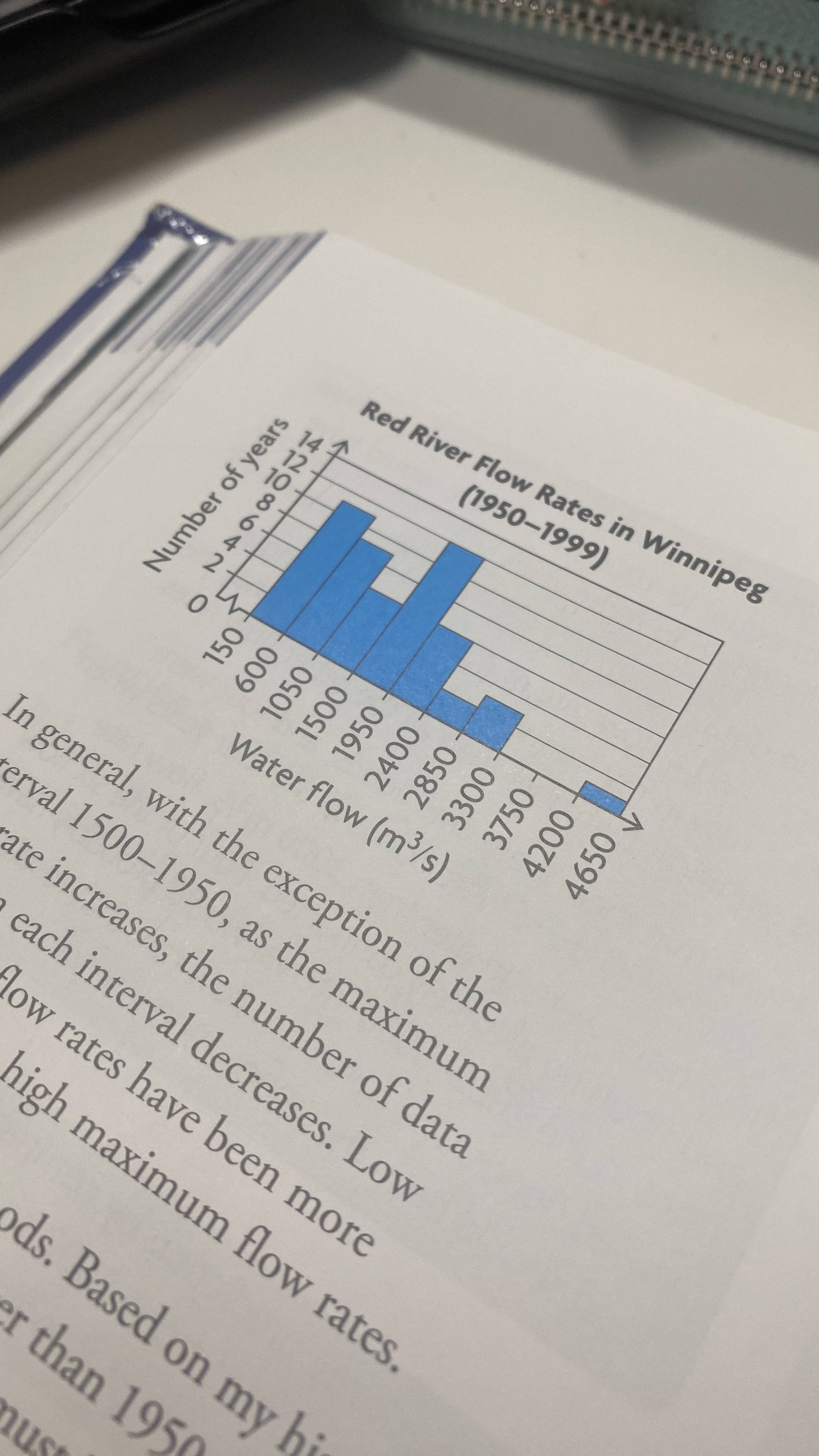
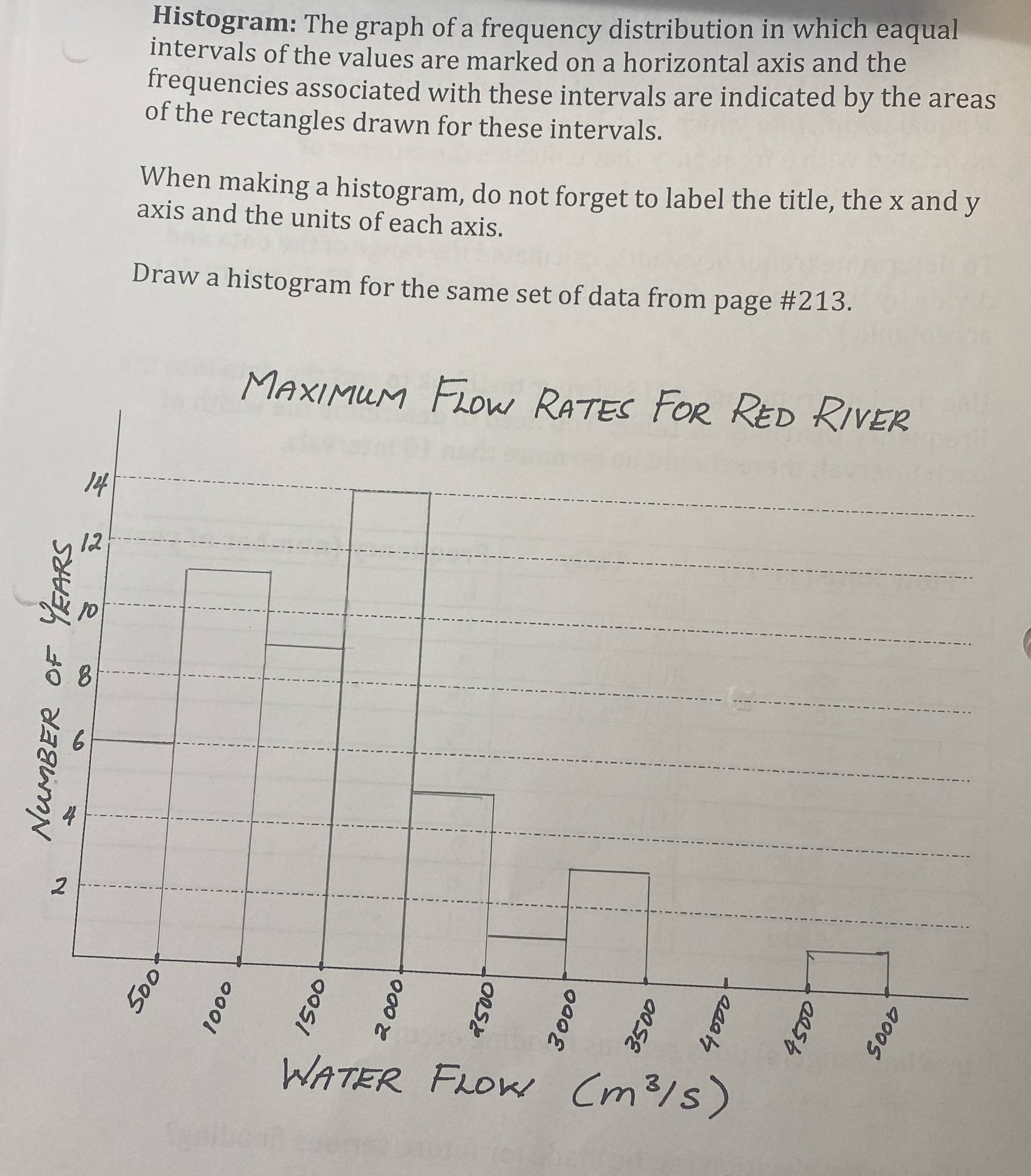
My friend asked me about histograms and sent me some examples given by their teachers and in the textbook. It is not like the histograms that I've learned at all. I was taught that the quantity represented by the area of the bars and the height of the bars represent frequency density and are calculated from bar width (for example, I would expect the "number of years" from image 2 to be represented by area of the bars, and not the y axis). Am I missing something? Image one is from a textbook while image two is from a worksheet.
3 Answers
Histograms can be used to represent frequency (as in the examples you showed) or density.
Like you I was taught density histograms only, but frequency histograms are in very common use (and are the default in R, as well as an option in Stata) so I think both are acceptable.
It is important to distinguish whether frequency or density is being plotted, and to use only density not frequency if bin widths are variable.
-
5$\begingroup$ We can add that histograms might show proportions or percents. $\endgroup$– Nick CoxCommented Mar 8 at 12:56
-
1$\begingroup$ How is density in a histogram defined? As a percentage of the whole sample belonging into a single bar? $\endgroup$ Commented Mar 8 at 21:35
-
1$\begingroup$ @Athaeneus, it is better to ask as a new question, but yes, if you divide each frequency / bin count by N, you get the proportion of the sample that falls within the bin's limits. That is a simple and coarse-grained estimate of the density. $\endgroup$ Commented Mar 9 at 13:16
I think there is an ambiguity about what the "number of years" refers to. If it referred to a six year period, and then an eleven year period, etc., then the plots would not meet the definition of a histogram. I am guessing that each observation is the flow rate that occurred within some year. There were six different years (each counting as one observation in the dataset) in which the flow rate was between $0 - 500\ m^3/s$. Thus, "number of years" is really a frequency of the binned values within the dataset. They could have written "frequency" on the y-axis instead of "number of years". That would probably have avoided the confusion. As @George Savva notes, it is also perfectly valid to divide the frequencies by the number of values in the dataset and put proportions / densities on the y-axis.
-
4$\begingroup$ Indeed. From knowing this kind of data very well, it is clear that data for a series of years is being reduced to one maximum for each year, but that does need to be explained clearly for everyone to understand the examples. $\endgroup$– Nick CoxCommented Mar 8 at 13:00
-
$\begingroup$ @NickCox, it definitely needs to be explained to me. I can see the OP's confusion, b/c I am not familiar w/ this kind of data. Until your comment, it didn't occur to me that these would be maximums--I figured they would be averages. I can certainly imagine the authors think it didn't need to be explained much, b/c their intended audience would already be familiar with this, but I would argue there should be at least minimal explanation anyway. That's what I teach to health science students. $\endgroup$ Commented Mar 8 at 15:43
-
1$\begingroup$ Assuming that everyone has knowledge, indeed expertise, in your field can afflict us all. I am puzzled here by "flow rate" because in my reading "(river) discharge" is by far the more common hydrological term; in other contexts, e,g, medical, discharge may sound like something that is between worrying and disgusting. $\endgroup$– Nick CoxCommented Mar 8 at 18:22
How narrowly you want to define the term "histogram" is, I think, up to you. I'd say "yes, they are close enough to histograms that I would call them 'histograms'" but others may disagree.
I don't think the precise label of the figure matters as much as whether it is a good representation of the data and that it represents the points you want to emphasize.
In general, histograms (and similar) aren't that great (although they are very common). William S. Cleveland in his seminal book Visualizing Data says this:
The histogram is a widely used graphical method that is at least a century old. But maturity and ubiquity do not guarantee the efficacy of a tool. The histogram is a poor tool for comparing groups of univariate measurements.
(p. 8).
While it may be that the authors of these graphs are not trying to compare groups of data, I think Cleveland's point applies: Even if you aren't explicitly comparing groups of data, any representation like this is asking the reader to compare this data to something.
Other problems with histograms are that changing the bin width or the starting value can have dramatic effects on how the data look. But the data should look like the data, regardless of these.
For these particular graphs, neither one makes the bins explicit, but there are bins.
-
5$\begingroup$ Strong agreement on this. I even teach how to deal with river flow data as in the question and always mention histograms before moving on to quantile plots for serious work. $\endgroup$– Nick CoxCommented Mar 8 at 12:59


