I'm new here, and somewhat of a lay-user in terms of statistics, and hoping this question will be at the appropriate place.
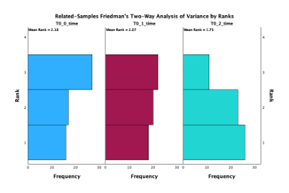
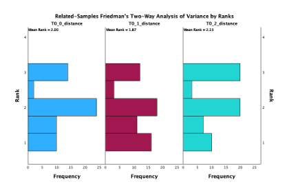
I'm running the mentioned analysis in SPSS on 3 iterations of an experiment I ran. Most compared metrics are shown in graphs similar to this, with the expected ranking across the 3 iterations.
However, in some cases, for some metrics, I'm getting graphs that show 4 bars instead of the expected 3.
As I can't find any information regarding this, I'm hoping someone can help me understand what this means/represents. Many thanks.


