There are myriad possibilities.
One option I have seen used which avoids confusion with boxplots (assuming you have medians or original data available) is to plot a boxplot and add a symbol that marks the mean (hopefully with a legend to make this explicit). This version of the boxplot that adds a marker for the mean is mentioned, for example in Frigge et al (1989) [1] :
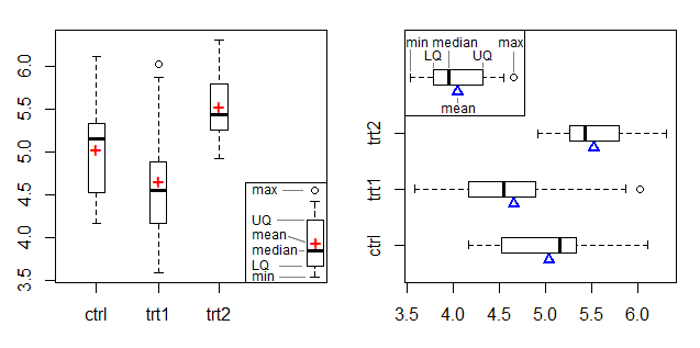
The left plot shows a + symbol as a mean marker and the right plot uses a triangle at the edge, adapting the mean marker from Doane & Tracy's beam-and-fulcrum plot [2].
See also this SO post and this one
If you don't have (or really don't want to show) the median a new plot will be needed and then it would be good for it to be visually distinct from a boxplot.
Perhaps something like this:
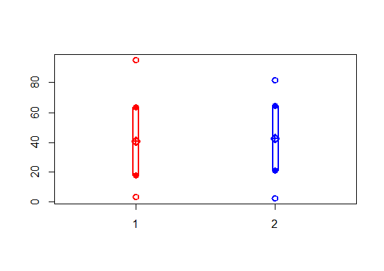
... which plots the minimum, maximum, mean and mean $\pm$ sd for each sample using different symbols and then draws a rectangle, or perhaps better, something like this:
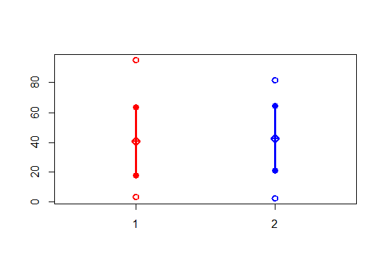
... which plots the minimum, maximum, mean and mean $\pm$ sd for each sample using different symbols and then draws a line (in fact at present that's actually a rectangle as before, but drawn narrow; it should be changed to drawing a line)
If your numbers are on very different scales, but are all positive, you might consider working with logs, or you might do small multiples with different (but clearly marked) scales
Code ( presently not particularly 'nice' code, but at the moment this is just exploring ideas, it's not a tutorial on writing good R code):
fivenum.ms=function(x) {r=range(x);m=mean(x);s=sd(x);c(r[1],m-s,m,m+s,r[2])}
eps=.015

plot(factor(c(1,2)),range(c(A,B)),type="n",border=0)
points((rep(c(1,2),each=5)),c(fivenum.ms(A),fivenum.ms(B)),col=rep(c(2,4),each=5),pch=rep(c(1,16,9,16,1),2),ylim=c(range(A,B)),cex=1.2,lwd=2,xlim=c(0.5,2.5),ylab="",xlab="")
rect(1-1.2*eps,fivenum.ms(A)[2],1+1.4*eps,fivenum.ms(A)[4],lwd=2,col=2,den=0)
rect(2-1.2*eps,fivenum.ms(B)[2],2+1.4*eps,fivenum.ms(B)[4],lwd=2,col=4,den=0)

plot(factor(c(1,2)),range(c(A,B)),type="n",border=0)
points((rep(c(1,2),each=5)),c(fivenum.ms(A),fivenum.ms(B)),col=rep(c(2,4),each=5),pch=rep(c(1,16,9,16,1),2),ylim=c(range(A,B)),cex=1.2,lwd=2,xlim=c(0.5,2.5),ylab="",xlab="")
rect(1-eps/9,fivenum.ms(A)[2],1+eps/3,fivenum.ms(A)[4],lwd=2,col=2,den=0)
rect(2-eps/9,fivenum.ms(B)[2],2+eps/3,fivenum.ms(B)[4],lwd=2,col=4,den=0)
[1] Frigge, M., D. C. Hoaglin, and B. Iglewicz (1989),
"Some implementations of the box plot."
American Statistician, 43 (Feb): 50-54.
[2] Doane D.P. and R.L. Tracy (2000),
"Using Beam and Fulcrum Displays to Explore Data"
American Statistician, 54(4):289–290, November

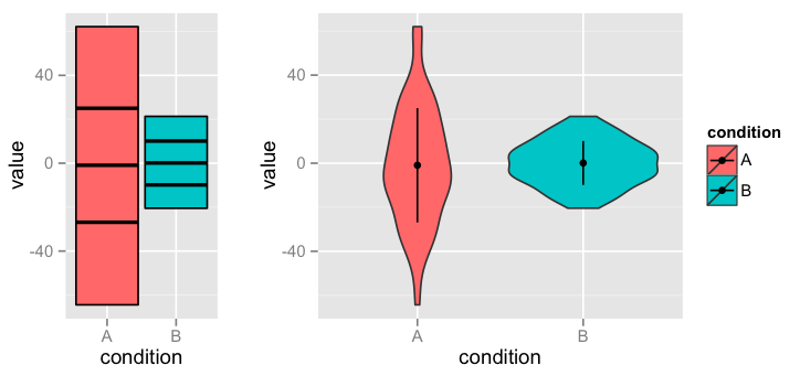


Rcommands then this question is off-topic here. But it seems you are asking primarily about what a good plot would look like and secondarily about how to create it. If so, I suggest deleting "with R" from your title and maybe stating, in the body, that you haveRavailable. $\endgroup$