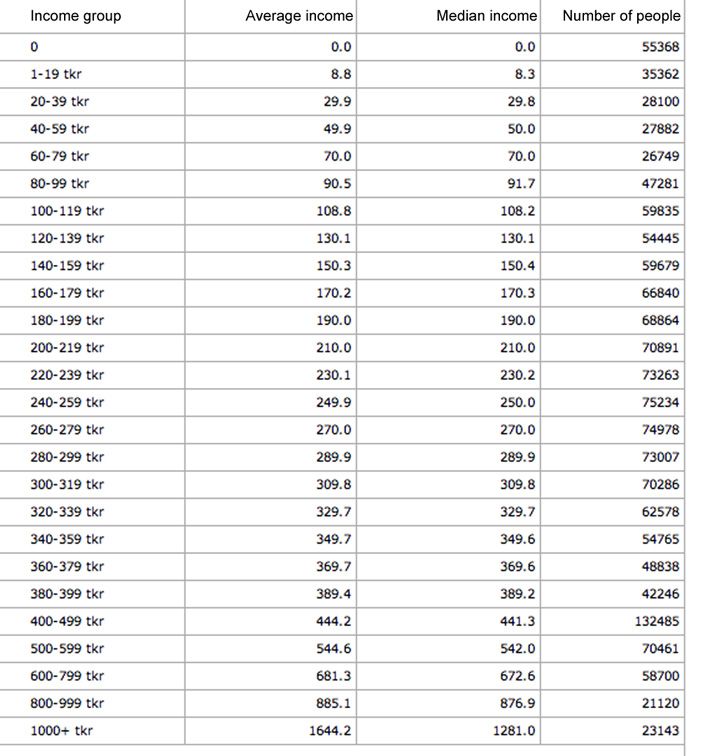
I would like to plot the attached
as an area chart: 
As you can see, personal income is divided into 26 intervals of varying width. I also have the average and mean income in the intervals.
To convey a truthful area graphic of this data, I wonder what my options really are?
Plotting the ordinal categorical data at hand would yield a big hump in the area chart for the 400-499 interval. But this is only because that interval is wider and the user can hence be misguided by the shape. Another issue with the categorical data is that the average of the "1000+ interval" is very far from 1000 (= 1644). An area graphic not taking this into account would do a bad job in showing the actual distribution.
How would you go about and is there any way in which I can use the average/mean to "convert the categorical scale to a continuous scale"?


