Is there a handy plot for comparing the variance-covariance matrices of two (or perhaps more) groups? An alternative to looking at lots of marginal plots, especially in the multivariate Normal case?
-
6$\begingroup$ Corrgrams? Ellipses? $\endgroup$– Andy WCommented May 19, 2013 at 13:43
-
1$\begingroup$ Something smart like assessing multivariate Normality by putting squared Mahalanobis distances on a quantile-quantile plot against the chi-squared distribution. $\endgroup$– Scortchi ♦Commented May 19, 2013 at 15:44
-
2$\begingroup$ Well, at least we are getting somewhere! Here are two questions (Q1 & Q2) that mention a Box M test that may be of interest. You may be able to decompose that test to provide the plot you want, not sure though (this is getting beyond anyway I can help though!) $\endgroup$– Andy WCommented May 20, 2013 at 19:36
-
3$\begingroup$ Came across this old question of yours. For two covariance matrices $S_1$ and $S_2$, I am wondering if one can compute $S_1^{-1} S_2$ that should be close to $I$ if $S_1 \approx S_2$, so one can plot the eigen-spectrum of this product and visually check how close it is to the horizontal line. Perhaps one can compute and plot, for comparison, the expected eigen-spectrum under the null: it will not be a flat line due to the finite sample size. I don't know how to compute it analytically given $n_1$, $n_2$, and $p$ (starting with Marchenko-Pastur?), but it should be easy to estimate numerically. $\endgroup$– amoebaCommented Sep 23, 2015 at 23:27
-
1$\begingroup$ @amoeba: Thanks; that sounds like an interesting approach. For more than two matrices, perhaps a 2x2 grid of eigen-spectra. I've also got two papers on the subject mouldering in my desk pile; & I need to think about decomposing the Box M-test. $\endgroup$– Scortchi ♦Commented Sep 25, 2015 at 9:15
1 Answer
An article Visualizing Tests for Equality of Covariance Matrices, by Michael Friendly and Matthew Sigal, has just appeared in print in The American Statistician (Volume 74, 2020 - Issue 2, pp 144-155). It suggests several graphical procedures to compare covariance matrices.
The authors' R package heplot supports these procedures. The illustrations in this post are modifications of those in the article based on the supplemental code maintained at https://github.com/mattsigal/eqcov_supp/blob/master/iris-ex.R. (I have removed some distracting graphical elements.)
Let's go there step by step, using the well-known Iris dataset, which will require us to compare three covariance matrices of $d=4$ variables.
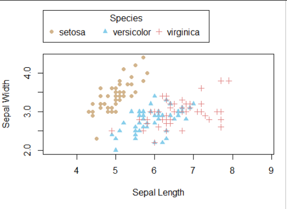
Here is a scatterplot of two of its four variables with symbol size and color distinguishing the three species of Iris.
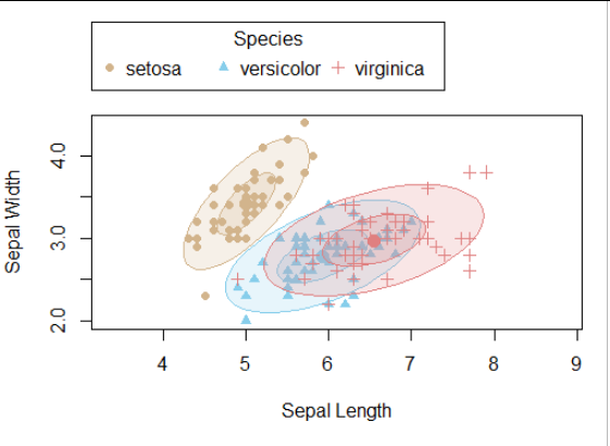
As usual, the first two bivariate moments of any group can be depicted using a covariance ellipse. It is a contour of the Mahalanobis distance centered at the point of means. The software shows two such contours, presumably estimating 68% and 95% tolerance ellipses (for bivariate Normal distributions). (The contour levels are found, as usual, by referring to quantiles of a suitable chi-squared distribution.)
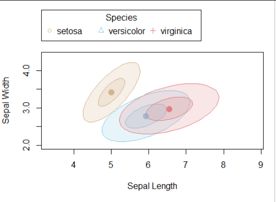
Provided the data don't have outliers and strong nonlinearities, these provide a nice visual summary, as we can see simply by erasing the data:
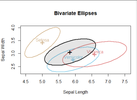
The first innovation is to plot a pooled covariance ellipse. This is obtained by first recovering the sums of squares and products matrices upon multiplication of each covariance matrix by the degrees of freedom in its estimation. Those SSP matrices are then summed (componentwise, of course) and the result is divided by the total degrees of freedom. We may distinguish the pooled covariance ellipse by shading it:
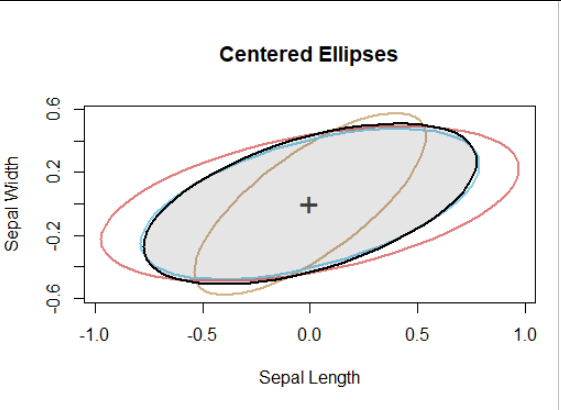
The second innovation translates all ellipses to a common center:
For example, the Virginica covariance is similar to the Versicolor covariance but tends to be larger. The Setosa covariance is smaller and oriented differently, clearly distinguishing the Setosa sepal width-length relationship from that of the other two species.
(Note that because the contour level (such as 68% or 95%) merely rescales all ellipses equally, the choice of which level to use for this plot is no longer material.)
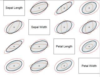
The final innovation emulates the scatterplot matrix: with $d \gt 2$ variables, create a $d\times d$ array doubly indexed by those variables and, in the cell for variables "X" and "Y," draw all the covariance ellipses for those two variables, including the pooled ellipse. Distinguish the covariances graphically using the line style for the contours and/or a fill style for the polygons they bound. Choose a relatively prominent style for the pooled ellipse: here, it is the only one that is filled and it has the darkest boundary.
A pattern emerges in which the Setosa covariance matrix departs from those for the other two species and that of Virginica (still shown in red) tends to exhibit larger values overall.
Although this "bivariate slicing" approach doesn't allow us to see everything that's going on in these covariance matrices, the visualization is a pretty good start at making a reasoned comparison of covariance matrices. Further simplification of the graphical representation is possible (using design principles inspired by, say, Tufte or Bertin) and, I think, likely to make this approach even more effective.
When $d$ grows large (in my experience, greater than $8$ becomes unwieldy unless you're willing to produce output on a high-resolution large-format printer, but even then $40$ is around an upper limit), some kind of variance reduction technique is called for. Friendly and Sigal explore PCA solutions. Of interest are the applications that focus on the principal components with smallest eigenvalues.
-
1$\begingroup$ Why is it considered important for the pooled elipse to be more prominent? To me that seems to make it harder to see the distinctions amongst the rest, especially in the smaller panels w/ a plot matrix. (However, I haven't seen it the other way, it may well be worse for different reasons.) Regarding the issue of too many variables to see in a plot matrix, one possibility is to break out sections of the matrix. I did that in my answer to How to extract information from a scatterplot matrix when you have large N, discrete data, & many variables? $\endgroup$ Commented Jun 2, 2020 at 16:54
-
$\begingroup$ @Gung The pooled ellipse is a reference. It deserves the same kind of visual prominence as any reference, such as the box of a boxplot. Although displaying blocks of a large matrix is what one often must resort to, it is less than satisfactory because it ruins the gestalt of seeing the entire thing. $\endgroup$– whuber ♦Commented Jun 2, 2020 at 17:48

