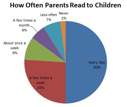
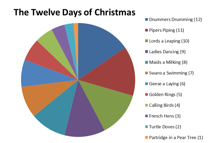
Should we put the legend on the side of the chart, or place it directly into the pie? Here are two example of this:


Should we put the legend on the side of the chart, or place it directly into the pie? Here are two example of this:


Generally, the evaluation criteria are:
1) Which design minimizes eye travel?
Compared to the second one, the first one requires less cross checking. Readers can look at the pie segment and then the neighboring label and get the information. The second one is not as convenient, as readers have to look at the color, memorize it, and then match the one on the side.
Another big problem about option 2 is that there are too many colors with similar hues. Although the label is aligned according to the pie segments, it's still confusion. Better to break them down into more contrasting hues, or with more contrasting saturations.
2) Which design is more robust against photocopying as black and white?
Your chart may be printed out in black and white. So, we should be mindful if the chart may loses its function in its black and white format. In this case, option will likely fail because the similar hues will appear as the same shade of gray.
And lastly, for 12 attributes, pie chart is a very bad choice. One of the criteria for objective comparison is that every attribute should have a common scale. In pie chart, each pie segment is angled differently, making it hard to actually compare, say, pie segment 3 and pie segment 7. Bar chart will be a much better choice, because by breaking them into bars, you don't need color any more.
The answer is really to do whatever aids the reader in interpreting the data correctly. So if there are many categories, like in this example, the first option might be better. But if inserting the names and percentages into the chart impact their readability (also a matter of font choice and colour), maybe consider presenting it a different way (like a bar chart as Pj_ suggested).
I'm sure there are many great resources out there and I'm by no means an expert, but a quick scan of this presentation highlights some of the things I've been taught over the years: