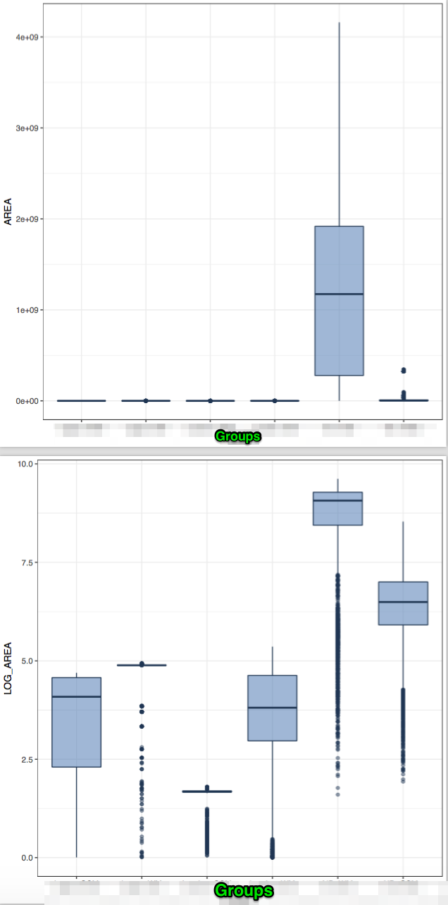
I have a set of area measurements for objects in different groups (e.g., cities), and I want to provide a visual summary of them. While Quartiles and medians are quite interpretable, I'm trying to use boxplots and I get the following plots. The first is the area measurements, and then the same values logged in base 10.
As the first plot is uninformative because of the fifth group, I decided to log the results, but I get very many low-value outliers. This is odd, as the distribution of this data is expected to be some power low, with many small values and a few large ones. I would expect outliers with high values, not with low ones.
Any suggestions on how to present this data more meaningfully?
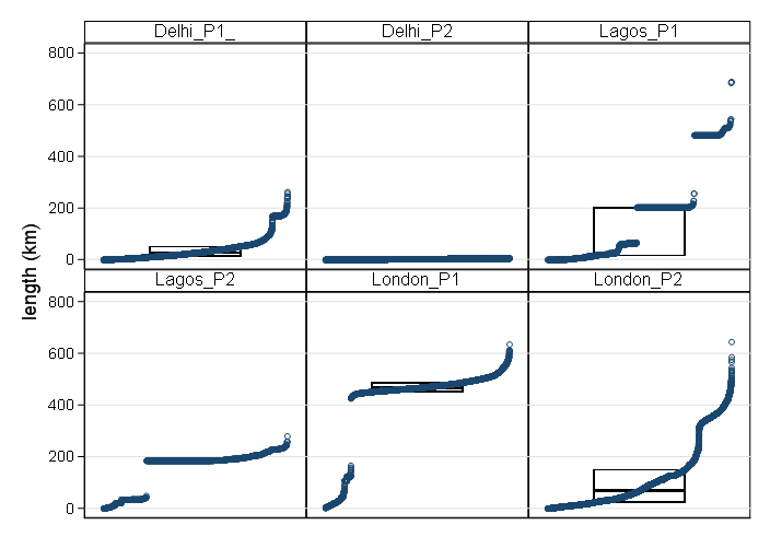
EDIT: full dataset available here in CSV format.


