3
$\begingroup$

A normal probability plot is defined as a plot of $n$ pairs:

($[100(i-0.5)/n]$ th $z$ percentile, $i$th observation).

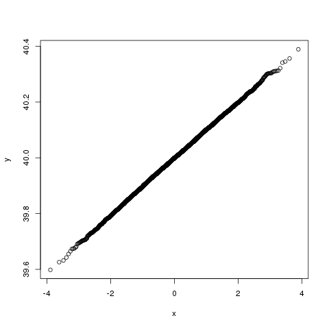
Theoretically the points should fall close to a straight line with slope $\sigma$ and intercept $\mu$, the population sd and mean of the observed random variable. But as shown in simulation results with R, the intercept seems always lower than $\mu$, why?

Here is the R code that I used:

    simu = function(n) {
        y = sort(rnorm(n, 40, .1))
        yperc = ((1:n)-.5)/n
        x = qnorm(yperc)
        plot(x,y)
    }
    simu(10000)

And the plot I get:
enter image description here

Also, the points in the middle always look denser than those on the two sides, why?


The link @whuber gave in the comments is really helpful. I will just write down some notes here for future reference. Imposing a linear percentage function on the orders, and under the restriction of symmetry, we have $f(i) = ai + b$, $f(n+1-i) = a(n+1-i) + b$, also $f(n+1-i) + f(i) = 1$, combining these, we get $a(n+1) + 2b = 1$, giving $a$ an arbitrary value of $1/n$, then $b$ has to be equal to $-0.5/n$.

$\endgroup$
5
  • 4
    $\begingroup$ (1) It is clear there is no bias, because ((1:n)-0.5)/n is reversed under the transformation $x\to 1-x$ and so is the inverse CDF of any symmetric distribution such as the Normal. So, what evidence do you have about a biased "intercept"? Are you computing it correctly? In your example the intercept looks perfectly accurate. (2) If the points in the middle were not denser, then the Normal distribution would be a uniform distribution. $\endgroup$
    – whuber
    Commented Feb 28, 2013 at 18:47
  • 1
    $\begingroup$ Why should the intercept be mu? I suppose it should be equal to the sample mean (which can be lower or higher than mu). $\endgroup$
    – ttnphns
    Commented Feb 28, 2013 at 20:46
  • 1
    $\begingroup$ @ttnphns You've almost got it. The intercept actually is the sample median, practically by definition. $\endgroup$
    – whuber
    Commented Feb 28, 2013 at 20:53
  • $\begingroup$ @whuber what is the rationale behind the $-0.5$? $\endgroup$
    – qed
    Commented Apr 8, 2013 at 16:50
  • 3
    $\begingroup$ Symmetry: see the section "Percentiles and EDF Plots" at quantdec.com/envstats/notes/class_02/… $\endgroup$
    – whuber
    Commented Apr 8, 2013 at 16:58

1 Answer 1

7
$\begingroup$

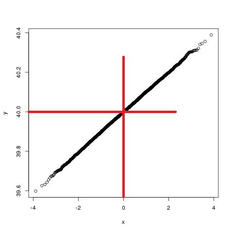
Note that the axis on which you find the intercept isn't at the left side of your plot but in the middle:

plot with intercept marked

Also, the points in the middle always look denser than those on the two sides, why?

Because the data (and the distribution from which you obtain your expected order statistics) are normal, not uniform.

Try this on your y:

 stripchart(y,pch=1)

or investigate the use of the function rug.

The data are more dense in the middle quite literally because the density (as in 'pdf') is higher there - the word 'density' in 'probability density function' is no accident. The effect you observe relating to the density of the data is exactly what it means - the density of points is higher in the middle because you drew from a distribution whose density is higher there, and the sample reflects the population.

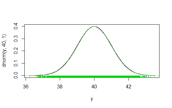
An example - the black line is the population density, the green vertical lines in the margin (the rug plot) and the green dotted kernel density estimate represent the density of the sample in two different ways:

density

- code:

y <- sort(rnorm(10000,40,1))
plot(dnorm(y,40,1)~y,type="l")
lines(density(y),col=3,lty=3)
rug(y,col=3)

In short, the points in the plot are denser in the middle because you made them to be.

$\endgroup$

Your Answer

By clicking “Post Your Answer”, you agree to our terms of service and acknowledge you have read our privacy policy.

Not the answer you're looking for? Browse other questions tagged or ask your own question.