16
$\begingroup$

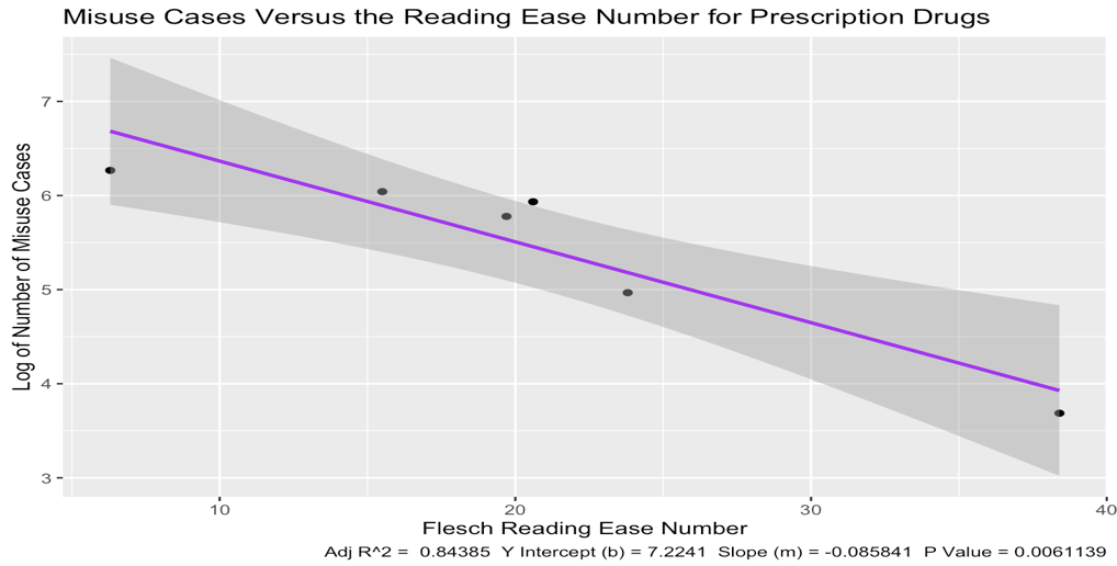
I thought that we assume i.i.d and therefore identically distributed (constant variance) over the line? But aren't the below saying that technically the distribution changes from one X value to another?

Example images of confidence intervals:

enter image description here

enter image description here

I thought that we assume i.i.d and therefore identically distributed (constant variance) over the line? But aren't the above saying that technically the distribution changes from one X value to another?

Edit

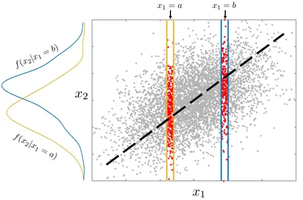
I think what I'm saying may be better described by the below image.

If we had enough data and could theoretically make a slice at each value of x_1, so as to obtain a theoretical conditional probability distribution of x_2 | x_1, wouldn't we expect this distribution to be the same around the best fit line for all x_1, for it to satisfy i.i.d? In the case of say normally distributed prediction intervals that widen as we go further from the centre of the data, it seems to me that we're suggesting the variance is not constant and therefore the distributions are not identical for all x.

Sorry if this makes no sense.

enter image description here

$\endgroup$
4
  • $\begingroup$ Sort of, I'm asking if the distribution obtained from sliding a small segment along x_1 -- centred around the best fit line -- has the same distribution? By "around the best fit line", that is too say that if we were to plot the distributions of the residuals around that black line for both x_1 = a and x_1 = b, then we would see that the blue and yellow conditional pdfs are the same. Sorry I know I'm explaining this poorly $\endgroup$ Commented Feb 2, 2023 at 17:20
  • $\begingroup$ A graphical analysis like the one I present at stats.stackexchange.com/a/354256/919 for a more complicated situation will give you immediate intuition: when you slide a line around the scatterplot among the positions that make it a plausible fit, you will see it tends to rotate around a central point (the point of averages) and move up and down just a little bit. The resulting envelope is a pair of hyperbolas. Obtaining a pair of parallel lines, as you seem to intuit, could occur only when the errors are all perfectly positively correlated. $\endgroup$
    – whuber
    Commented Feb 3, 2023 at 0:39
  • $\begingroup$ You are missing the fact that the slope and intercept you're plotting are estimate from data. If you knew the exact value of the slope, then you'd indeed have two parallel lines as your confidence intervals. $\endgroup$ Commented Feb 3, 2023 at 18:27
  • 1
    $\begingroup$ Great old answer here $\endgroup$
    – feetwet
    Commented Nov 3, 2023 at 17:33

4 Answers 4

11
$\begingroup$

I think i can give a more mathematical answer then the two already provided.

You are fitting a linear model $Y = X\beta + \epsilon$. $X$ being a design matrix $\epsilon \sim N(0, \sigma_\epsilon)$. The estimators of your model parameters $\hat\beta$ have an estimated covariance matrix $\hat{\Sigma}_\beta$, from which the standard error of $ \hat E(Y|X=x) = \hat y(x) = x^T\hat\beta$(with $X$ now being a general stand in for the independent variables) can be calculated with $$ SE(\hat y(x)) = \sqrt{x^T\hat{\Sigma}_\beta x} $$

This will almost never be a constant, so the width of your confidence interval will vary.

Now for the predictive interval you assumed that $(Y|X=x) \sim N(\hat y(x), \hat\sigma_\epsilon)$, but you should have included the uncertainty about $\hat y(x)$, so $(Y|X=x) \sim \text{Student_t}\left(\mu = \hat y(x), \sigma =\sqrt{\hat\sigma_\epsilon^2 + SE(\hat y(x))^2}, \nu = \text{model residual df} \right)$

Here is some R code to illustrate the point:

n <- 50
x <- rnorm(n)
y <- 0.5*x + rnorm(n, sd = 1) 

m <- lm(y ~x)
x_help <- seq(-4, 4, length.out = 1000)

sum_m <- summary(m)
res.sig <-sum_m$sigma
df_conf <-  as.data.frame(predict(m, newdata = data.frame(x = x_help), interval = "conf", se.fit = T))
df_pred <- as.data.frame(predict(m, newdata = data.frame(x = x_help), interval = "predict"))
plot(x_help, df_pred$upr - df_pred$lwr, 
     ylim = c(2*qnorm(0.975)*res.sig, max( df_pred$upr - df_pred$lwr)),
     ylab = "Width of 95%-prediction intervall")
abline(v = mean(x))
# naive straight 
abline(h = 2*qnorm(0.975)*res.sig)
# adding variances, but normal distribution is wrong
lines(x_help, 2*qnorm(0.975)*sqrt(res.sig^2 + df_conf$se.fit^2))
# using t-distribution
lines(x_help, 2*qt(0.975, df = n - 2)*sqrt(res.sig^2 + df_conf$se.fit^2), col = 2) 

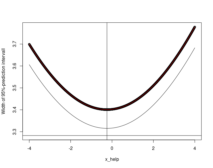
and here is the resulting figure: Thick black the width of prediction interval produced, thin black to approaches that underestimate and in red the correct method

$\endgroup$
0
13
$\begingroup$

Both bands are created by uncertainty in both intercept and slope.

If the intercept were a bit higher (or lower), the entire line would move up (or down).

If the slope were a bit steeper (or shallower), the line wouldn't move much in the middle of the graph, but would move a lot at the ends.

Sum those together and you get the fourth graph you included in your question. That graph shows linear regression fitting both slope and intercept. Your first graph is nonlinear regression. Your second and third are linear regression fitting only the slope but constraining the intercept to a fixed value (origin).

$\endgroup$
5
$\begingroup$

Lukas has already given a very comprehensive mathematical explanation. I just want to add a quick note about a misunderstanding in your question. The linear regression model assumes IID errors on the dependent variable $y$, for a given model $\beta$, i.e. $p(y|x,\beta)$. The prediction intervals you are looking at are most likely representative of something like the posterior predictive distribution, which provides a distribution of possible unobserved values conditional on the observed values. In other words, given some training data $(X_t,Y_t)$, the posterior predictive is the distribution of new observations, given the training data, marginalised over all possible models: $$p(y|x,X_t,Y_t) = \int_{\beta} p(y|x,\beta)\,p(\beta|X_t,Y_t)\,d\beta.$$ So, the reason the intervals are wider in some places than others is not due to the observation error (which is constant, according to the IID assumption) but rather to the larger uncertainty about the position of the regression line in those regions.

$\endgroup$
1
  • 2
    $\begingroup$ Hey thanks for this, in combination with the other answers this really helped my intuition :) $\endgroup$ Commented Feb 3, 2023 at 10:02
4
$\begingroup$

The intervals are informed by precision of estimates of $y|x$, so for OLS regression the estimates near the lowest and highest $x$ values are farthest away on average from all the $x$ points, and thus less precise. In the GAM case, this is somewhat ameliorated by estimation weighted towards values of $x$ local to the point being estimated, so the narrowness of the intervals follow the tightest clustering of $x$ values.

$\endgroup$
3
  • $\begingroup$ Hey Alexis, thanks for the response. So I think that makes sense in my head for the confidence, but not the prediction interval -- allow me to modify my post, only so I can add an image which illustrates better my point $\endgroup$ Commented Feb 2, 2023 at 16:48
  • $\begingroup$ Hi rob & alexis, I've updated the post which hopefully clarifies? Thanks for your time $\endgroup$ Commented Feb 2, 2023 at 16:56
  • 2
    $\begingroup$ @TheFriendlyAsker both CIs and PIs depend on estimates of $y|x$. $\endgroup$
    – Alexis
    Commented Feb 2, 2023 at 18:13

Your Answer

By clicking “Post Your Answer”, you agree to our terms of service and acknowledge you have read our privacy policy.

Not the answer you're looking for? Browse other questions tagged or ask your own question.