3
$\begingroup$

Using Stats models and Pandas (and requests for the data) I'm working on a forecast model.. my 1st step is just getting the Arma function working and understood. My data is available publically and is highly seasonal residential real estate unit sales data, I'm planning to see how a quarterly survey that we do can help with the forecast as a later step. Hence why I am changing the frequency to quarterly with dates that match the dates I have on the quarterly survey.

So the code looks like:

#get the statewide actual data from Sheet 1 parse dates and select just unit sales
act = requests.get('https://docs.google.com/spreadsheet/ccc?key=0Ak_wF7ZGeMmHdFZtQjI1a1hhUWR2UExCa2E4MFhiWWc&output=csv&gid=1')
dataact = act.content
actdf = pd.read_csv(StringIO(dataact),index_col=0,parse_dates=['date'], thousands=',') #converts to numbers
actdf.rename(columns={'Unit Sales': 'Units'}, inplace=True)
actdf=actdf[['Units']]
actdfq=actdf.resample('Q',sum)
actdfq.index = actdfq.index + pd.DateOffset(days=15) #align the actual data dates to the   survey dates Eg the 15th of the quarter
actdfq=actdfq['2009':] # selcts the time periods for which we have surveys (actual results here) The survey would be shifted back by one
actdfqchg=actdfq['Units']
fig = plt.figure(figsize=(12,8))
ax1 = fig.add_subplot(211)
fig = sm.graphics.tsa.plot_acf(actdfqchg.values.squeeze(), lags=4, ax=ax1)
ax2 = fig.add_subplot(212)
fig = sm.graphics.tsa.plot_pacf(actdfqchg, lags=4, ax=ax2)

the data looks like:

2009-01-15     7867
2009-04-15     7483
2009-07-15    10109
2009-10-15    10648
2010-01-15     9678

The acf graphs look like: enter image description here
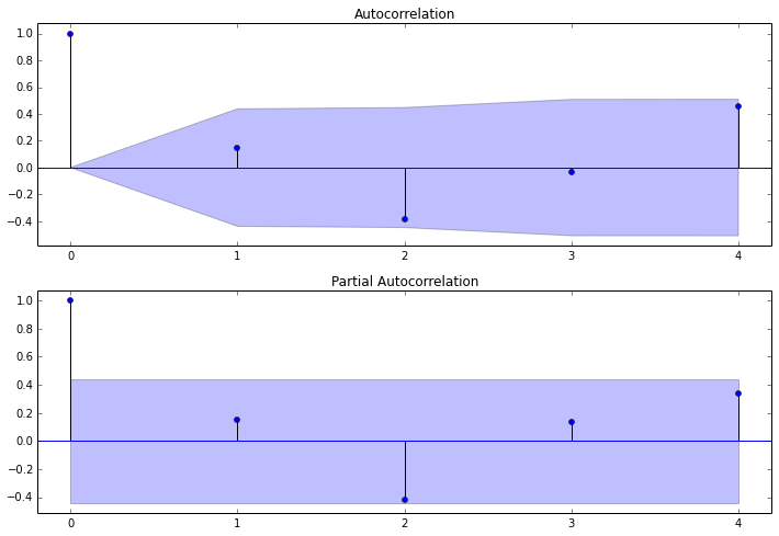
So I don't really know what the ACF is telling me..The graph of auto correlation would tend to tell me that the 4q correlation is the strongest but still only .4? (correct?) and the 2q score of -.4 would indicate that the summer to winter correlation would be the weakest (which makes sense) and how to proceed with 1) a projection based on this actual data just using straight Arma Stats models capabilities.

and 2) how to best incorporate survey data that attempt to predict the following quarter.. the survey is taken asking for predictions for the following quarter on a 5 point scale with a400+ participants, the straight correlation is not super strong but I think somehow I should be able to find the quarterly correlation to help inform the projection for the subsequent quarter..??

$\endgroup$
3
  • $\begingroup$ FWIW I did also redo this with the monthly data and stats models and made some more headway but the main question still stands.. It seems to me that the positive correlation indicated at 4 and the negative at 2, although not above the significance shaded area are still, "good enough" still having trouble with the stats models parameters to get a prediction, and no idea of how to incorporate survey data...(probably with a different method??) $\endgroup$
    – dartdog
    Commented Nov 14, 2013 at 17:52
  • $\begingroup$ I have expanded the notebook and posted it here with monthly data nbviewer.ipython.org/7473989 $\endgroup$
    – dartdog
    Commented Nov 14, 2013 at 20:44
  • $\begingroup$ I have expanded the question and posted a revised IPython notebook (with access to data), see the Google Groups entry here groups.google.com/d/msg/pystatsmodels/HmQldkxK344/uWH3Dbh0O9QJ $\endgroup$
    – dartdog
    Commented Nov 18, 2013 at 18:27

1 Answer 1

2
$\begingroup$

I agree with Simeon here that this is more a stat question.

First of all, the 2q score of -0.4 indicates that there is a negative correlation between summer and winter (i.e. the higher the summer values the lower the winer values). This allows for more predictivity so I wouldn't say the weakest.

1) These ACF and PACF indicate autocorrelations which are not significant (the significance interval is in blue). Maybe the agregation in quarters caused some loss of information here.

2) There is a lot of info on how to use ACF and PAF graphs in order to build ARMA models. These slides are a good overview of the associated Box Jenkins methodology and are a quick read: http://www.colorado.edu/geography/class_homepages/geog_4023_s11/Lecture16_TS3.pdf

EDIT 1: Before going into the ARMA model, you should first differenciate your serie in order to make it stationary, i.e. with constant mean. Then you should be able to detect safely the periodicities of the time serie and try to build a model. If differenciating once is not enough to remove tendancy, do it again. You should really have a look at the Box-Jenkins methodology, which is really a standard for this kind of problem.

A small point: The test you are doing after building the model are don to test if you have a normally distributed error (or white noise) in your model. If so this means that you have discovered most of the information cointained in your signal.

$\endgroup$
0

Your Answer

By clicking “Post Your Answer”, you agree to our terms of service and acknowledge you have read our privacy policy.

Not the answer you're looking for? Browse other questions tagged or ask your own question.