4
$\begingroup$

I have regressed data for rainfall on years 1990-2010. This was a simple linear regression in R using the lm() function. The data represent mean yearly amount of rainfall in mm. When I plotted the residuals, however, I noticed that they follow exactly the same pattern and grouping as my data.

Is this normal or because I regressed with year as a variable and shouldn't have? Thanks.

$\endgroup$
3
  • 1
    $\begingroup$ Hi Ellen and welcome to the site. What regression did you perform? A linear regression? And what do the data represent? Amount of rainfall? I think it would help tremendously if you uploaded a graph of your data. $\endgroup$ Commented Feb 25, 2014 at 18:33
  • 1
    $\begingroup$ Hi, a simple linear regression in R using lm( function. The data represent mean yearly amount of rain fall in mm. Im not sure i can upload graphs as i only have guest access! $\endgroup$ Commented Feb 25, 2014 at 18:40
  • $\begingroup$ Have added graphs! $\endgroup$ Commented Feb 25, 2014 at 18:45

3 Answers 3

6
$\begingroup$

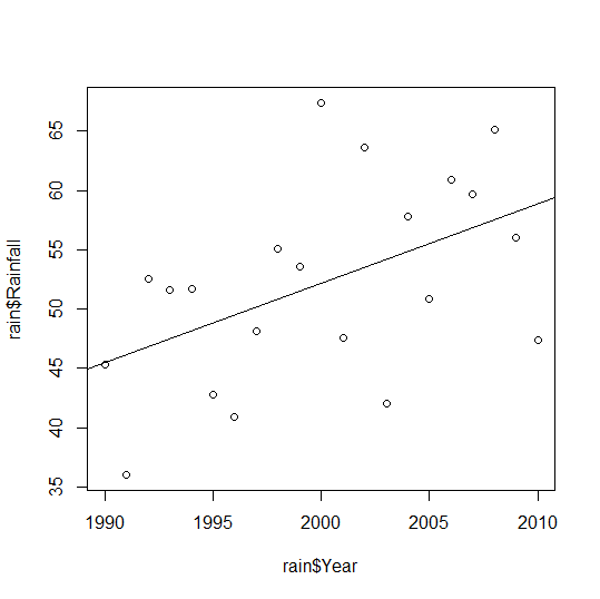
Residuals are the errors in the predictions of your linear model for each observation. Because yours is a simple linear model, your errors look a lot like your observations, but they are not exactly identical. Your regression line in the first scatterplot is essentially the same as the horizontal dotted line in your second scatterplot, Residuals vs. Fitted, but angled upward to reflect a positive correlation between year and rainfall, and passing through different coordinates. Hence the pattern only differs between these two scatterplots in terms of that angular rotation and the locations of your coordinates. I.e., your Residuals vs. Fitted scatterplot rotated and relocated the data coordinates so that your scatterplot $x$ and $y$ axes changed from Year and Rainfall, respectively, to: $$x_{\text{Residuals vs. Fitted}}= \text{Year}\times\text{slope}+\text{intercept }\\\ \ y_{\text{Residuals vs. Fitted}}=\text{Rainfall} - x_{\text{Residuals vs. Fitted}}$$ Thus your slope coefficient determines the change in angle and your intercept coefficient changes the location of the observation pattern in your coordinate space. If either were closer to zero, your patterns would be that much more identical. Either value being exactly zero is a perfectly tolerable and potentially meaningful result for a linear regression. In fact, these represent the null hypotheses of typical $t$ tests for those coefficients, so they have to be tolerable and interpretable results – otherwise, one could not really try to falsify those nulls this way (however, regression is not a NHST inherently).

@Penguin_Knight's answer is a useful alternative phrasing of my point here, with an additional consideration of multiple regression, which you may want to consider if you have other independent variables you'd like to relate to rainfall. @charles' answer is an interesting response to whether you should've used this particular model. Building on that, here are some other points to consider:

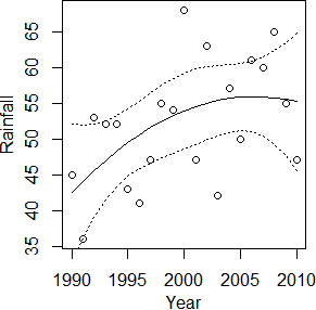
  • Your Residuals vs. Fitted plot has a convex, locally weighted scatterplot smoothing () line drawn through it, if I'm not mistaken. Because it's convex, you might want to try polynomial regression or other approaches if you can get more data...but with 21 observations only (one per year, right?), these are exercises in . Their utility depends on your purpose.

    • I tried eyeballing your Rainfall data as roughly the following: Rainfall=c(45,36,53,52,52,43,41,47,55,54,68,47,63,42,57,50,61,60,65,55,47)
      then tried summary(lm(Rainfall~Year+Year2)) where Year=1990:2010 and Year2=scale(Year,scale=F)^2 (Can't seem to square Year inside lm()...). Here's what I got: $$\text{Rainfall}=.64\times\text{Year}-.05\times\text{Year}^2-122$$ This worsened the model's $F$ and $R^2$, and with $t_{(18)}=-.99,p=.34$ for the quadratic term, I wouldn't reject a null hypothesis that denies a curvilinear relationship, but it is prettier:produced with curveplot(Year,Rainfall) where
      curveplot=function(x,y){plot(x,y);x2=scale(x,scale=F)^2; lines(x,predict(lm(y~x+x2))) lines(x,predict(lm(y~x+x2),interval='confidence')[,2],lty=3) #(these two lines plot lines(x,predict(lm(y~x+x2),interval='confidence')[,3],lty=3)} #(95% s)

      You may want to run this function on your actual data, since my eyeballs distorted your Rainfall data...or you might not. It's a more complex model, it might be overfitted, and there's really not enough evidence of a curvilinear trend. If you were modeling a longer period of time or trying to predict rainfall for years outside 1990–2010, it's almost certain that you wouldn't want a quadratic Year term, because it causes the $\lim_{\text{Year}\rightarrow\pm\infty}=-\infty$ (so long as it's negative, as here). Hence I only suggest it in case you want to describe the gradually decreasing slope in this specific time frame with a relatively simplistic model (e.g., as evidence against a strong curve). Also, I wanted to show off a simple confidence interval plot!
  • If you have more precise information about the times of your observations – e.g., if they weren't exactly annual, and you know how many days/weeks/months short of a full year each observation of Rainfall pertains to – you might want to improve the precision of your Year values, because a simple linear regression model fit with OLS assumes your variables are continuous. E.g., if 1995's observation pertains to the sum of rainfall measurements beginning after the last rainfall measurement of 1994 on December 25 and ending with the last rainfall of 1995 on December 6, you might consider setting the value of Year corresponding to that sixth observation of Rainfall to be $\frac{346}{365}$ higher than the previous value, not exactly 1 higher. You might not want to either; it complicates your work, and it shouldn't matter much as long as the real time differences between your observations don't vary too much.

    Annual rainfall measurements between 35–70mm implies incredible aridity though – even Antarctica gets more precipitation than that, mostly. Even if you actually meant centimeters, this is probably still a desert. If it's not raining often in your region of interest, your real time differences between observations might vary widely. If you can preserve that information, you should. Also, if you have info on separate observations within years that you are summing to simplify your analysis, bear in mind that this is reducing the accuracy of your model too. Annual rainfall accumulates as a function of day-of-year, and in arid climates, may be useful to incorporate in the model, because many days won't see any rain.

    If you can model Rainfall over time with disaggregated measurements and specific dates, you'll also have to worry more about seasonal cycles after all, following charles' original reasoning. Never fear though; we'll be happy to help you pick the right model for that kind of data too, if you describe its disaggregated nature in a separate question (i.e., I wouldn't try to change this question to describe it). If your data is necessarily aggregated to the annual level, and if you don't have specific measurement dates, you can disregard most of this point, unfortunately.

  • Another problem with OLS regression for these data may be implied by your Normal Q-Q plot. OLS regression also assumes normally distributed residuals. It looks like yours have excess , though maybe not too much. Regardless, you might consider or alternatives to OLS linear regression. Some sacrifice power, but you might prefer to play it safe.

$\endgroup$
6
$\begingroup$

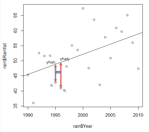
If it's a one-predictor linear regression, then what you observed is normal. See this illustration for explanation:
enter image description here

The order on the scale of year is the same as if they are on the scale of predicted rainfall. In the picture below, the red double headed arrows point at the observed $x$ and $y$ of two data points, $i$ and $j$, and their corresponding position on predicted outcome (on the regression line, yhat). You can see that $x_i$ comes before $x_j$ on the continuum of year, and $\hat{y}_i$ comes before $\hat{y}_j$ on the regression line. So, if you plot the residual plot using predicted outcome, $\hat{y}$, as horizontal axis, the horizontal order and relative distance of the data points do not change.

Now, vertically, residual is just the distance between observed $y$ and predicted $y$, which are represented by the red arrows for two chosen data points. So, the vertical spread is preserved as well.

In a nutshell, in one-variable linear regression, the residual would look just like the scatter plot, but the the regression line tilted to level. Once you add another predictor or more, this will no longer be true.
$\endgroup$
2
  • $\begingroup$ Thanks - So is it viable to use linear regression with year as the independent variable? All im after is a statistical summary as to whether it has changed over time. $\endgroup$ Commented Feb 25, 2014 at 19:13
  • 3
    $\begingroup$ @EllenMarshall, not necessarily a consequence. The error plot resembles the data distribution has nothing to do with if the variables or model are correctly specified. Generally, time-series data violates the assumption of independence between observations. Some forms of correction will be needed so that your standard error will not appear to be too small. $\endgroup$ Commented Feb 25, 2014 at 19:27
3
$\begingroup$

(1) It does not look like rainfall data. There is both a trend and a yearly cyclical component.
(2) The residual pattern is a result of using linear regression rather than a time series approach
(3) You could capture some of the cyclical pattern - and thus maybe reduce residuals to "white noise" (no pattern) - by introducing dummy variables. Either trigonometric or standard dummies. This approach may be challenging in this instance since (1) your time series is fairly short (2) there is not clear hypothesis (pre-specified concept of cycle length) to generating dummies (usually one uses month, season or quarter etc) (3) trig variables are a tad painful and also assume you have some concept of cycle duration.
(4) But more generally - leaving the time series aspect aside - you're assuming a linear relationship where one clearly does not exist. The residual pattern here is commonly seen when that assumption is violated. Normally a non-linear function would be sufficient (polynomial being the easiest), but that isn't going to be a great way to capture the cyclical nature of data (the data has a specific type of non-linearity).
(5) The model does appear to capturing the overall trend over time.

$\endgroup$
4
  • $\begingroup$ I can assure you that it is rainfall data! How would i do a time series approach? I want to quantify in some way the trend for rainfall over time. $\endgroup$ Commented Feb 25, 2014 at 19:11
  • 1
    $\begingroup$ You've captured the trend over time. So if that is your goal, the analysis is good. (the trend here appears to be linear) If you wanted to provide predictions then you'd need to capture some of the cyclical nature of data. You can sometimes do that with dummies, but I don't see a clear pre-specified way to build them. Unless this cycle is well known/described? Given that you'd likely need some time series methodology, smoother or ARIMA. That is fairly painful. So depends on your goals, for many/most this may well be fine. $\endgroup$
    – charles
    Commented Feb 25, 2014 at 19:19
  • $\begingroup$ The data is annual rainfall, so no cyclical component. $\endgroup$
    – jbowman
    Commented Feb 25, 2014 at 21:07
  • $\begingroup$ Thanks, my aim was simply to capture the trend. I have since broken this variable into separate seasons. $\endgroup$ Commented Mar 19, 2014 at 13:59

Your Answer

By clicking “Post Your Answer”, you agree to our terms of service and acknowledge you have read our privacy policy.

Not the answer you're looking for? Browse other questions tagged or ask your own question.