5
$\begingroup$

This may come off as a silly question, but I am having a hard time identifying the name of the following cumulative plot. For example, say I have the following data:

number_of_items_sold_per_store = [10, 6, 90, 5, 102]

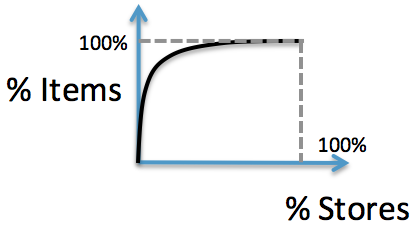
what is the name of the statistical plot that shows the following cumulative relation?

                              enter image description here

The plot above assumes that X axis (i.e. Stores) have been sorted from left to right with the stores that sold the most items to the left.

$\endgroup$
4
  • 3
    $\begingroup$ Lorenz curve. The existing tag definition is way too narrow and doesn't really distinguish it from a cdf plot. Also a p-p or probability-probability plot. $\endgroup$
    – Nick Cox
    Commented Nov 18, 2014 at 1:24
  • $\begingroup$ @Nick That's the name I've been trying to find for the last ten minutes or so. Could not recall the name. $\endgroup$
    – Glen_b
    Commented Nov 18, 2014 at 1:36
  • 1
    $\begingroup$ @Glen_b There is no "I" in teamwork! $\endgroup$
    – Nick Cox
    Commented Nov 18, 2014 at 1:37
  • $\begingroup$ See also e.g. stats.stackexchange.com/questions/66749/… $\endgroup$
    – Nick Cox
    Commented Nov 18, 2014 at 2:04

2 Answers 2

4
$\begingroup$

That looks like it's the curve of the cumulative proportion in a Pareto chart.

See also Pareto analysis - the article describes the construction of the curve.

As Nick Cox points out in comments, it's a Lorenz curve.

If you look at the ones in the Wikipedia article on it, the curves there are "flipped" compared to the one in your question.

If quantity on the x-axis is numerical (as with income in $, for example), you'd order it the way it's done in the Lorenz article. When the x-axis represents categories, it's common to order by the size of the proportion, largest to smallest (which is what 'flips' the chart from convex to concave).

Done the way they are in a Pareto chart is still a Lorenz curve, though, they're still a cumulative distribution by size, just with the size going from largest to smallest.

$\endgroup$
1
$\begingroup$

If I correctly understand the question, you are asking for the name of the plot of the function that is

$$f(x) := \sum_{i=0}^x \frac{\textrm{NumItemsSoldByStore}(i)}{\textrm{TotalItems}},$$

except with $x$ rescaled to go from 0 to 1, or 0 to 100%, however you like (plot versus $y = x / \textrm{TotalStores}$, meaning $g(y) = f(y * \textrm{TotalStores})$).

This is just the plain old cumulative distribution function where you have additionally ordered $x$ by $\textrm{NumItemsSoldByStore}(x)$ and scaled it to be 0-100%. This is because

$$p(\textrm{item was sold by store }x) = \frac{\textrm{NumItemsSoldByStore}(x)}{\textrm{TotalItems}}$$.

Given all that, it is also a P-P plot, where you have again sorted it already, and instead of the often-used theoretical cumulative distribution on the horizontal axis, you are using the cumulative distribution of the stores themselves.

If you are asking about the name of these when you've sorted it already, it's called a lift curve.
$\endgroup$

Your Answer

By clicking “Post Your Answer”, you agree to our terms of service and acknowledge you have read our privacy policy.

Not the answer you're looking for? Browse other questions tagged or ask your own question.