-1
$\begingroup$

I have a table that has this structure. So as you see, the frequency of each subset is identified in each cell. It's very unclear which one is better.

    COC EG EE AC LE ME SC
 CE   3 22  0  0  4  3 50
 AU  21  7  1  0  0  0 15
 WA   4  0 10  0 12  0 21
 HH   0 12  5  0  2  1  8
 MH   0  2  0  2  2  0 26
 HA   8  7  3  0  1  0  8
 TY   0  0  0  0  0  0  1
 PK   3  0  0  0  0  0  2
 SR   0  1  0  0  0  0  1
 FU   0  0  0  0  0  0  2

To import directly into R:

library(gsheet)
data <- read.csv(text = gsheet2text('https://docs.google.com/spreadsheets/d/1RHFifBQpuia_YXtSogjv0j9pkNLL6WMR9sRN78VGR4k/edit?usp=sharing',
format ='csv'), row.names=1)

To make this a bit more human readable, I could use heatmap style. That means higher the number, the darker the color of the cell.

Are there are any better solutions?

$\endgroup$
11
  • 2
    $\begingroup$ Please post that in a form that can be copied and pasted into people's favourite software. Are the rows and columns already in an order that makes substantive sense? (I can't identify what they mean, which may be deliberate.) $\endgroup$
    – Nick Cox
    Commented Oct 16, 2015 at 11:49
  • 1
    $\begingroup$ To underline my last question, it's important to know whether rows and columns can be permuted without loss of meaning. $\endgroup$
    – Nick Cox
    Commented Oct 16, 2015 at 11:58
  • 4
    $\begingroup$ Sure, you want ideas, but the whole point of posting in a forum is that the answers could interest many different people. Therefore, being able to use your example would make answers more vivid to many readers. Personally, I decline to type in 70 numbers. It's the responsibility of the OP to make a question publicly interesting and not just a way to get individual help in public. $\endgroup$
    – Nick Cox
    Commented Oct 16, 2015 at 17:46
  • 3
    $\begingroup$ I modified your table because enough effort has been poured into this question not to get an answer, but I completely agree with @Nick Cox comments. $\endgroup$ Commented Oct 20, 2015 at 13:39
  • 3
    $\begingroup$ @l'ombradel'atzavara, it was awfully nice of you to spend your time typing all that up. $\endgroup$ Commented Oct 20, 2015 at 13:39

2 Answers 2

2
$\begingroup$

Try MATLAB: put your table as input and it will generate a heatmap for you.

see https://plot.ly/matlab/heatmaps/

$\endgroup$
2
  • 1
    $\begingroup$ Tha'ts not what I'm asking for. I just want other ideas (other than heatmaps) to plot this. $\endgroup$
    – M-T-A
    Commented Oct 16, 2015 at 13:14
  • $\begingroup$ Not sure your purpose. I may use stacked bar chart (each bar represents a country or a research domain). This kind of chart can clearly show the dominant research area of each country. $\endgroup$
    – Sean
    Commented Oct 20, 2015 at 8:21
1
$\begingroup$

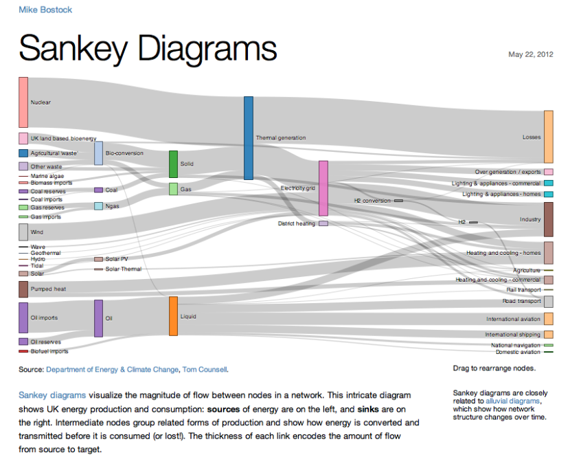
Sankey Diagrams did a great job as an alternative to visualize this frequency table.

Sankey diagrams look similar to this enter image description here

So with each item in the row, a line should go to the corresponding item in the column. The width of the line should be proportional to the value inside the common cell between row and column.

While this image has three or more levels of change, the frequency table above should have two levels only. The left level should represent row items and the right level should represent the column items.

Photo credit goes to Mike Bostock. The photo was taken from a creative commons article written by Tony Hirst too. More details could be found here.

$\endgroup$
4
  • 2
    $\begingroup$ Welcome to Cross Validated. We are trying to build a permanent repository of high-quality statistical information in the form of questions & answers. We try to avoid overly brief or link-only answers (which are subject to link-rot and may be deleted). At present this is more of a comment than an answer in its own right. If you're able, could you expand it, perhaps by giving a summary of the information at the link. Alternatively we can convert it into a comment for you. $\endgroup$
    – Glen_b
    Commented Oct 20, 2015 at 12:26
  • $\begingroup$ @Glen_b better? $\endgroup$
    – M-T-A
    Commented Oct 20, 2015 at 13:37
  • 2
    $\begingroup$ If you can legally post the diagram (e.g. if it falls under a creative commons license, or is in the public domain), you'll need to give credit in order to conform to the SE rules on such posting as well as conform to whatever rules the license itself imposes. If that's a diagram you own the rights to it won't be necessary to give credit $\endgroup$
    – Glen_b
    Commented Oct 20, 2015 at 14:24
  • 2
    $\begingroup$ @M-T-A If you managed to create a similar plot with your data, can you please include it in your response, together with an explanation of the variables and the code you used, etc.? $\endgroup$ Commented Oct 20, 2015 at 14:45

Your Answer

By clicking “Post Your Answer”, you agree to our terms of service and acknowledge you have read our privacy policy.

Not the answer you're looking for? Browse other questions tagged or ask your own question.