7
$\begingroup$

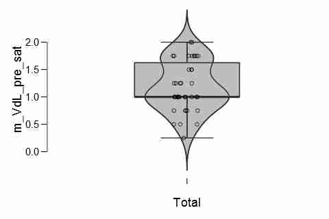
I would like to represent my data in the most informative way. As successors of the boxplot, I have found violin plots as well as beanplots. What are the advantages of each plot? A violin plot could be combined with a boxplot:

Violin plot from JASP

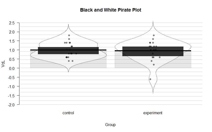
A beanplot could be combined with the mean and a HDI around it, as seen in the pirateplot() function:

enter image description here

What is the difference? What would you prefer?

$\endgroup$
7
  • 2
    $\begingroup$ Do we have to choose? I don't like either much. Why not broaden your question to allow suggestions of other possibilities and post your data so that there can be different answers? The example data, whether they are yours or not, show how both plots impute and suggest structure that may not be possessed by the underlying data. For example, the suggested extremes are projections beyond the actual extremes. $\endgroup$
    – Nick Cox
    Commented Sep 1, 2016 at 12:15
  • $\begingroup$ There is also granularity to your data that may or may not be important. Can you comment? Multiples of 0.25? $\endgroup$
    – Nick Cox
    Commented Sep 1, 2016 at 12:17
  • $\begingroup$ Voting to close as " What would you prefer?" is manifestly an opinion-based question. Also @NickCox Your suggestion seems to invite preference list type answers, which are off topic here. This said, the question could be edited to add more focus and not request opinion-centered answers. $\endgroup$
    – Alexis
    Commented Sep 25 at 15:44
  • 1
    $\begingroup$ @Alexis Well, it seems to me that different graphical methods can be discussed using arguments and evidence in terms of why they work or do not work, work better or worse than others. and so forth Otherwise statistical graphics is just a matter of taste, and I don't think it is. $\endgroup$
    – Nick Cox
    Commented Sep 25 at 17:01
  • $\begingroup$ @NickCox I agree that different graph forms communicate information in different ways. "What would you prefer?" is not an appropriate way to ask about those differences on CV. $\endgroup$
    – Alexis
    Commented Sep 25 at 17:29

1 Answer 1

8
$\begingroup$

I don't know about bean plots but for small sample sizes violin plots may be unstable and I would prefer to just show the raw data with a rug plot or spike histogram. Sometimes I superimpose a violin plot with an extended box plot and the raw data. An extended box plot shows many more quantiles than a regular box plot. In R you can see a demonstration of many variations by running

require(Hmisc)
example(panel.bpplot)

See also some of the examples in https://hbiostat.org/bbr/descript.html#sec-descript-graphics

See https://hbiostat.org/R/Hmisc for other examples of back-to-back violin plots for displaying distributions for two treatment groups over time. No need to always show the mirror images.

$\endgroup$
0

Your Answer

By clicking “Post Your Answer”, you agree to our terms of service and acknowledge you have read our privacy policy.

Not the answer you're looking for? Browse other questions tagged or ask your own question.