2
$\begingroup$

Is there a proper or ideal way to annotate a bubble chart outside of what is required for a standard 2-variale scatterplot?

The bubble area is supposed to be associated with the 3rd variable, but is there something that should say so? Is there a way to properly indicate what the third variable is?

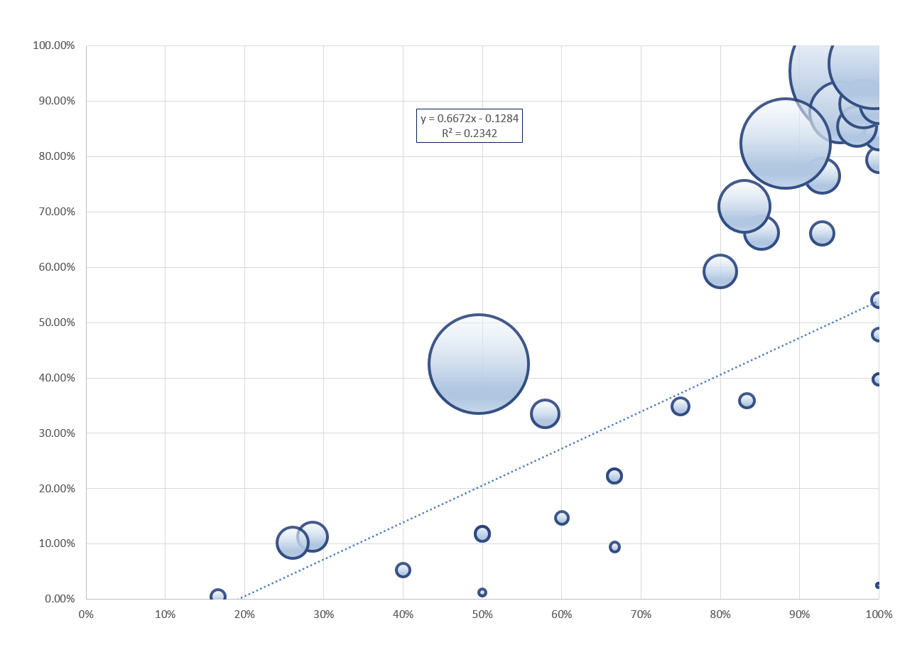
So here is my scatterplot, except that bubbles replace the points, and the bubble area is related to a third variable, not x or y.

enter image description here

How do I say what the bubble sizes are? Is there something that I need to say about the fit line being not weighted? Should I have a x=y line?

I know that I will need title, axis labels, and to clean up units on the y-axis. Is there anything else needed?

$\endgroup$
6
  • 3
    $\begingroup$ Are you just asking about the legend? See some examples for maps here. $\endgroup$
    – Andy W
    Commented Sep 27, 2016 at 16:25
  • $\begingroup$ @AndyW - nice reference. $\endgroup$ Commented Sep 28, 2016 at 18:10
  • 1
    $\begingroup$ It looks inconsistent to plot an unweighted regression line on such a bubble plot. Fitting a linear least squares model to these data seems inadvisable in the first place, because the responses appear to be constrained to 0 to 100%. Regardless, how are your readers supposed to know the bubble areas are proportional to $Z$ when nothing on the plot even mentions $Z$? $\endgroup$
    – whuber
    Commented Sep 28, 2016 at 20:09
  • $\begingroup$ @whuber - I strongly agree with you. It is a horribly ugly plot. It is, however, useful. Part of the purpose of the plot is to show how bad the unweighted regression is - it is meant to be like 'The Cramer' who is "a loathsome, offensive brute, yet I can't look away". A good thrust of the question is about how should $Z$ be described properly in the plot, and also in much less ugly plots. $\endgroup$ Commented Sep 28, 2016 at 20:16
  • 1
    $\begingroup$ @Nick I agree generally, but there is a subtlety. One purpose of a scaled bubble plot is to reveal patterns of relationships (among the two coordinates and the bubble sizes). We are aiming for a gestalt reaction rather than an accurate decoding of each bubble area. Indeed, some cartographers have suggested scaling bubbles by a power of the variable (around 0.57 rather than 1/2) based on psychological testing(!). I have found bubble plots to be quite useful for revealing multidimensional relationships, even though I never would use, say, a pie chart if I can help it. $\endgroup$
    – whuber
    Commented Apr 21, 2022 at 15:18

1 Answer 1

0
$\begingroup$

Here is a tool used to argue that fault detection algorithm health should be measured using lower confidence interval given sample size instead of prevalence. It is a lower estimate, but it takes into account sample size, and protects from customer-facing falsehoods - which can be expensive.

Note the legend.

Plot:
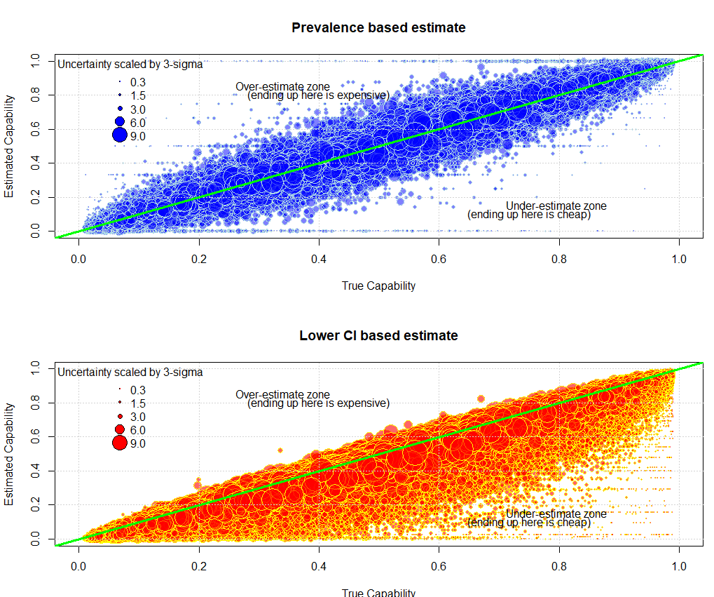
figure with 2 subplots, upper is prevalence estimate, lower is lower-ci based estimate

Code:

# Purpose:  Show relationship between prevalence and CI for binomial

# -------------
# housekeeping
# rm(list=ls())

#libraries
require(pacman)
p_load(PropCIs)  #for Clopper-Pearson (exact)

#reproducibility
set.seed(09302016)


N_loops <- 100000  #decent sample size

#CI threshold
ci_threshold = 0.95

#stage store for loop
p_true    <- numeric(length = N_loops)
n_samp    <- numeric(length = N_loops)
prev      <- numeric(length = N_loops)
L_CI      <- numeric(length = N_loops)

store          <- data.frame(p_true, n_samp, prev, L_CI)

### main loop ###

for (i in 1:N_loops){
        
        #how many samples show up (uniform random)
        n_samp1         <- sample(x=c(1:300), size = 1, 
                                  replace = FALSE)
        
        #true prevalence (uniform random)
        p_true1         <- runif(n = 1, min = 0, max = 1)
        
        #draw samples (binomial)
        mysamples      <- rbinom(n = n_samp1, size=1, 
                                 prob = p_true1)
        
        #compute prevalence
        prev1 <- sum(mysamples)/length(mysamples)
        
        #compute the lower conf interval
        #  Agresti-Couli exact as "finish line"
        btest <- exactci(x = sum(mysamples), 
                         n = length(mysamples), 
                         conf.level=ci_threshold)
        
        L_CI1 <- btest$conf.int[1]
        
        #pack into store
        store$p_true[i]   <- p_true1
        store$n_samp[i]   <- n_samp1
        store$prev[i]     <- prev1
        store$L_CI[i]     <- L_CI1
}


#make scatterplots

#take off extreme tails
idx_kill <- which(store$p_true < 0.01 | store$p_true > 0.99)

store <- store[-idx_kill,]

#compute variance per row 
var_samp <- store$n_samp*store$p_true*(1-store$p_true)

#convert to visually intuitive form
radius <- sqrt(var_samp/pi)/3


## make plot
par(mfrow=c(2,1))

#first subplot
symbols(x = store$p_true,
        y = store$prev,
        circles = radius,inches=0.2, 
        fg="LightBlue",
        bg=rgb(red=0,green=0,blue=1,alpha=0.5),
        xlim=c(0,1),ylim=c(0,1),
        main="Prevalence based estimate", 
        xlab="True Capability", 
        ylab="Estimated Capability")

grid()
abline(a=0, b=1, col="Green", lwd=3)

#some annotations
text(0.25,0.85,"Over-estimate zone",pos = 4,bg="white")
text(0.4,0.8,"(ending up here is expensive)",bg="White")

text(0.7,0.15,"Under-estimate zone",pos = 4,bg="white")
text(0.75,0.1,"(ending up here is cheap)",bg="White")

legend(
        "topleft", 
        title = "Uncertainty scaled by 3-sigma",
        legend=c("0.3",  "1.5", "3.0","6.0","9.0"), 
        pch = 21,
        bty = "n",
        col = "black",
        pt.bg = "Blue",         
        pt.cex = c(0.1,0.5,1,2,3)
)  

#second subplot

symbols(store$p_true,store$L_CI,radius,inches=0.2,fg="yellow",
        bg=rgb(red=1,green=0,blue=0,alpha=0.6),xlim=c(0,1),ylim=c(0,1),
        main="Lower CI based estimate",
        xlab="True Capability", 
        ylab="Estimated Capability")

grid()
abline(a=0,b=1,col="Green",lwd=3)

#some annotations
text(0.25,0.85,"Over-estimate zone",pos = 4,bg="white")
text(0.4,0.8,"(ending up here is expensive)",bg="White")

text(0.7,0.15,"Under-estimate zone",pos = 4,bg="white")
text(0.75,0.1,"(ending up here is cheap)",bg="White")

legend(
        "topleft", 
        title = "Uncertainty scaled by 3-sigma",
        legend=c("0.3",  "1.5", "3.0","6.0","9.0"), 
        pch = 21,
        bty = "n",
        col = "black",
        pt.bg = "Red",         
        pt.cex = c(0.1,0.5,1,2,3)
)  

par(mfrow=c(1,1))
$\endgroup$

Your Answer

By clicking “Post Your Answer”, you agree to our terms of service and acknowledge you have read our privacy policy.

Not the answer you're looking for? Browse other questions tagged or ask your own question.