A histogram represents probability by area:

In this figure, the white region (to the left of $x=1$) comprises half the area. The blue region comprises the other half. The boundary between them at $x=1$ is, by definition, the median: it splits the total probability exactly in half.
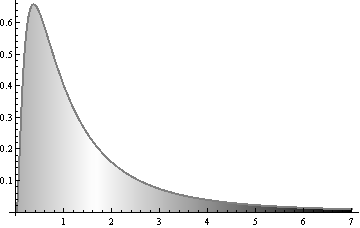
The areas in the next figure are shaded with varying densities of black:

The density of black is directly proportional to the horizontal distance from the middle (around 1.65 here). Each point near $x=7$ is very dark. Such points contribute proportionately more to the total amount of black ink used to shade this figure. The central place (where the shading becomes white) is chosen to make total amount of black to its right equal the total amount of black to its left. This makes it equal to the mean.
We see that the distant values ($x$ larger than $3$ or so) contribute so much black that they "pull" the dividing line--the mean--towards them.
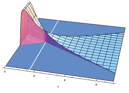
Another way to see this uses three dimensions. The mean is the point at which the two volumes (pink/yellow and blue/purple) are exactly equal:

This figure was constructed by sweeping the original histogram (shown in the $x$ (horizontal) and $z$ (up) directions) from side to side around the mean value. This caused the long extended "tail" at the right to sweep out a larger region, because it is further from the mean than the rest of the figure. By virtue of that, it contributes more to the volume.
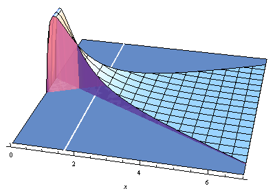
Were we to try the same thing by sweeping around the median (at $x=1$), we would get unequal volumes:

The white line on the ground still shows the mean, but now the axis of sweeping is around the median. Although the median correctly splits the cross-sectional area into two, it allows more volume to the right because the points to the right are "skewed" away from the median. Thus the sweeping axis has to be shifted toward larger values of $x$ to make the volumes balance.


