In the documentation for the R compositions package, and in reference to ternary diagrams, it is stated that:
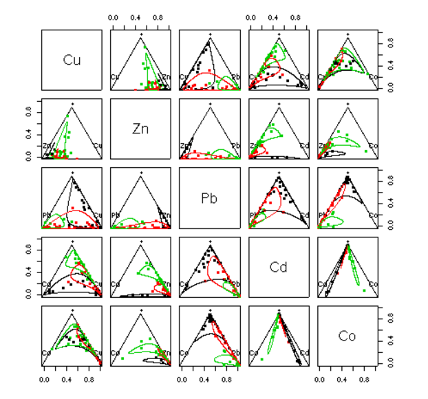
However the ternary diagram can only display compositions of three parts. In case of more parts a scatter plot matrix like matrix of ternary diagrams is displayed which selects two components against some sort of margin of the rest:
plot(acomp(sa.lognormals5))
plot(acomp(sa.lognormals5), margin = "rcomp")
plot(acomp(sa.lognormals5), margin = "Cu")
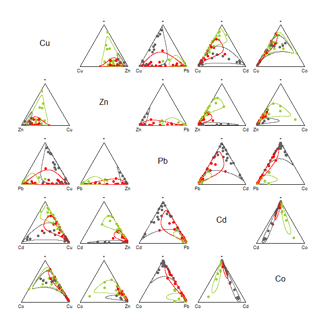
In here the author presents this (tantalizingly beautiful) plot:
... without the code!
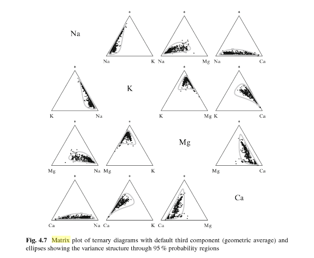
The "mystery" asterisk $(*)$ is clarified in this passage in Analyzing Compositional Data with R By K. Gerald van den Boogaart, Raimon Tolosana-Delgado
margin = "acomp" (or nothing, the default) computes the third part as the geometric of all components except those two from row and colum (symbolized with "*").
The question is:
What are the meaning and mathematics behind these deformed circles (lines or curves) generated by the function
ellipses, and how to generate them?


Rquestion: after all, if you have the code to draw one curve (they're evidently not ellipses!), iteration will draw as many curves as you like. If you want this to fly on Stack Overflow, supply a simple dataset so that people can reproduce your computation. For (1) I don't know the answer, because I don't want to research your references, but the first thing that comes to mind is to plot each pair of components $(X_i,X_j)$ against the sum of all other components: that gives a meaningful three-component mixture. $\endgroup$ellipsesis the function in the package. Finally, I do think you answered my more meaningful question (1) to the point that if you happened not to be exactly correct, it wouldn't make any conceptual difference. $\endgroup$