0
$\begingroup$

I had already asked a similar question here, but I'm experiencing the same problem for a different data-set and for a different family of mixed models.

My response variable is a binary outcome of whether an individual hunted a prey or not (0 and 1). I'm trying to see how this hunting behaviour change with time (across 31 trials). My data-set consists of 242 individuals (ID) nested within 12 different colonies. Both colony and ID were converted into factors, while the fixed effect predictor (trials) is an integer ranging from 1 to 31.

Since the model using maximum likelihood (binomial glmer) resulted in a singular fit, I used a bayesian model (from rstanarm).

model<-stan_glmer(Attacker~Trial+(Trial|colony/ID),data=data,family='binomial',chains=2).

(I used only 2 chains because running the model with the default 4 chains resulted in issues with the RAM while visualizing the plots).

Model diagnostics were checked and the model seemed to be a reasonably good fit (no divergent transitions, rhat < 1.05, very low autocorrelation).

From this model, I generated random slopes plot using sjPlot package as follows:

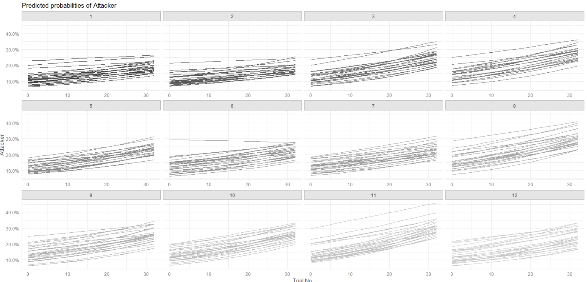
plot_model(model,type="pred",terms=c("Trial","ID","colony"),pred.type="re",show.legend=F,colors="gs",ci=F).

And I got the following plot

enter image description here

As you can see, some lines are curved. I'm wondering how regression lines cannot be straight. I'm not sure what went wrong with the model. Any help will be much appreciated. Thanks!

$\endgroup$
2
  • 1
    $\begingroup$ Why is this question down-rated? $\endgroup$
    – BP86
    Commented Jan 10, 2019 at 20:55
  • $\begingroup$ Are you sure they are curved? Can you plot a high detail version of the plot? $\endgroup$ Commented Jan 11, 2019 at 8:23

1 Answer 1

7
$\begingroup$

Nothing went wrong with your model. The model was fitted on the log odds scale. For example, for a typical individual nested in a typical colony, the log odds of that individual being an attacker were modeled as a linear function of trial:

log (odds of attacker) = beta0 + beta1*Trial 

In your plot, you changed the scale on which the results are presented from the log odds scale to the probability scale. If you had plotted results on the original log odds scale, you would have seen straight lines in your plot. Here is what happened for the typical individual in the typical colony with this change of scale:

  1. The odds of the individual being an attacker were computed as:

    odds of attacker = exp(beta0 + beta1*Trial)

  2. The probability (prob) of the individual being an attacker - expressed as a percentage - was computed from these odds as:

    prob of attacker = (odds of attacker)/(1 + odds of attacker) x 100% =

                 = exp(beta0 + beta1*Trial)/(1 + exp(beta0 + beta1*Trial)) x 100%
    

Note that the log odds of the individual in question being an attacker are a linear function of Trial (hence the expected straight lines). However, the probability of that individual being an attacker is a non-linear function of trial (hence the curved line in your plot).

Of course, your plot uses estimated values of beta0 and beta1 for the typical individual in the typical colony, which leads to predicted probabilities. A similar reasoning explains why you see curved lines for all other individuals.

See https://www.graphpad.com/support/faq/probability-vs-odds/ for a nice explanation of the difference between odds and probability. In particular, this reference states that, to convert odds to a probability, you need to divide the odds by one plus the odds.

$\endgroup$
1
  • $\begingroup$ You're welcome, @BP86! (: $\endgroup$ Commented Jan 11, 2019 at 19:12

Your Answer

By clicking “Post Your Answer”, you agree to our terms of service and acknowledge you have read our privacy policy.

Not the answer you're looking for? Browse other questions tagged or ask your own question.