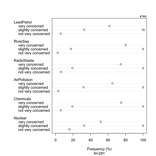
Stacked barcharts are generally well understood by non-statisticians, provided they are gently introduced. It is useful to scale them on a common metric (e.g. 0-100%), with a gradual color for each category if these are ordinal item (e.g. Likert). I prefer dotchart (Cleveland dot plot), when there are not too many items and no more than 3-5 responses categories. But it is really a matter of visual clarity. I generally provide % as it is a standardized measure, and only report both % and counts with non-stacked barchart. Here is an example of what I mean:
data(Environment, package="ltm")
Environment[sample(1:nrow(Environment), 10),1] <- NA
na.count <- apply(Environment, 2, function(x) sum(is.na(x)))
tab <- apply(Environment, 2, table)/
       apply(apply(Environment, 2, table), 2, sum)*100
dotchart(tab, xlim=c(0,100), xlab="Frequency (%)",
         sub=paste("N", nrow(Environment), sep="="))
text(100, c(2,7,12,17,22,27), rev(na.count), cex=.8)
mtext("# NA", side=3, line=0, at=100, cex=.8)

Better rendering could be achieved with lattice or ggplot2. All items have the same response categories in this particular example, but in more general case we might expect different ones, so that showing all of them would not seem redundant as is the case here. It would be possible, however, to give the same color to each response category so as to facilitate reading.
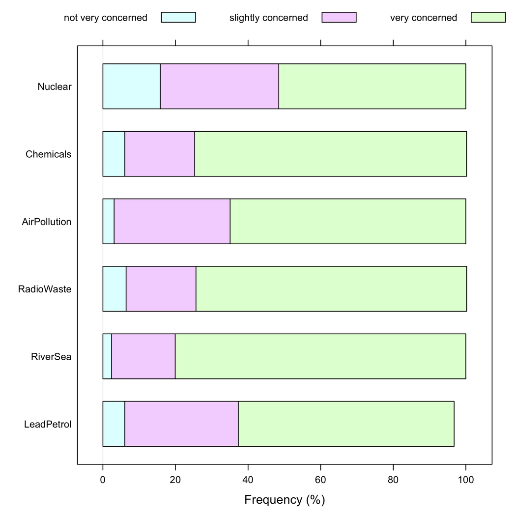
But I would say stacked barcharts are better when all items have the same response category, as they help to appreciate the frequency of one response modality across items:

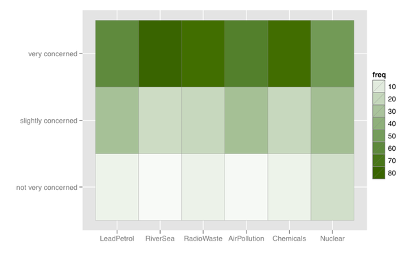
I can also think of some kind of heatmap, which is useful if there are many items with similar response category.

Missing responses (esp. when non negligible or localized on specific item/question) should be reported, ideally for each item. Generally, % of responses for each category are computed without NA. This is what is usually done in survey or psychometrics (we speak of "expressed or observed responses").
P.S.
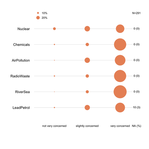
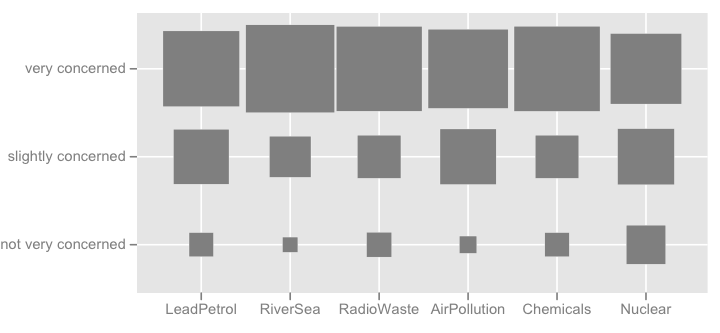
I can think of more fancy things like the picture shown below (the first one was made by hand, the second is from ggplot2, ggfluctuation(as.table(tab))), but I don't think it convey as accurate information as dotplot or barchart since surface variations are difficult to appreciate.
